Branding/PR/Marketing
Branding Project
Timeframe: April - May 2020
Collaborated with: Martin Lindberg (builder of landing page, creater of brand book layout, and worked hand in hand with on all research, branding, and art direction)
Roles:
Skills:
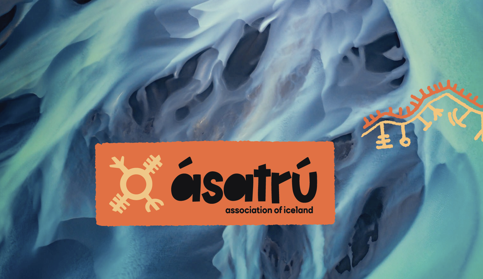
Ásatrú
(Icelandic Religion Revival)Branding Project
Timeframe: April - May 2020
Collaborated with: Martin Lindberg (builder of landing page, creater of brand book layout, and worked hand in hand with on all research, branding, and art direction)
Roles:
- Designer
- Illustrator
- UX Researcher
- Branding
Skills:
- Procreate
- Adobe Illustrator
- Adobe Photoshop
- Adobe Indesign
- Layout
- Typography
- G-Suite
- Timekeeping/management
Problem:
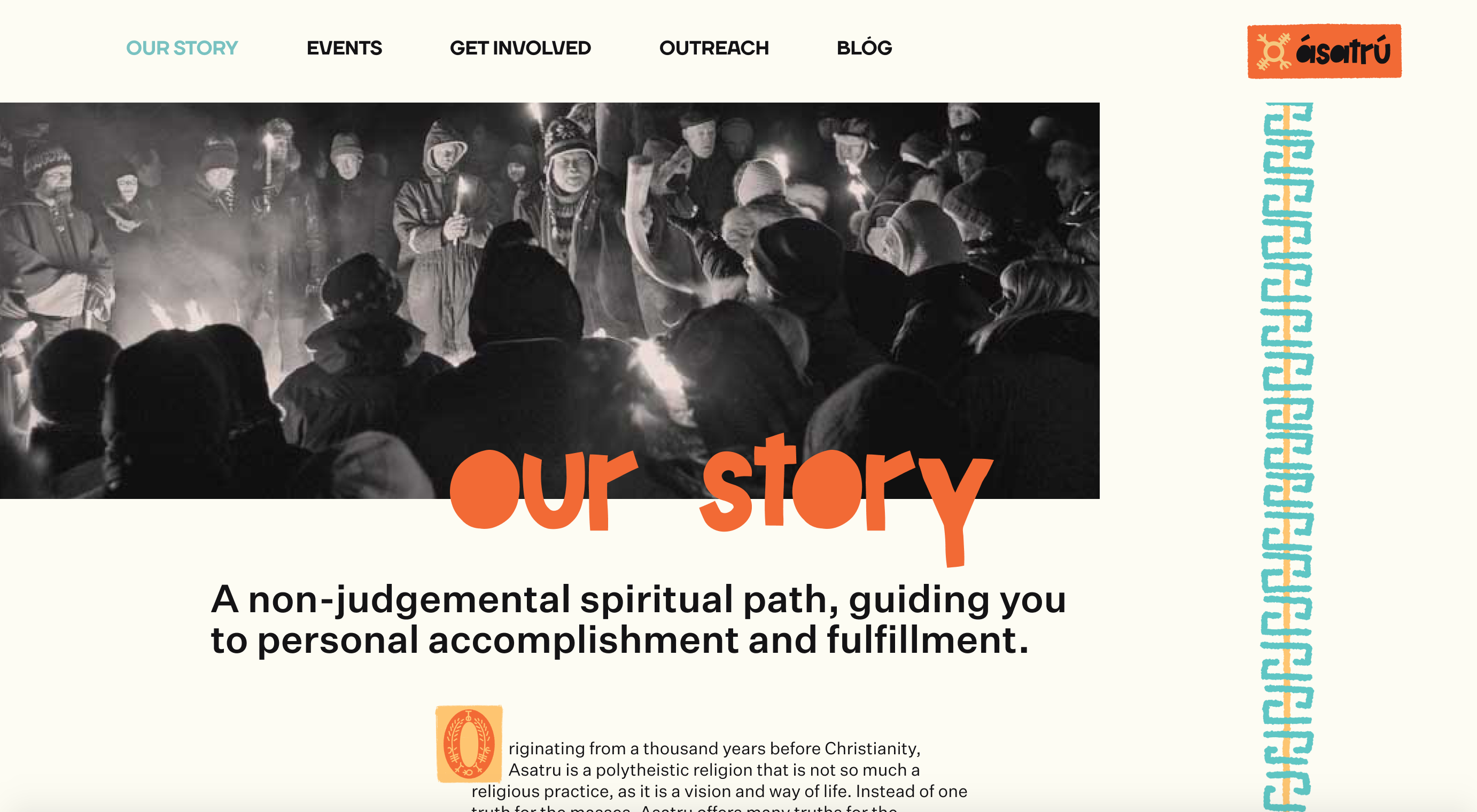
Ásatrú is the modern revival of an ancient Icelandic pagan religion. Our job was to create a brand identity for a religion that has a couple big obstacles: It is very foreign (not just geographically, but also theistaically), it’s seems like a cult (thanks Midsommar!), and the big one: A lot of the elements of Norse theology has been co-opted by Neo-Nazi’s and white supremacists.How do we create an identity that expresses what Ásatrú really is?
Background:
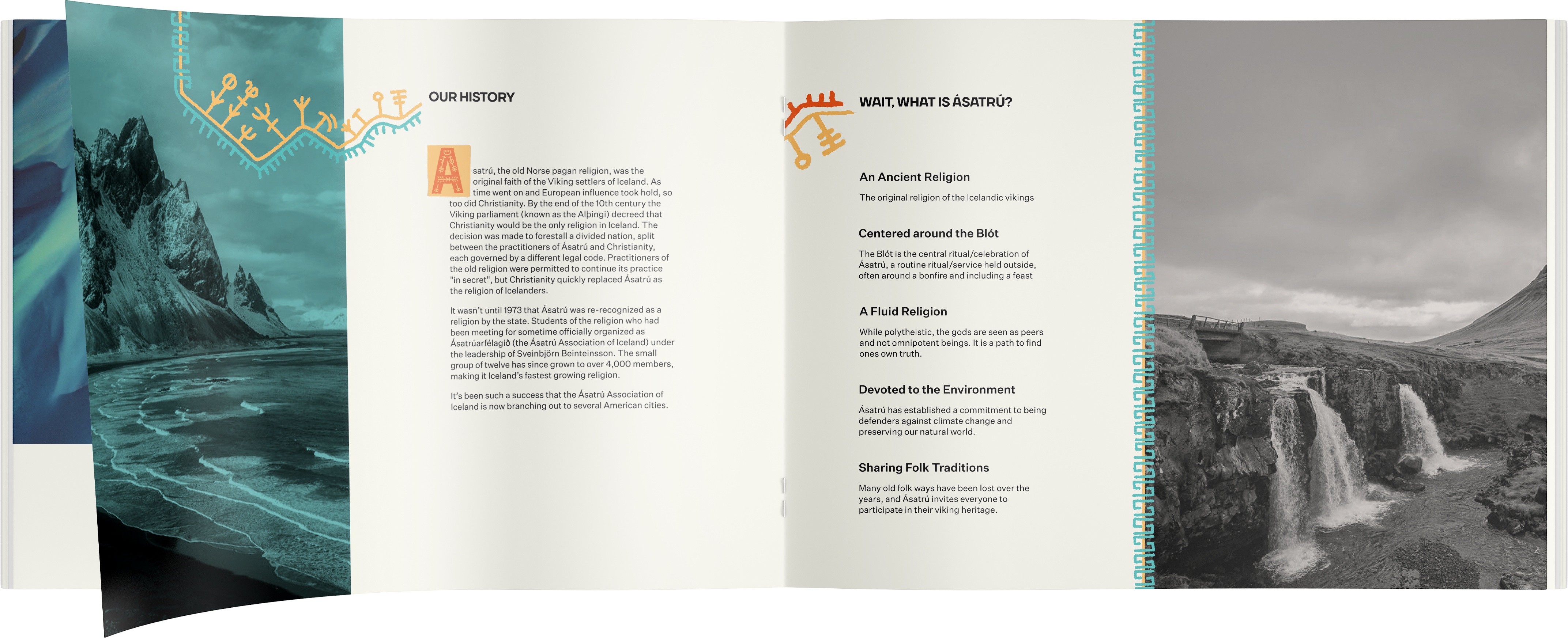
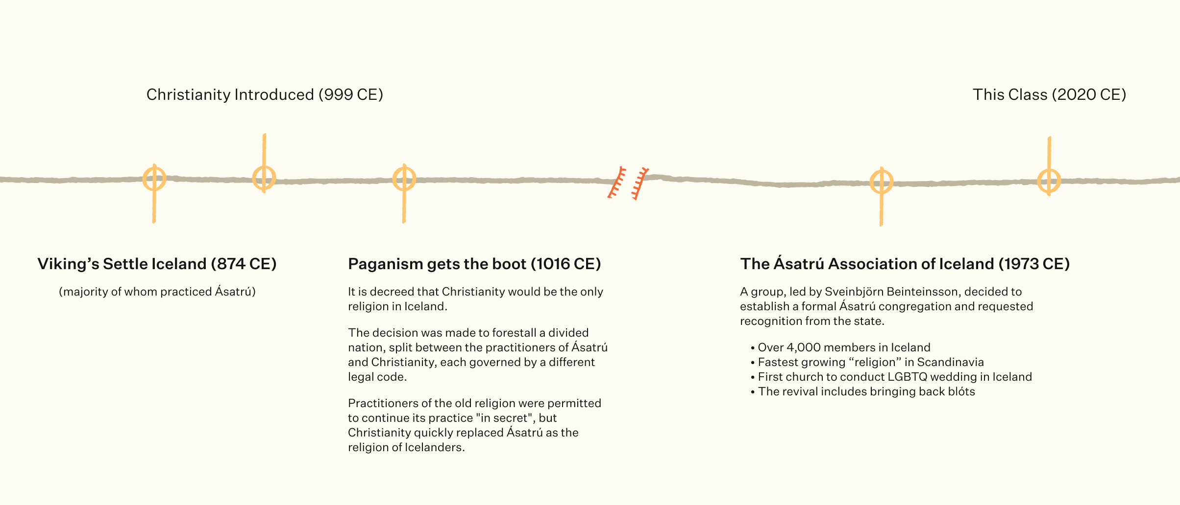
What is Ásatrú?Exactly. Our first step was researching what exactly this is. Diving into some research, we found out about its history and meaning. There is no centralized religion, but rather several groups under the umbrella of Ásatrú.
The Ásatrú Association of Iceland is the most popular and foremost of the Ásatrú organizations. What we also learned is that actually, it is not a religion in the most common sense, it’s very fluid, open, and accepting, and its dogma is taken to be more of a suggestion. The gods are considered more of friends, or peers. They don’t command us or answer our wishes, but they can guide us in the right direction. The central celebration is the Blót; a recurring event that is part feast, bonfire, ceremony, and social gathering. It is used for weddings, funerals, lunar events, graduation–pretty much anything that is worth celebrating.
Contradictory to what we had learned about Nazis associating with Ásatrú, we learned it is extremely progressive and a supporter of LGBTQ+ rights, immigration, multiculturalism, and diversity. They were a pioneer in Icelandic marriage equality, conducting the first ceremonies.
Key to all of this is a committment to environmental stewardship. Because of the consideration of the gods as peers, science is taken with full credibility, and congregants are expected to treat the planet with respect, care, and admiration.
 A short timeline of the history of Ásatrú!
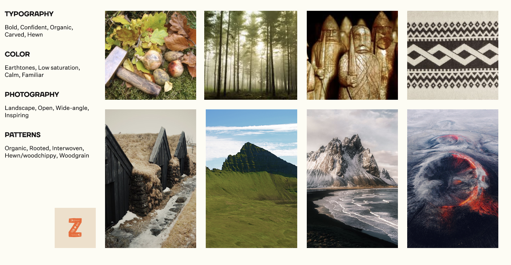 Stewardly
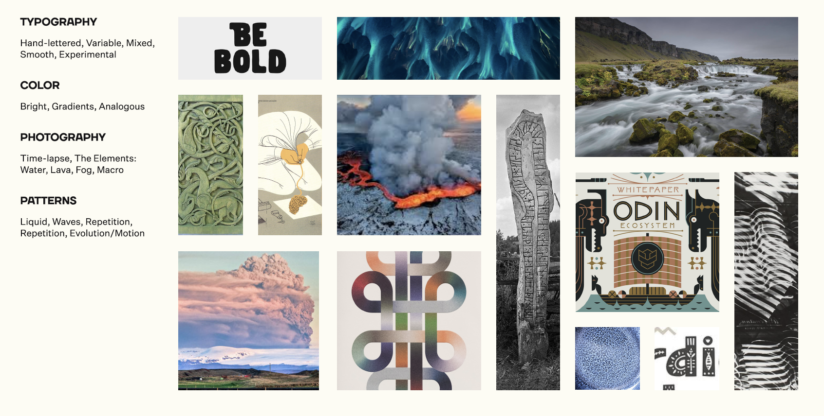
Fluid
Tolerant
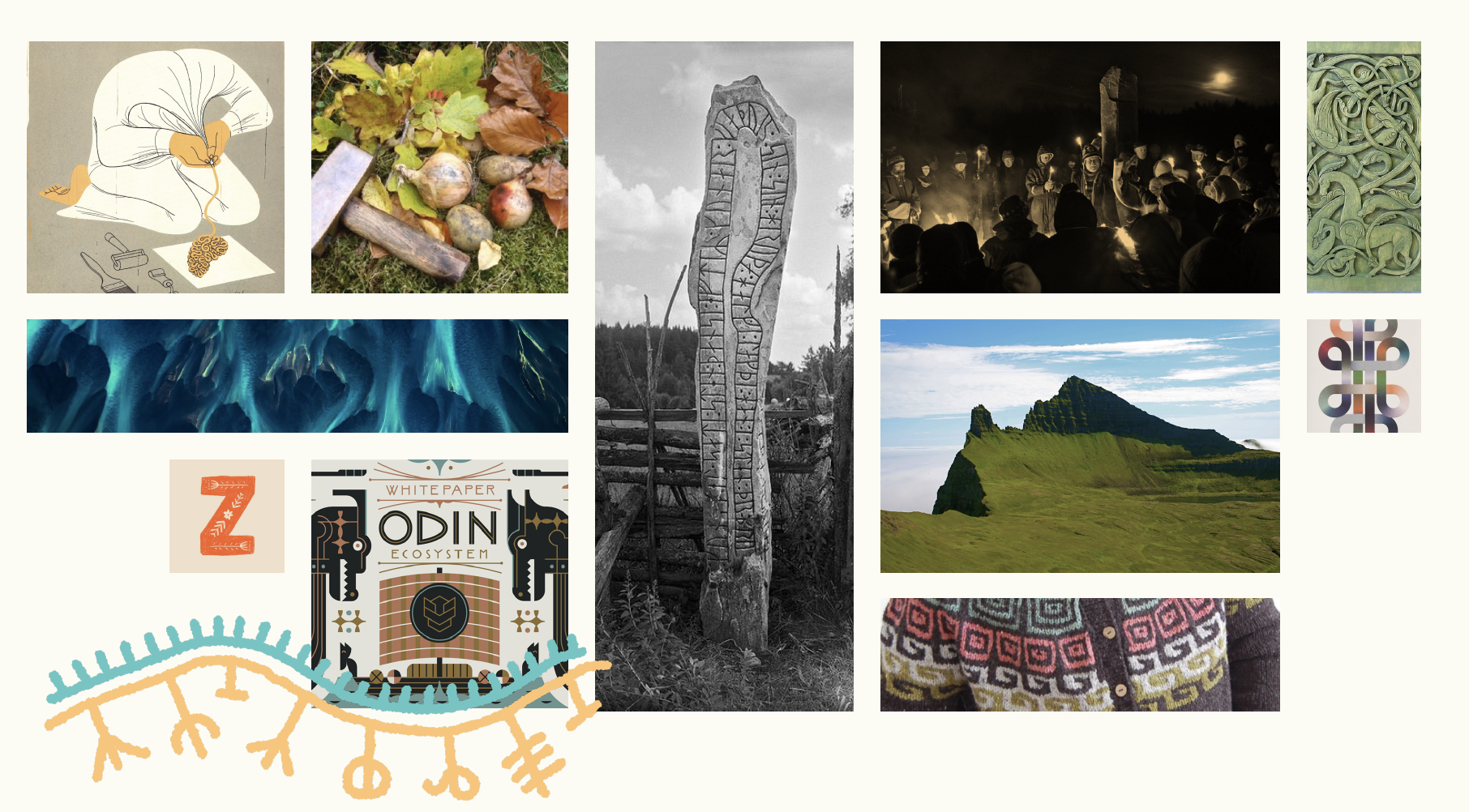 The final concept board.
Process
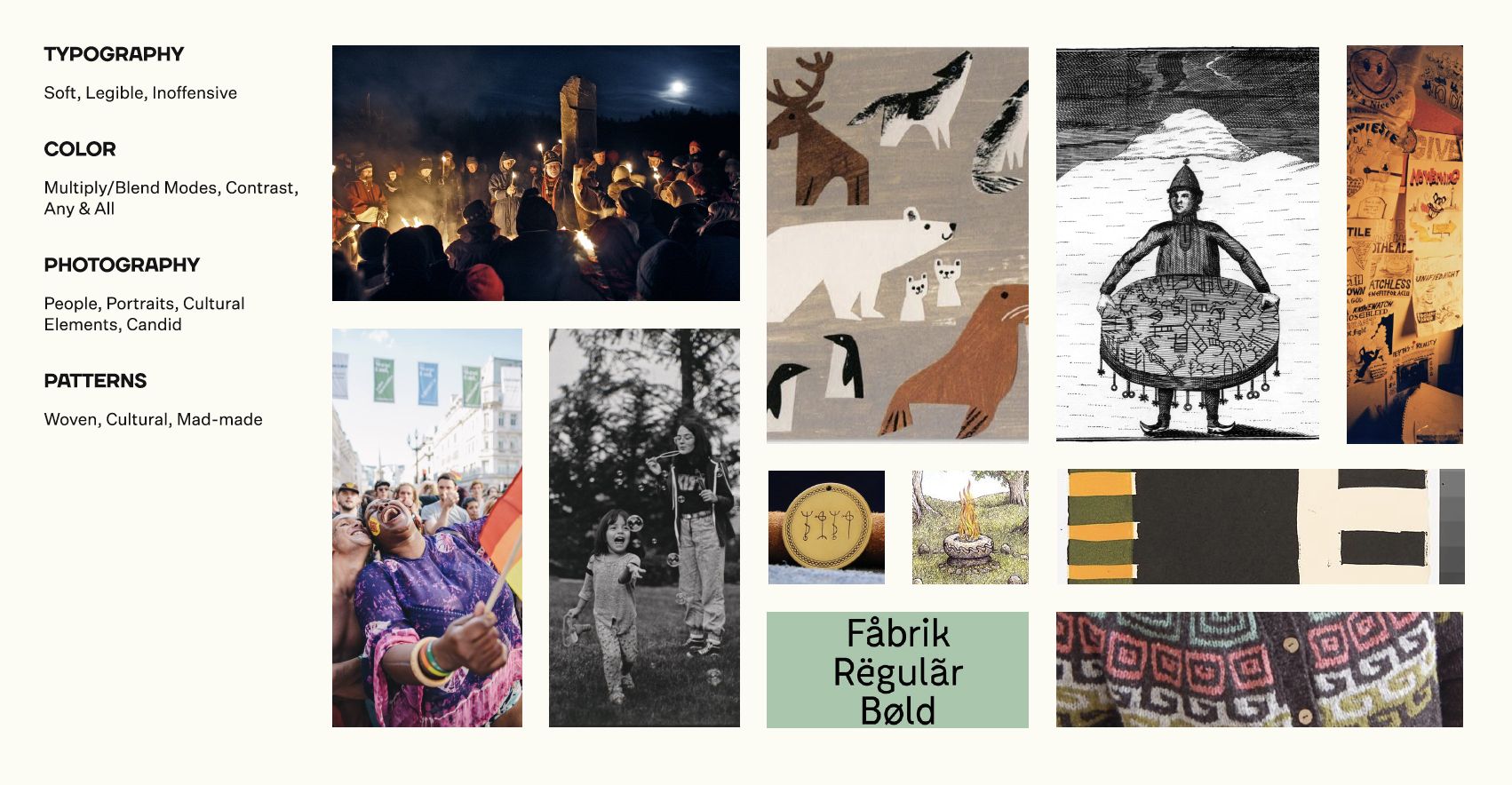
So, from there, we looked at what Ásatrú’s characteristics were, and built tonal boards to reflect it, before coming up with a final concept. We had to emphasize that Ásatrú needs to be approachable and fun. While initially we thought that using elements and characters of Norse folklore would be a good start, we realized that it plays into the common American perception, which is the Thor films in Marvel Cinematic Universe. Which stands against the pacifistic values of Ásatrú. Instead we focused on the natural beauty of Iceland (and the target US markets), traditional Icelandic patterns, and the ancient runes that dot their art and landscape.
We came up with the three values of Stewardly, Fluid, and Tolerant.
The New Old Way–
Ancient Guides for Modern People
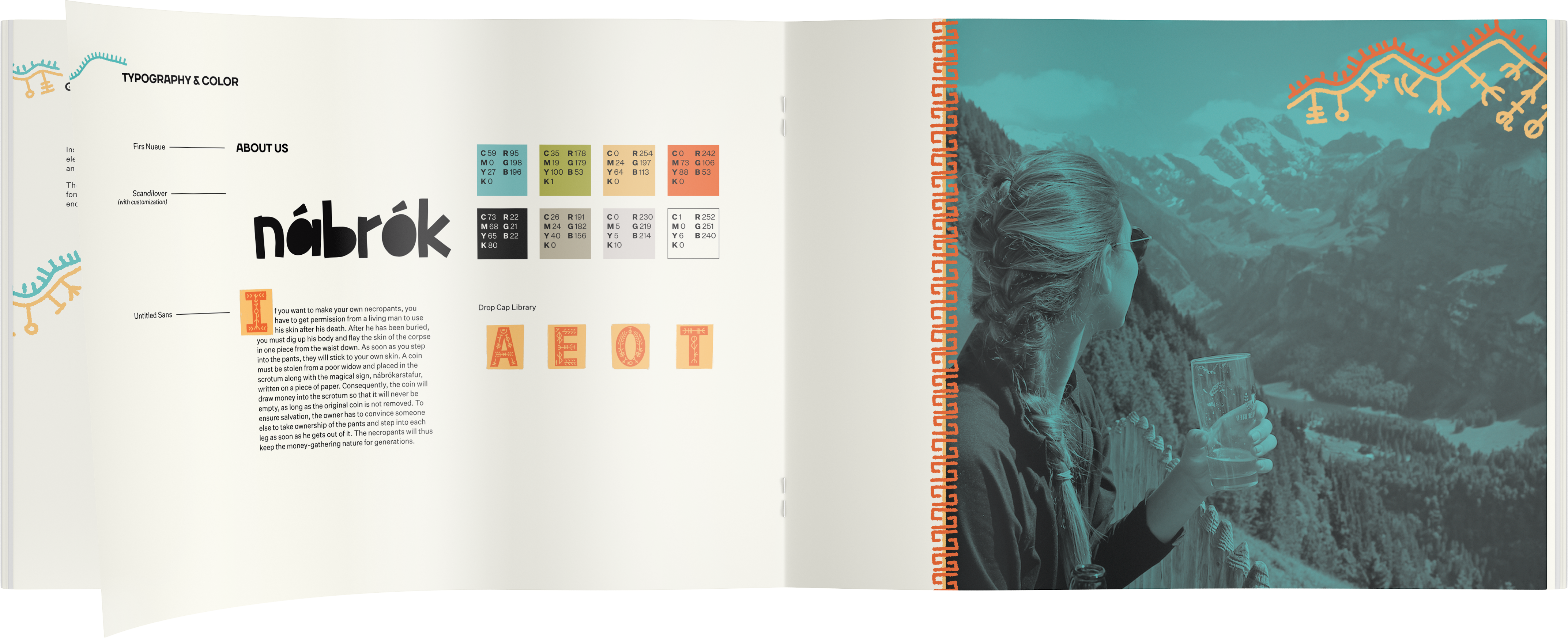
We built a brand around those three values, which visually was distrubuted as about 40% Fluid, 30% Stewardly, and 30% Tolerant (wait, but I thought Ásatrú was 100% tolerant?!–Jk, I jest). From this we created a logo, colors, and typography rules.
Solution
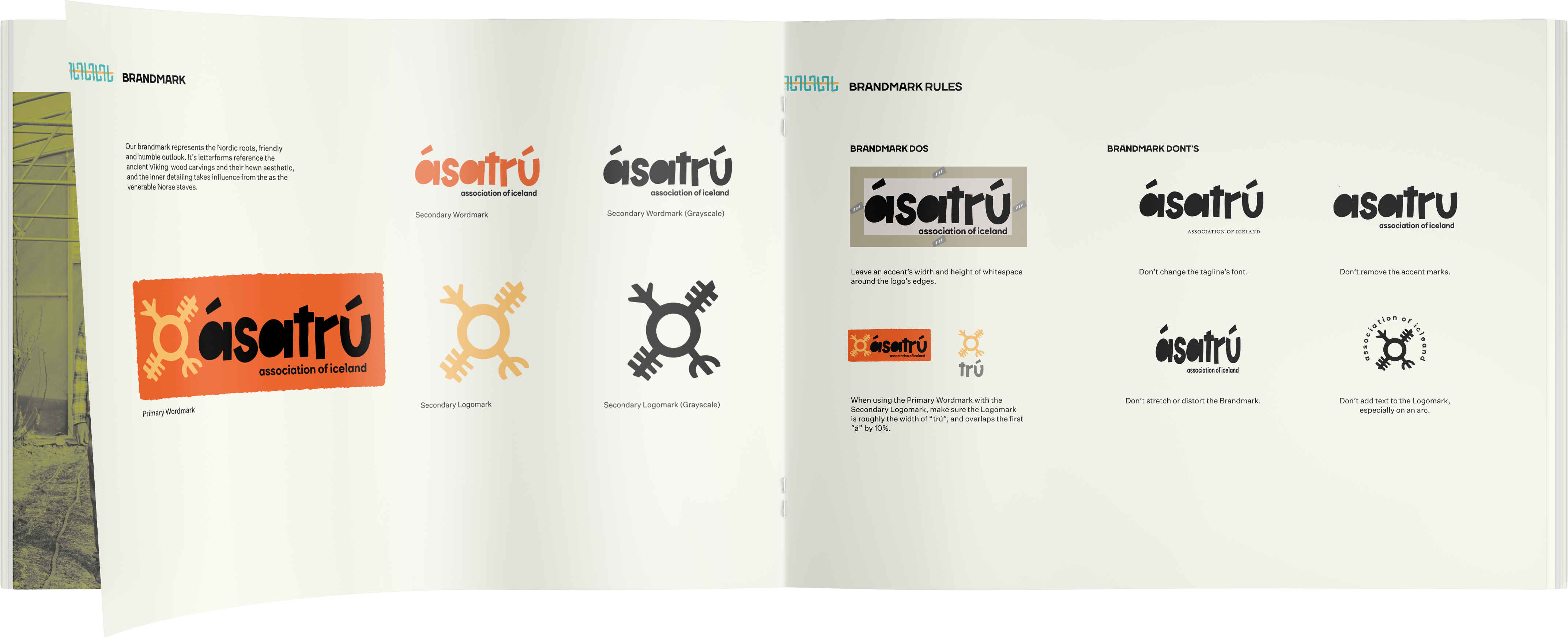
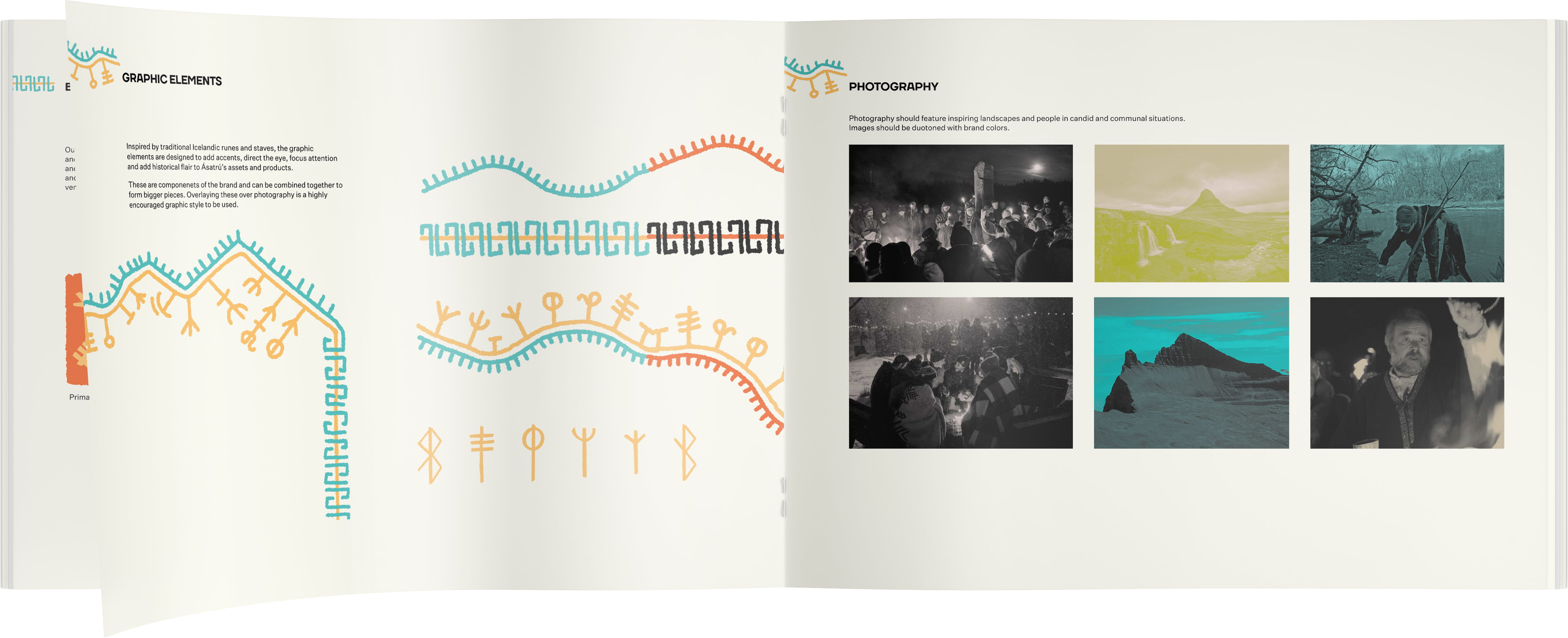
Finding an identity and branding for Ásatrú came down to a combination of embracing the friendliness, openness, inclusivity, and environmentalism that they want to project. Instead of pretending/avoiding that Nazi’s are not co-opting their religion, we brand it as an opposition to hate. It is an outlet to show acceptance and better the world, and we created the tone and imagery to support that.We also didn’t want to leave out the Icelandic heritage. We made sure to include not just the landscapes and natural imagery, but also utilize the traditional runes and staves. We designed our own iteration of these runes based off of some symbols that are modifiers on the runes; the ancient runes themselves adhere to a design system based on how energy is collected, saved, or shared (if this sounds very new-age or alternative medicine, yes it is, but this really is about the suspension of disbelief).
By using them in both a drop cap library and also on wandering paths that can be added to text blocks or overlaid onto photography. The concept is rather than rely on illustrations of lore and existing stories, we have made a system for the congregants to create their own narrative.
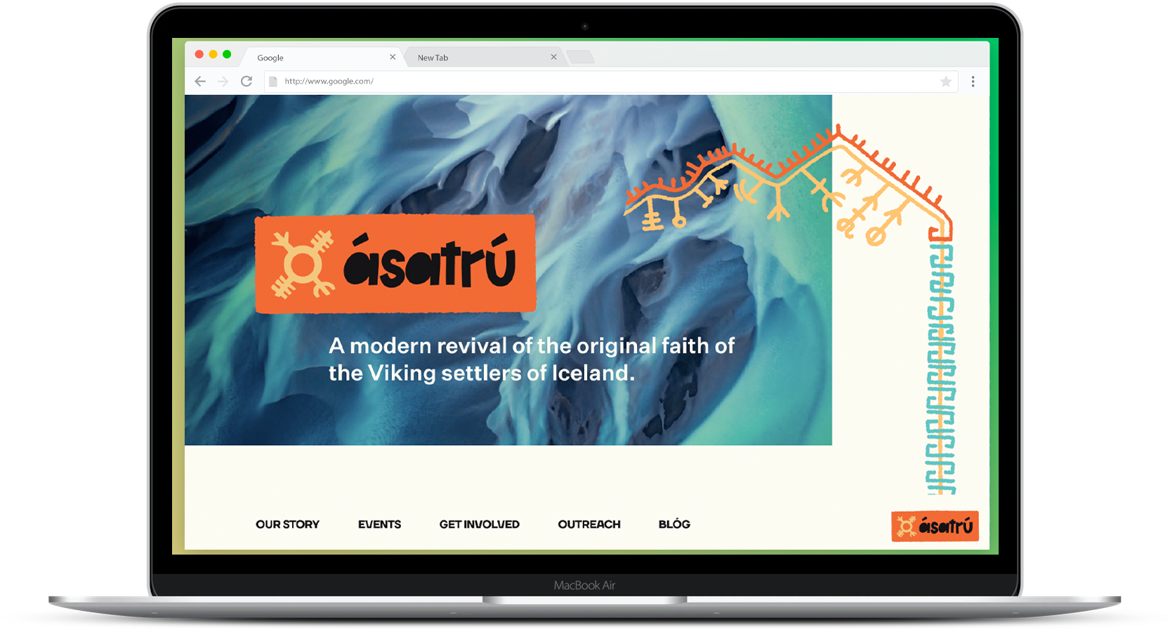 Screen capture of the landing page
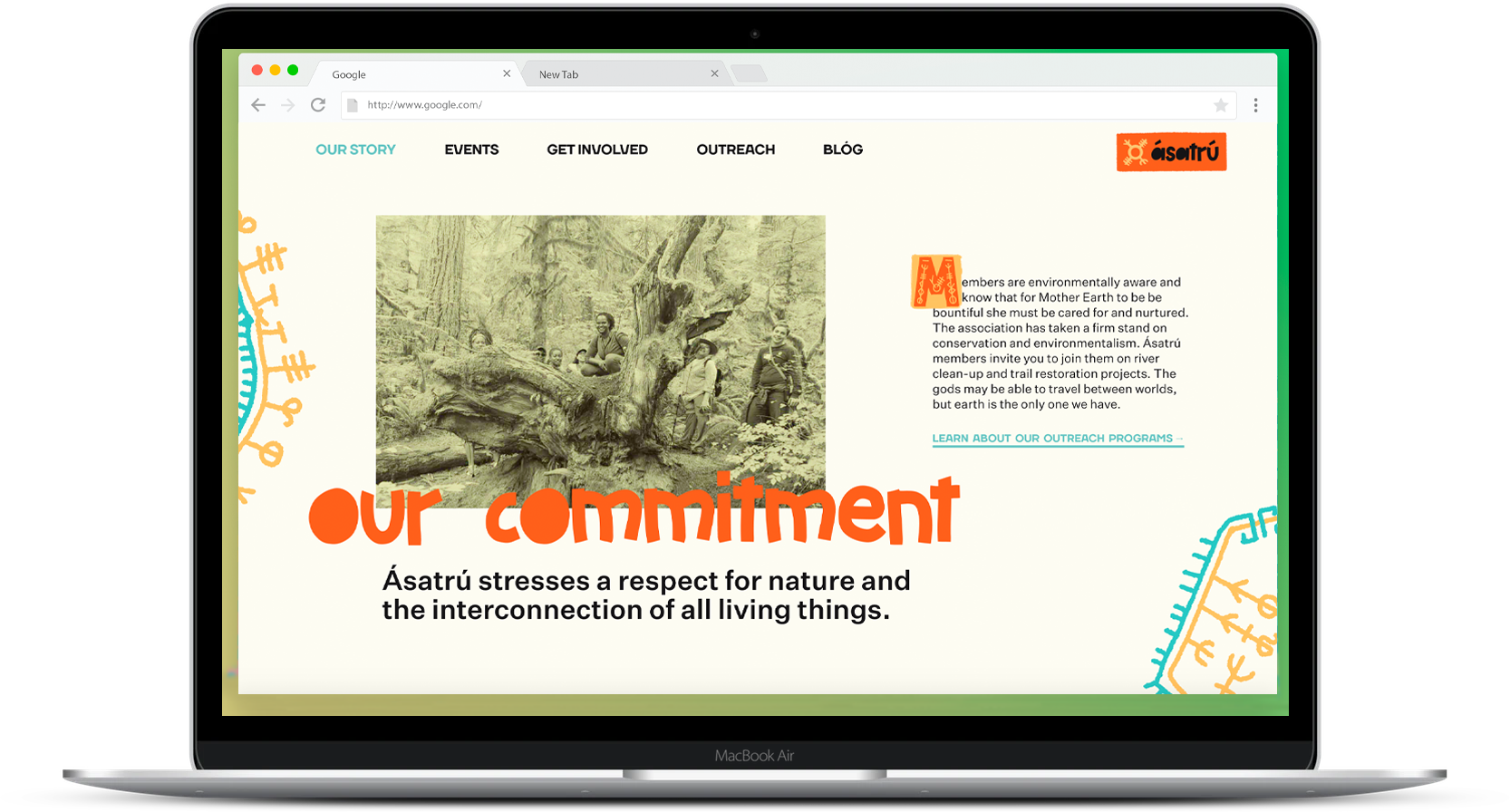 And scrolled further down
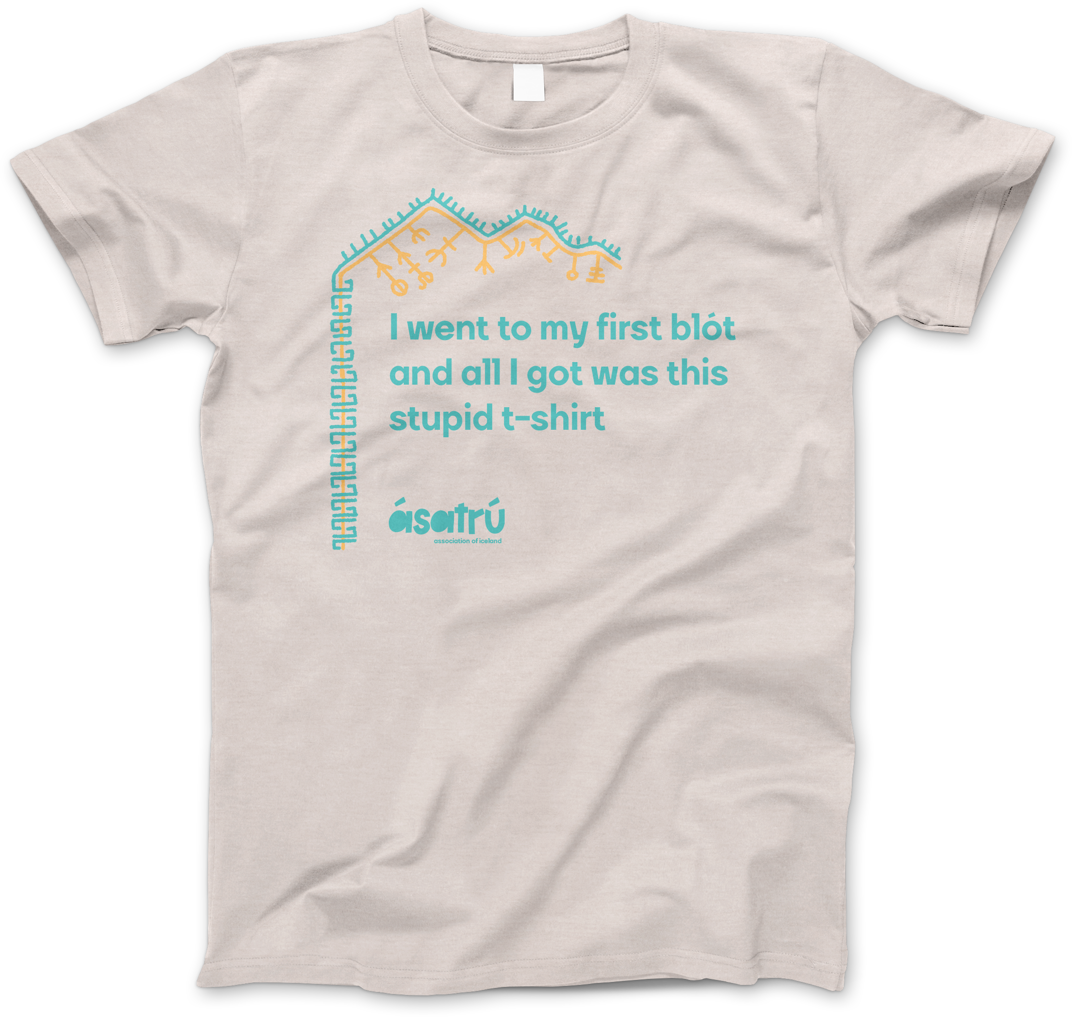
We also built up assets for how one might encounter Ásatrú in the real world. Due to their commitment to the environment and natural preservation, we imagined that they would be participants in Adopt-a-Trail programs and also participate in river/beach/preserve clean-ups. Having brochures at trailheads and along posts would be a way to engage folks who otherwise might not see them. Additionally, something as simple as a t-shirt showing off their Ásatrú experience (I almost used pride, but that is a loaded word in this context!) could invoke curiosity and conversation from folks they might meet in a bar or other social gathering.
![]()
Brochure one might see in real life.

Brochure one might see in real life.

Reflections
This was an interesting project. Having to design for a religion is already a little bit risky, as it can either be boring or if it gets too expressive, then it runs the risk of offending someone. Designing for a somewhat controversial religion is even riskier. But why did we take the challenge? Because this will happen in our careers when we are unsure of the organization and its perception. Sometimes it might be a harmful group, and declining might be the best option. In this case it is a harmless group that is actually trying to do good in the world. So yes, we took the risk. This was also the first project I have done in isolation, and a key to the success of this project was using Figma to collaborate in real time with Martin. It was no replacement for being face to face, but it held us both accountable to each other and really helped our creative process.
A big problem we had trying to find a metric for the success of this is we couldn’t actively engage with people in the real world. It would have been great to find a way to hold a blót out in a park and see how passers by would interact, show interest, or participate. Additionally, we would have loved to actually interview some of the existing Icelandic congregants and find out what it means to them, and why they joined. Perhaps in a world a little less isolated and with a longer time frame we could have achieved those goals.