Illustration/Advertising/Typography
Timeframe: November 2019
Team Member: Christine Chang (Co-Researcher and Designer, Photographer)
Roles:
Skills:
EXO Cricket Protein Bars
Timeframe: November 2019
Team Member: Christine Chang (Co-Researcher and Designer, Photographer)
Roles:
- Designer
- Illustrator
- Researcher
- Model
Skills:
- Design
- Adobe Illustrator
- Adobe Photoshop
- Typography
- Illustration
- Customer Research
Problem
With the world’s resources and land becoming increasingly scarce, how can people be convinced to switch from traditional Western forms of animal protein consumption (beef, chicken, pork, etc) to a more sustainable and environmentally conscious source of protein? Specifically insect based protein (in the form of crickets) which takes up much less space, energy, and water.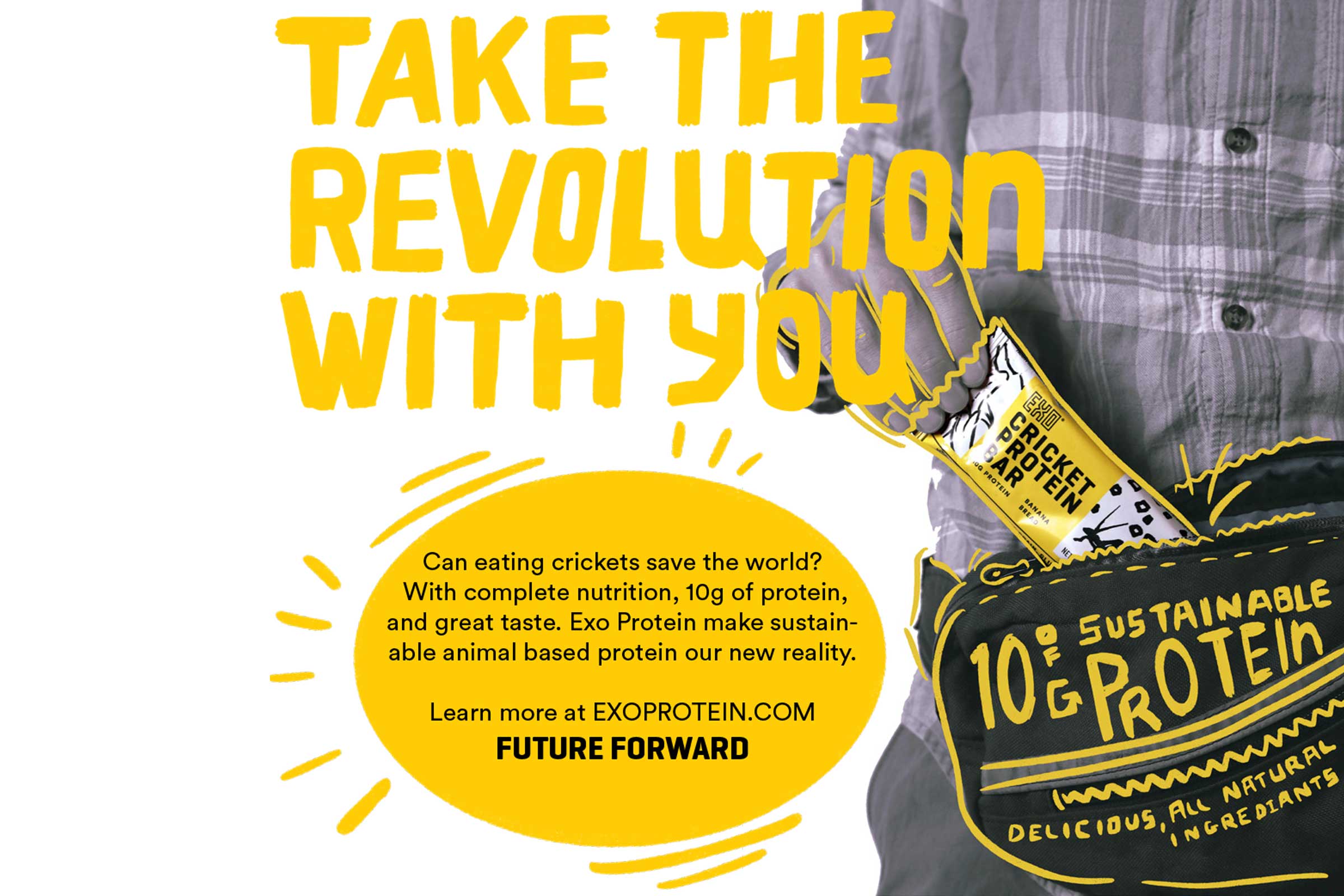
Web add for Facebook/Amazon use
Background
Exo Cricket creates and sells protein bars and cricket powder using much fewer resources than “normal” protein does. EXO currently markets their products to a younger audience (20’s and younger) , and specifically that of bodybuilders and athletes. Targeting an audience of Gen-X consumers (~40-54 years old), a campaign to convince them that eating bugs isn’t gross, but is in fact easy, fast, and approachable.Project Goal
Design and approachable and relatable campaign to be printed on 3 single page (8.5”x11”) ads, 4 banner ads for web use (mobile and desktop), and 10’x30’ outdoor billboard.
Big 30’x10’ Billboard. Not too buggy.
Process
It started by researching EXO and what their products were, and what their current ads were like, along with a comparison to their competitors (both in conventional protein bars, and bug-based protein alternatives). Their current campaign is pretty basic, lots of social media with food “porn shots” that are close ups of the product, and attractive fitness models holding the packaged bar. No one is eating the product (we tried it...it’s not bad! I was pleasantly surprised) and it is definitely marketed in an “influencer” style. There are also ads tied in with the movie Snowpiercer...which if you haven't seen that movie, SPOILER ALERT: this is not a good way to sell the product. Sorry.We surveyed some folks on their current perceptions and knowledge of the product, and then offered samples. Almost universally, everyone had heard of cricket protein, but could not name a single brand. After sampling (only one person refused, they were vegetarian–so am I, but I was way too curious not to try it!) The feedback was very positive, aside from some complaints about greasiness, and surprisingly, several folks were disappointed by the lack of visible cricket. The biggest barriers to purchasing it was lack of visibility, availability, and high price point.
We looked at what the lifestyle of a typical Gen-X'er is, which now is in general: Mid-career, raising children, busy/time constraints/ environmentally conscious, but also a frequent purchaser of consumer goods. We also looked at where they currently shop, what brands they trust, and where they spend their time on the internet (Hello Facebook and Amazon).
In general, fitness is on their minds, but is not a lifestyle. The demand for energy to power them through their busy/hectic day is a higher concern than a product to increase strength and bulk up.
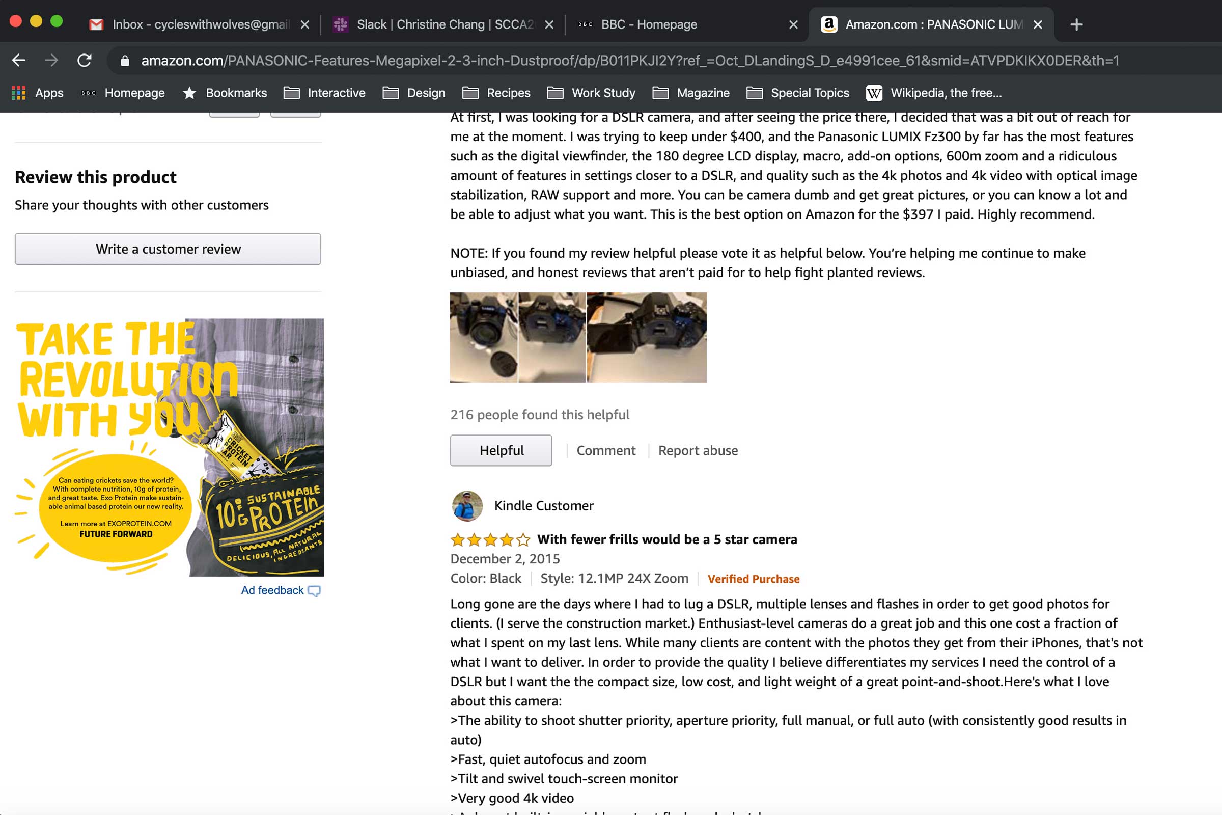
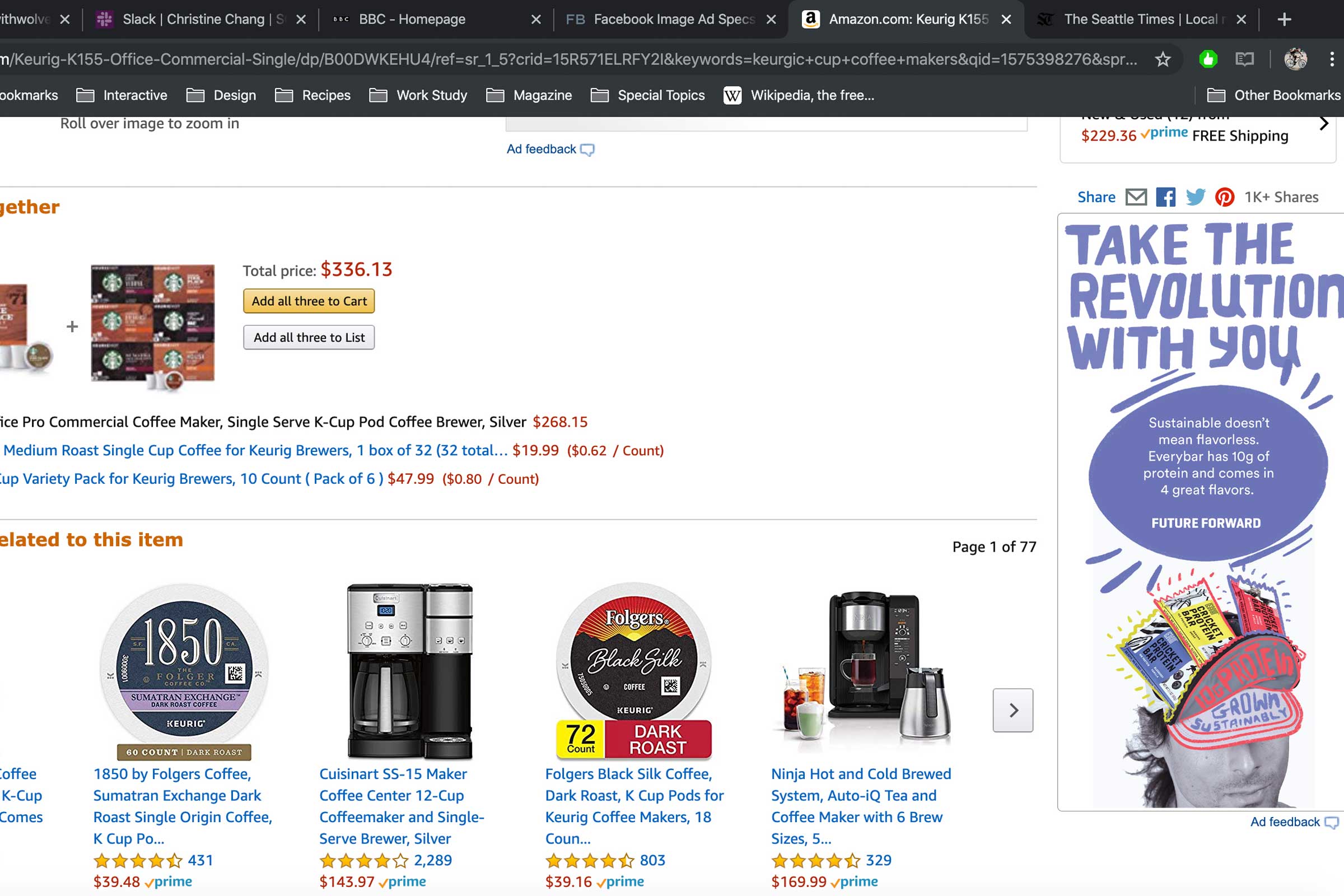
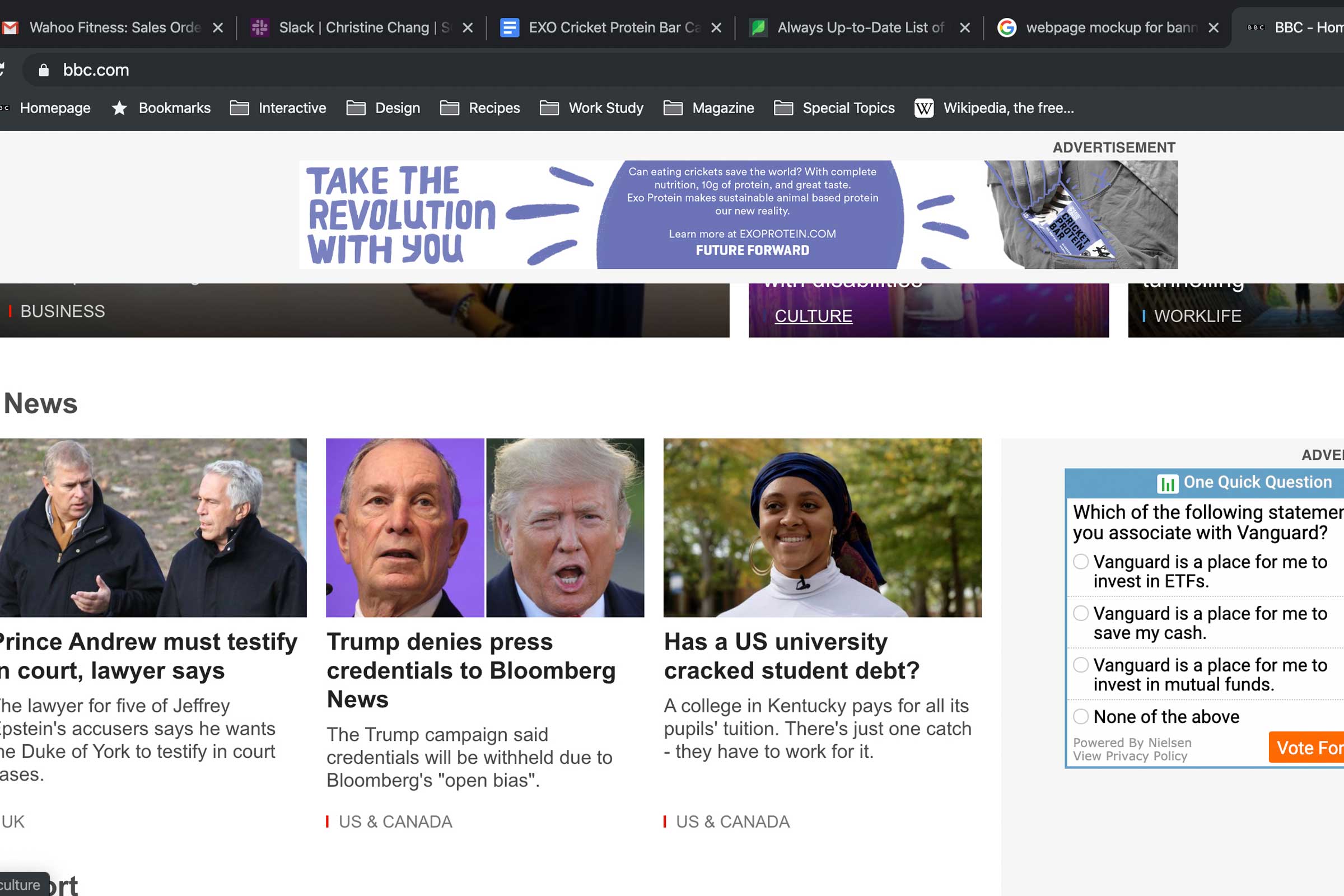
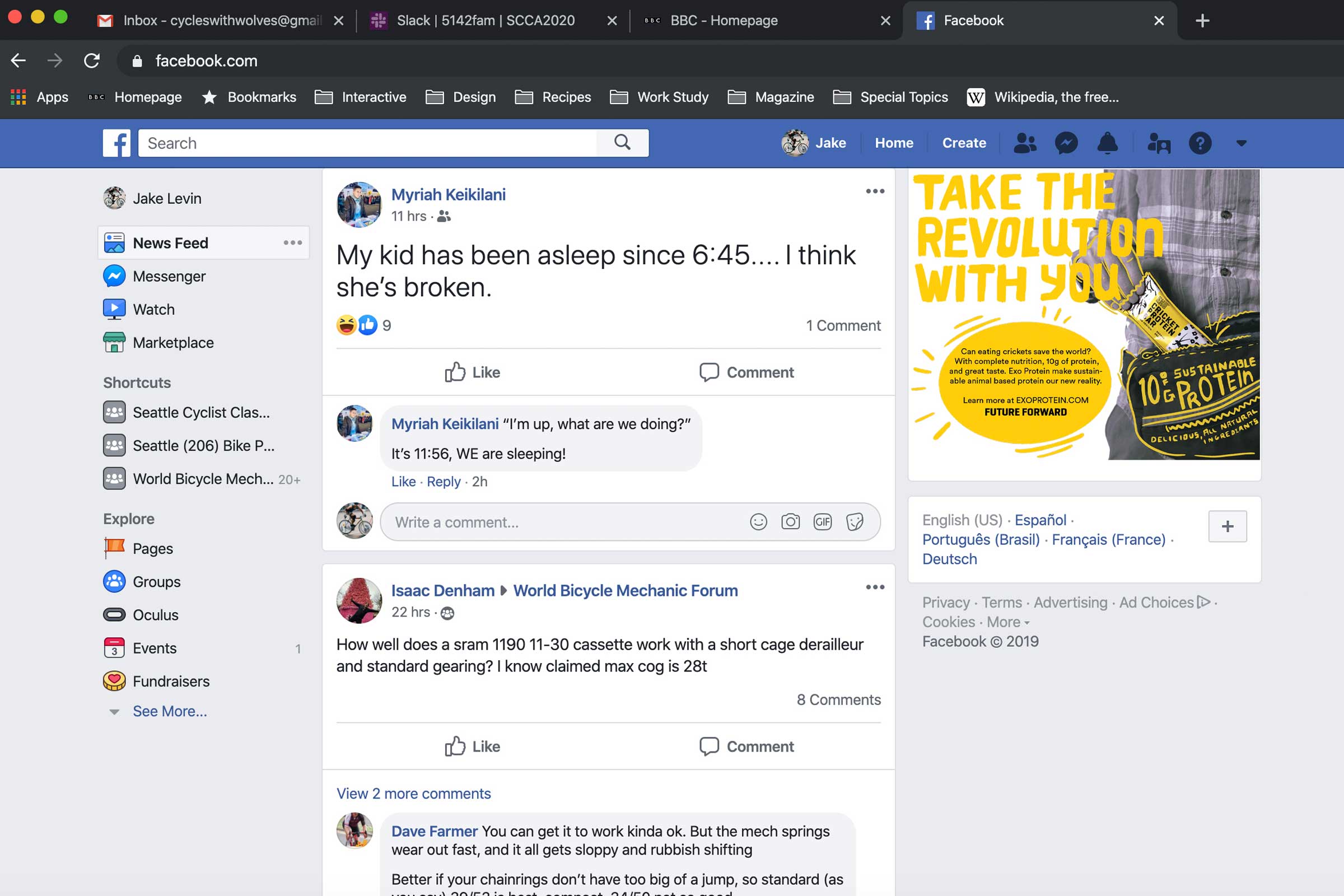
Web usage (Desktop)
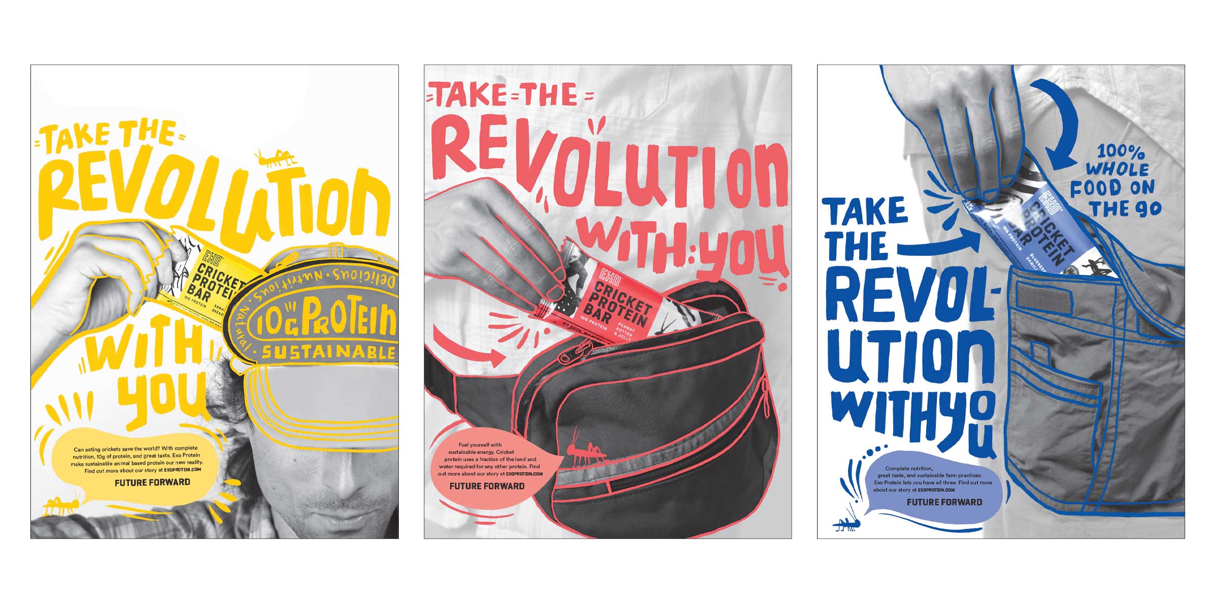
8.5”x11” Print ads (built by Christine Chang)
Solution
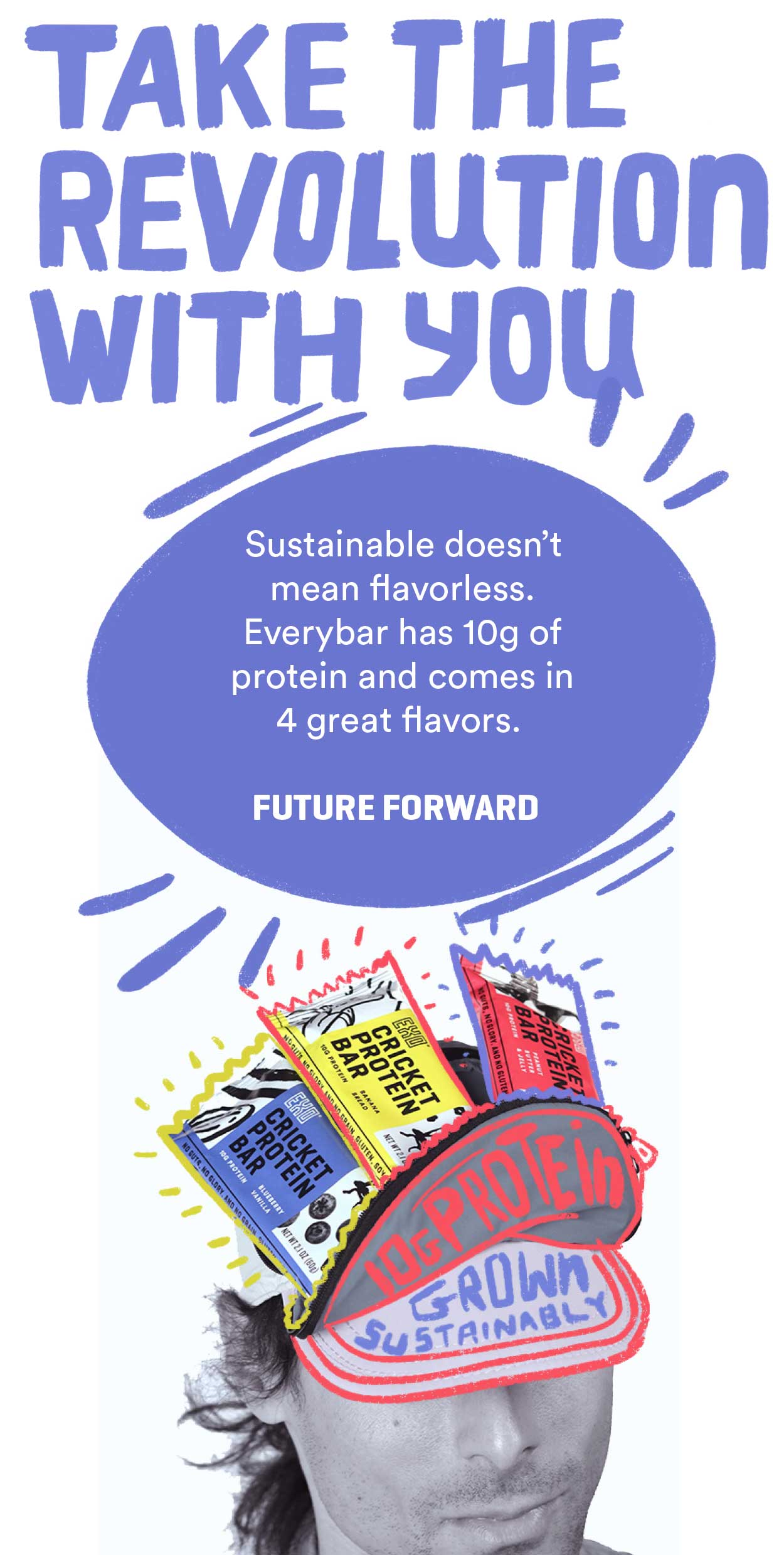
After looking through several concepts, we started getting some potential looking at Gen-X not as some stressed out boring adults, but as some folks who were cool, and hip, and fought the man, man. This was the grunge generation, and now they are raising the next generation of hellraisers. So we wanted it to be revolutionary. But like...how? And then we had that “Aha” moment when we overheard someone say “Oh, I always carry a Clif Bar in my purse in case me or one of the kids needs some energy”So we came up with: Take the Revolution with you.
Gen-X is also the generation of cargo pants, fanny packs, and some questionable headwear, and we used that as the catalyst for our design.
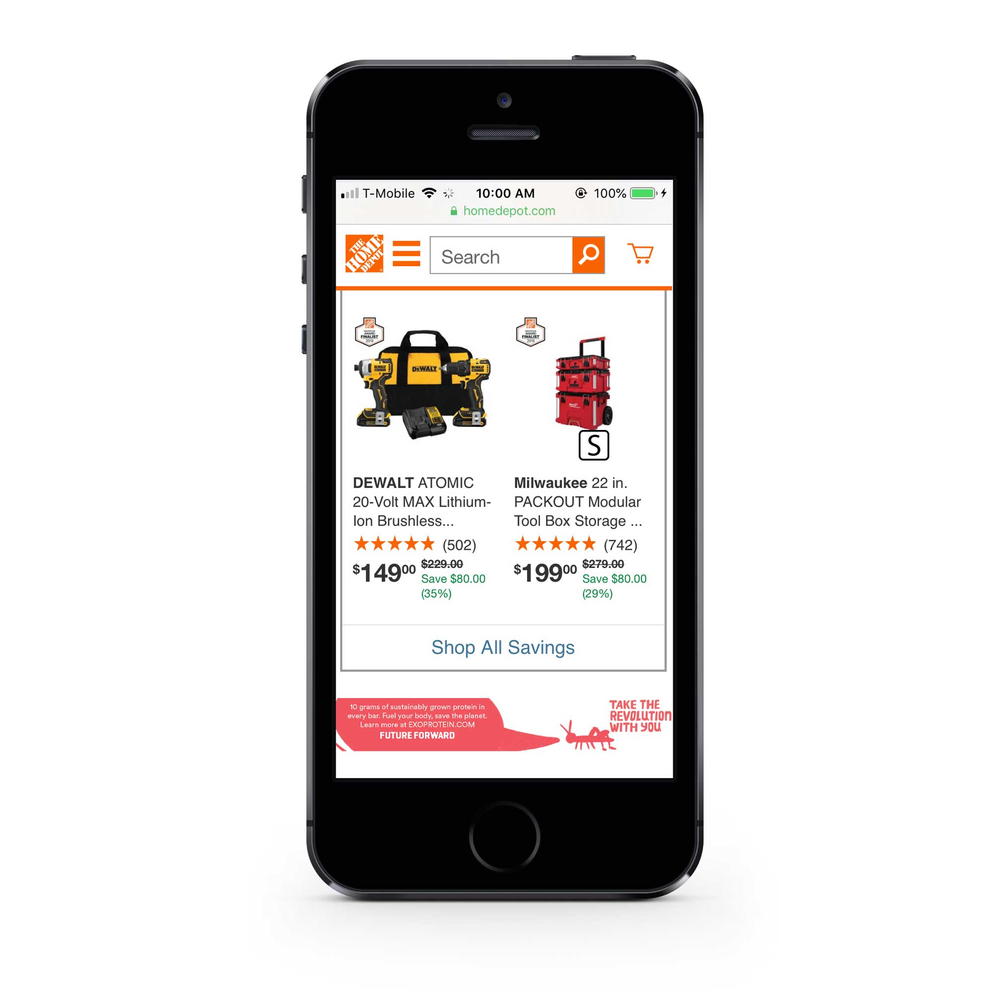
Web ad (Mobile banner)
Conclusion
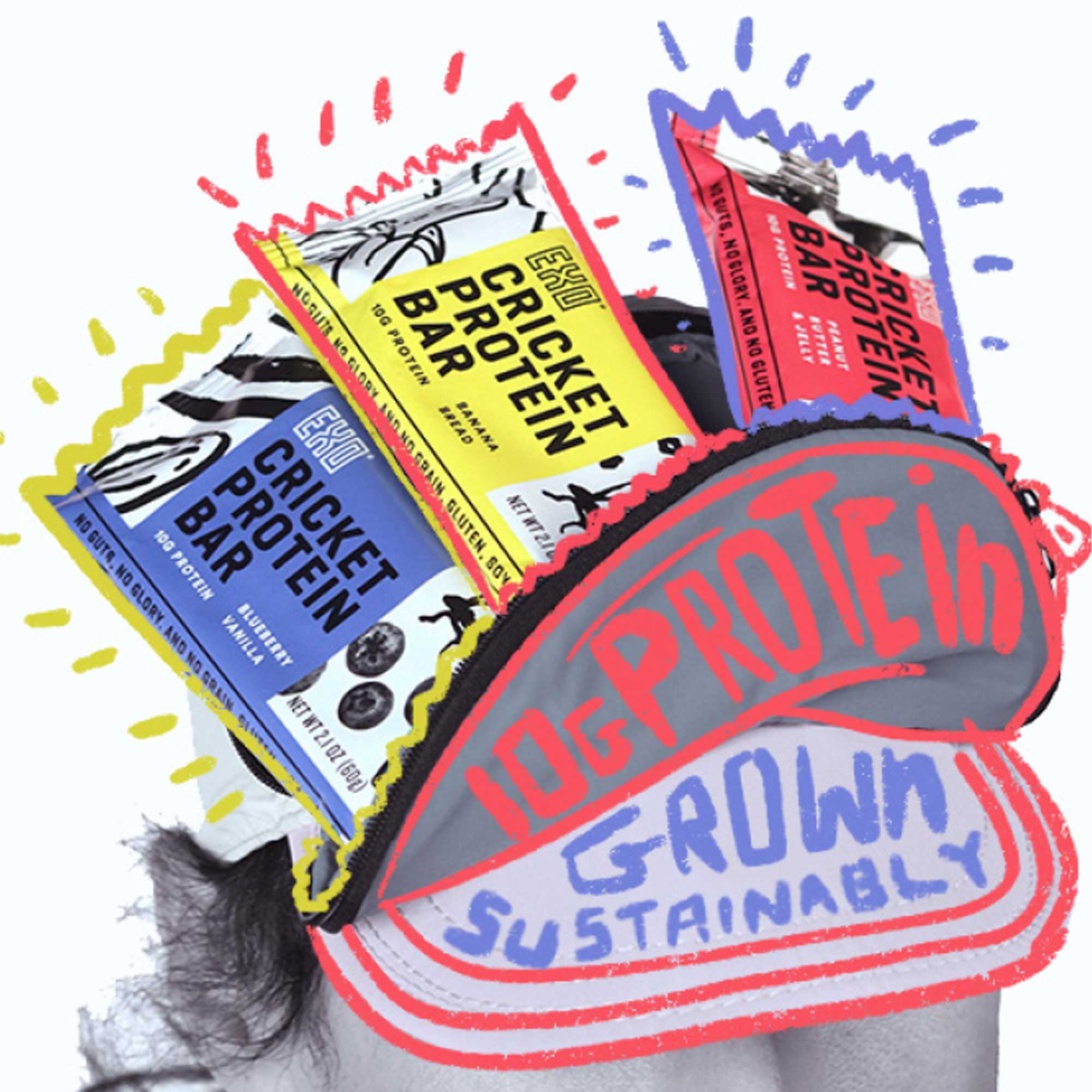
With the biggest obstacle being Christine and I having fairly different graphic styles (She is very clean, precise, and often minimal) I think our outcome was very successful. We both love illustration overlays over photography and wanted to add a fun and relatable element to the “revolution” idea. We sketched out our type and image ideas over some thumbnails and then Christine took some photographs of me with EXO bars in the pockets of the cargo shorts, fanny pack, and cap-sac that I was wearing.
Christine finalized the typography style and selected the brush to be used for it, while I designed the cricket element. We then split the work on deliverables with Christine building the print ads, while I made the digital ads and billboard. I’m proud of how well we were able to have made a style that was able to be used by both of us indistinguishably.
