T-Mobile’s 2023 Post-Holiday
Reset
Un-Holidazzling T-Mobile’s stores
Timeframe: September-December 2022
Collaborated with: Ryan Harvey (Design Director), Nicolae White (Copywriter)
Roles:
- Graphic Designer
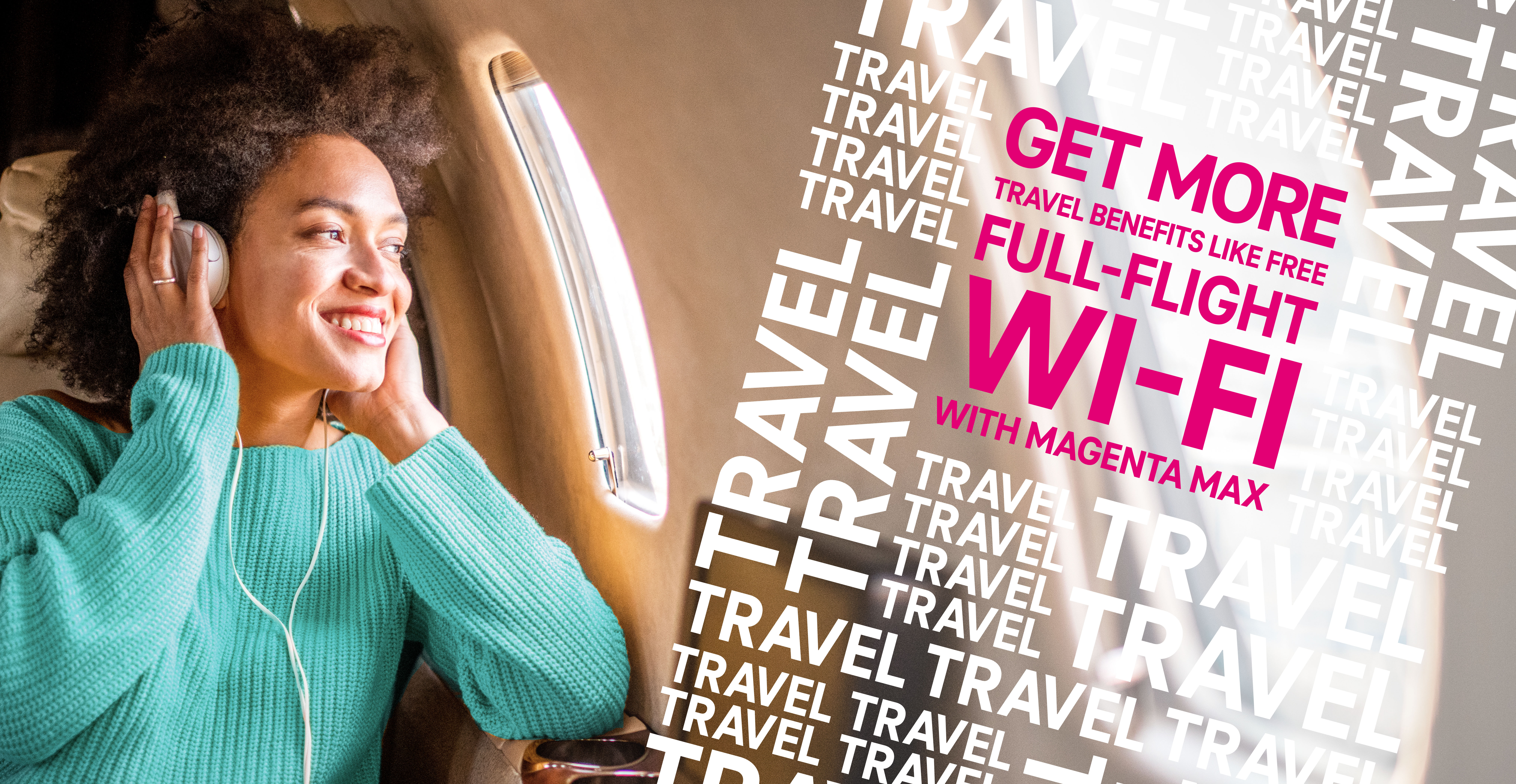
Objective
Following T-Mobile’s annual holiday treatment to their stores, they asked for a fresher take on what would normally be seen as a “default” state for their stores. The client had asked for an approach that prioritized value and benefits messaging, and adhering to the T-Mobile brand’s visual guidelines (utilizing the square shape in the logo, magenta, and a focus on the perspective being that of the customer—capturing the scene as if it was from their eyes/phone).

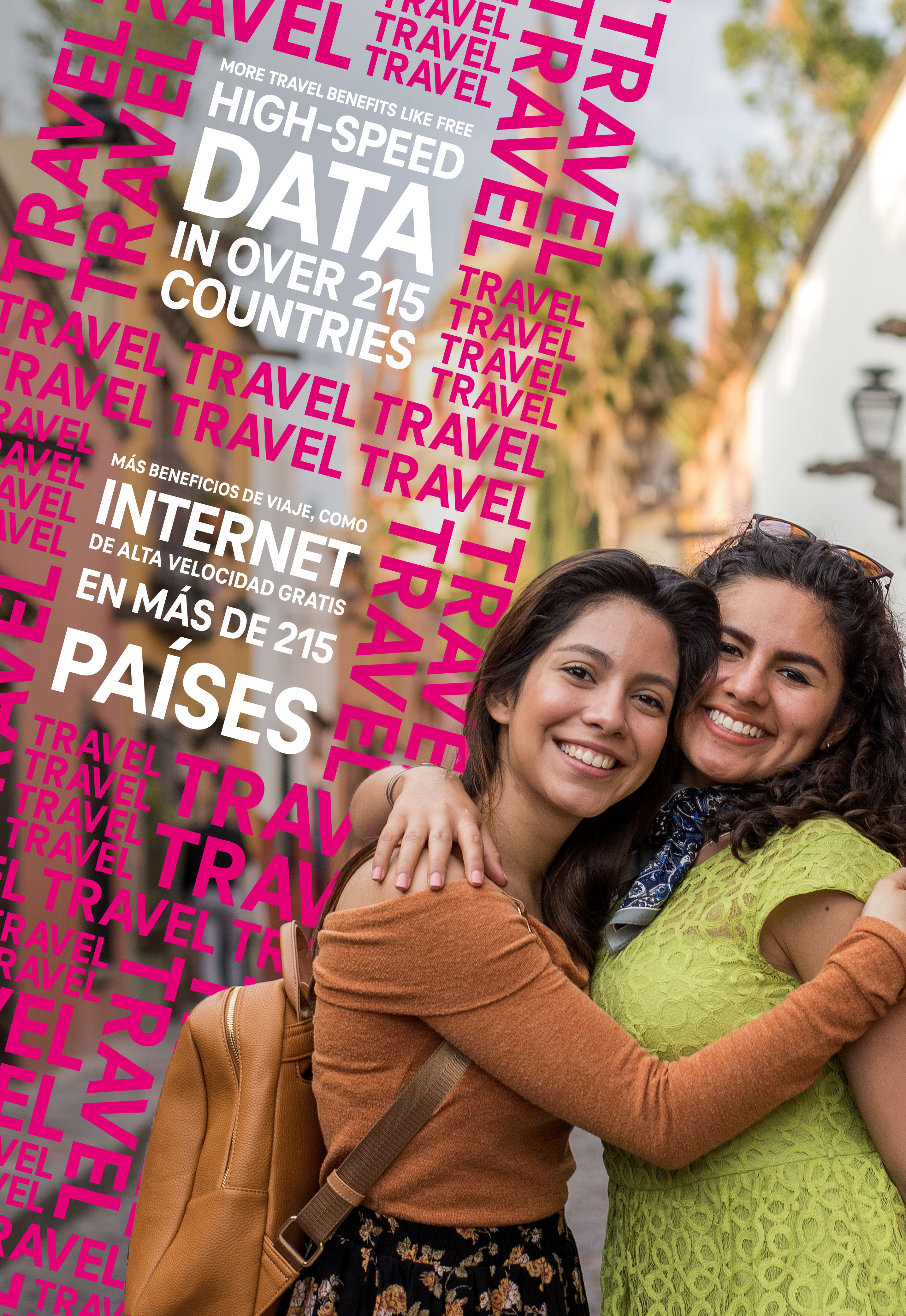
Process
Prioritizing T-Mobile’s needs and how to adhere to their brand vision, I knew I had a limited color palette of white, black, and magenta (100% M of course) and needed to incorporate photography that focused on family and travel. Type repetition had been used frequently over the past campaigns, and I wanted to develop something more visually compelling.
Using the main benefit as a textural pattern, I used it to frame the headline, while still keeping the frame clear for the talent to engage with the audience.
All in all, about 10 patterns in white, magenta, and a magenta outline were developed to frame 8 different value headlines.
The headlines and patterns were all tilted 15º to the right, which came up as the best balance between visual interest, tension, and legibility.
Fun fact: I had to build most of the patterns in every/any color besides magenta, because I couldn’t tell if I would go blind or crazy first, due to an overwhelming surplus of magenta.

All patterns, headlines, and rules on placement and scaling were collated into a visual design guide provided to the production team who were absolute heroes, and created over 400 (!!!) different deliverables across over 6700 stores.
 Winning concept for the pitch to client
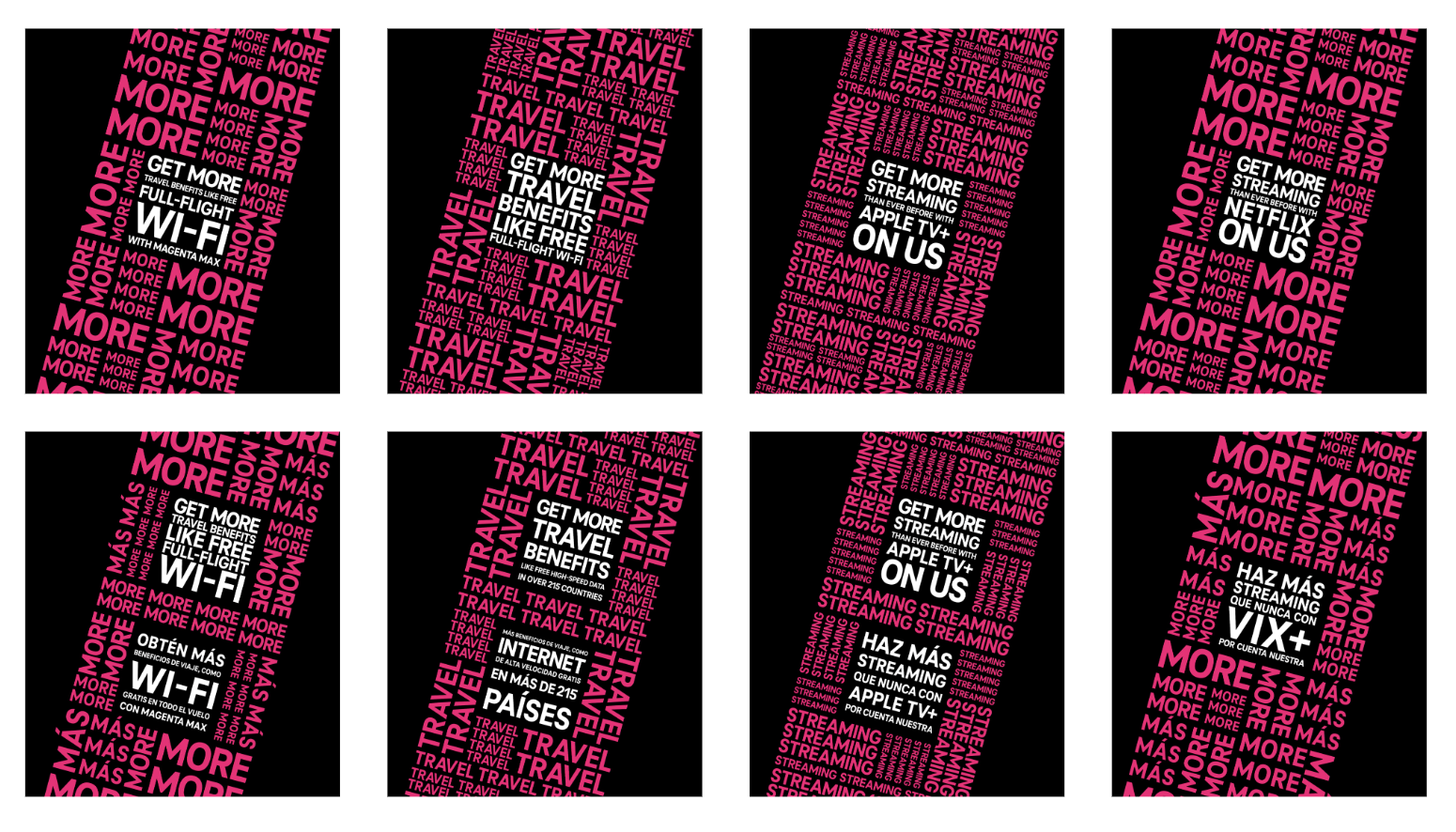
8 patterns in the visual design guide
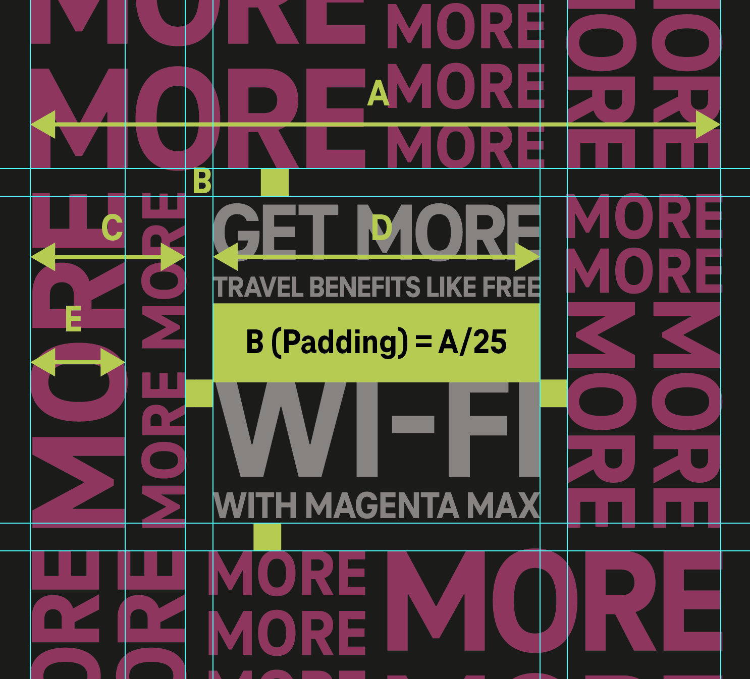 Excerpt from visual guidelines
An obstacle that had not presented itself to us immediately (our agency had just been awarded the fleet stores and this was a new territory for all) was that 200+ of the 6700ish stores would have all signage and graphics in both english and spanish. Learning that for most of the deliverables it would need to be a bilingual approach, I had to find a way to keep the same visual approach, but allowing for both languages to be displayed as equal as possible.
We referred to this internally as “the colon” which was to create another hole on the pattern to stack the headlines, hence a “:” shape.
Additional challenges were adapting non-mural sized, wayfinding, and less photo reliant signage to a complimentary visual style. This was done by applying that 15º angle to other elements, and finding more opportunities to use a texture and repeating pattern.

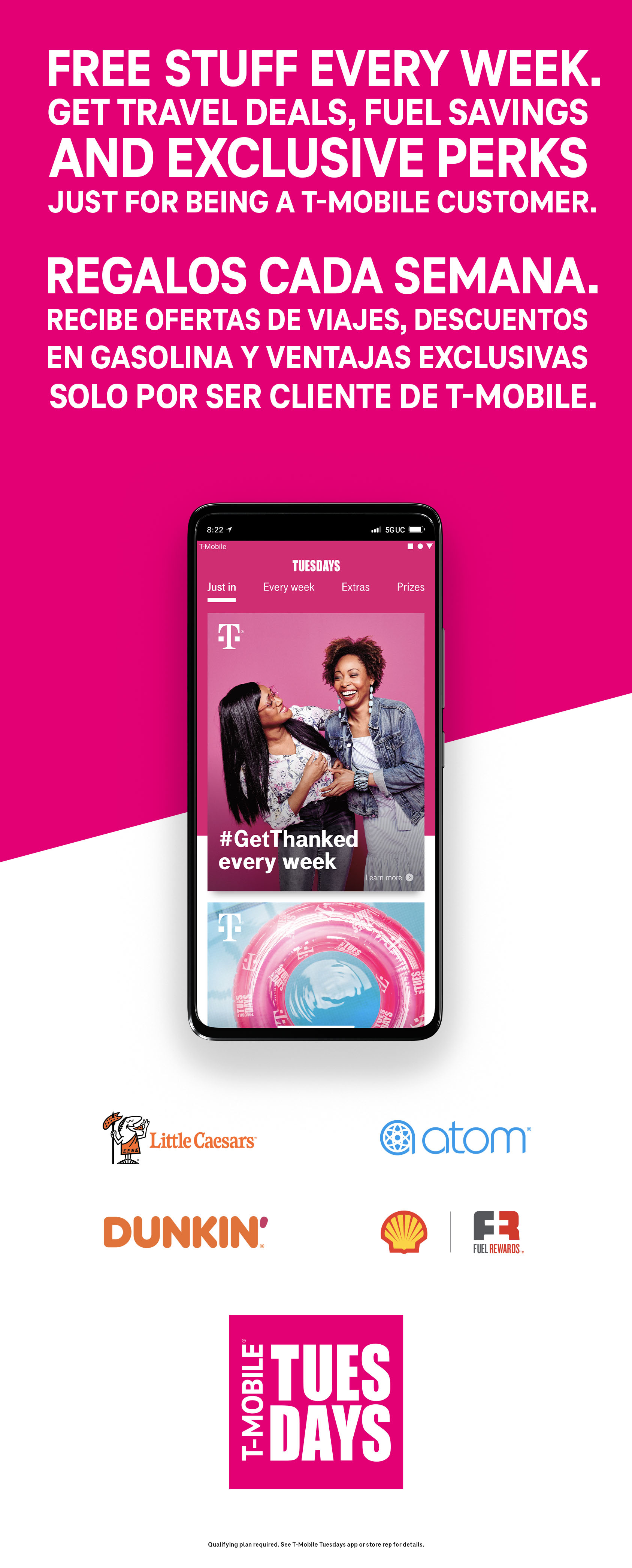
 English only layout
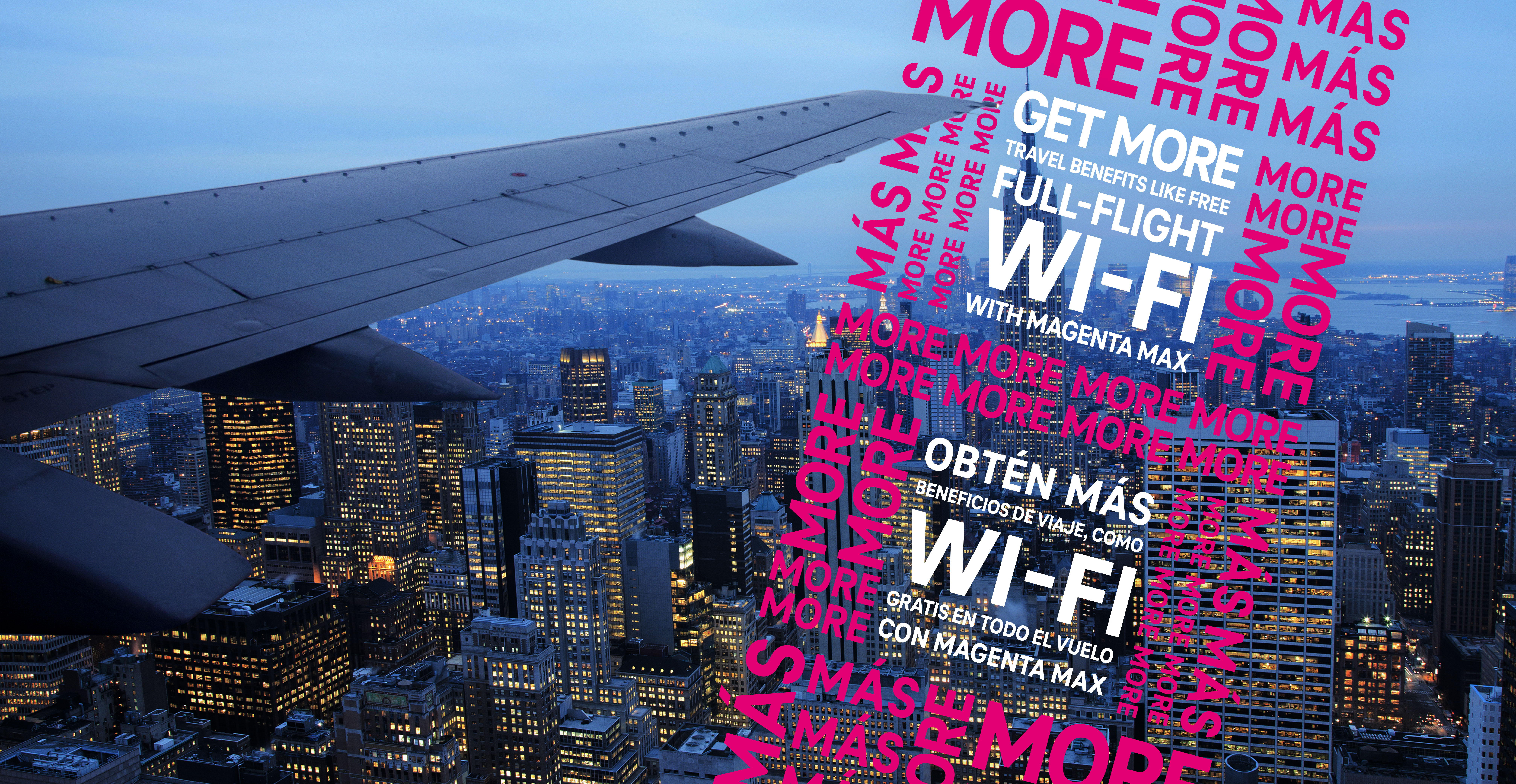 Bilingual layout


