Branding
Timeframe: January-March 2020
Collaborated with: Kayli Putaportiwon, Martin Lindberg, and Adam Smith (on research, tonal territory, and mission, promise and positioning statements.)
Roles:
Skills:
The Vera Project
Rebrand of The Vera ProjectTimeframe: January-March 2020
Collaborated with: Kayli Putaportiwon, Martin Lindberg, and Adam Smith (on research, tonal territory, and mission, promise and positioning statements.)
Roles:
- Branding
- Layout Design
- Graphic Designer
Skills:
- Adobe Illustrator
- Adobe Photoshop
- Adobe InDesign
- Procreate
- Research
- Typography
Background
The Vera Project is a non-profit organizationproviding youth in the Seattle an all-ages music
venue, classes and workshops for the arts and
music industry, volunteer opportunities, and a
safe and inclusive social space.
The primary offerings of Vera are:
• All-ages shows up to 5 nights a week
• Screen-printing classes/studio
• Audio-engineering classes and facilities
• Live production workshops
Problem
As the most visible all-ages venue (and workshop space) in the Seattle Area, The Vera Project has been a fantastic community asset for Seattle’s youth for nearly 20 years, but is currently facing several issues such as:- Lack of a cohesive brand idenity
- Misunderstood target demographic
- Outdated website
- Poor environmental visibility
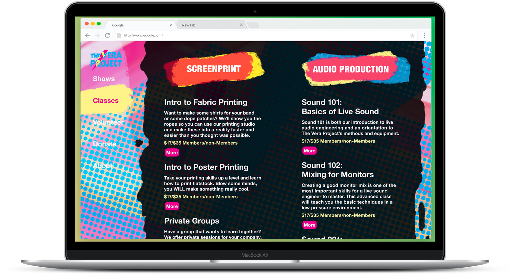
Design for new landing page on desktop
Objectives
The end product was to create a physical brand book (unfortunately, we could not actually print it because of obvious coronavirus related reasons) that showcased the new brand identity.However, that was a small aspect of the whole project which was:
- Research the services, history, and audience of Vera
- Create a brand identity–Purpose, Mission, Promise, and Concept
- Build a set of brand standards and guidelines
- Create a logo/wordmark
- Build out assets and applications for the new identity
- Create examples of collateral that would be used


Example of a print ad (quarter page for The Stranger)

Process
We started by researching the history, audience, services, and culture of The Vera Project, along with interviewing the operations manager. From that we learned:Audience
- 18-24 year old Seattle Area Youth looking for creative and social outlets, along with untraditional learning experiences.
-
Their parents and Vera “alumni” who support Vera financially, through volunteering, and community engagement.
-
25+ Adults who are interested in music and art and are looking to see a show or learn something new.
Mission Statement
Based on looking at what tonal territories we saw fit we found that:
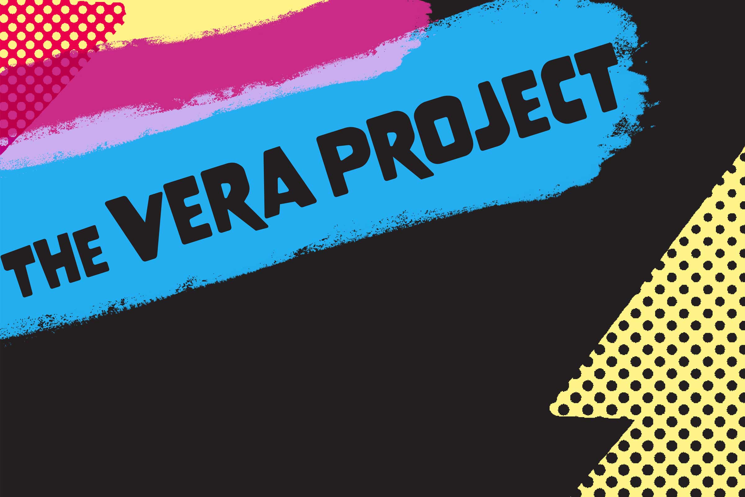
The Vera Project is creative, inclusive, and empowering–committed to building community through music and art.
Based on looking at what tonal territories we saw fit we found that:
The Vera Project is creative, inclusive, and empowering–committed to building community through music and art.
Brand Promise
We believe that expression powers personal and community growth. That’s why we are committed to providing an all-ages, safe and accessible venue for entertainment
and education.
We believe that expression powers personal and community growth. That’s why we are committed to providing an all-ages, safe and accessible venue for entertainment
and education.

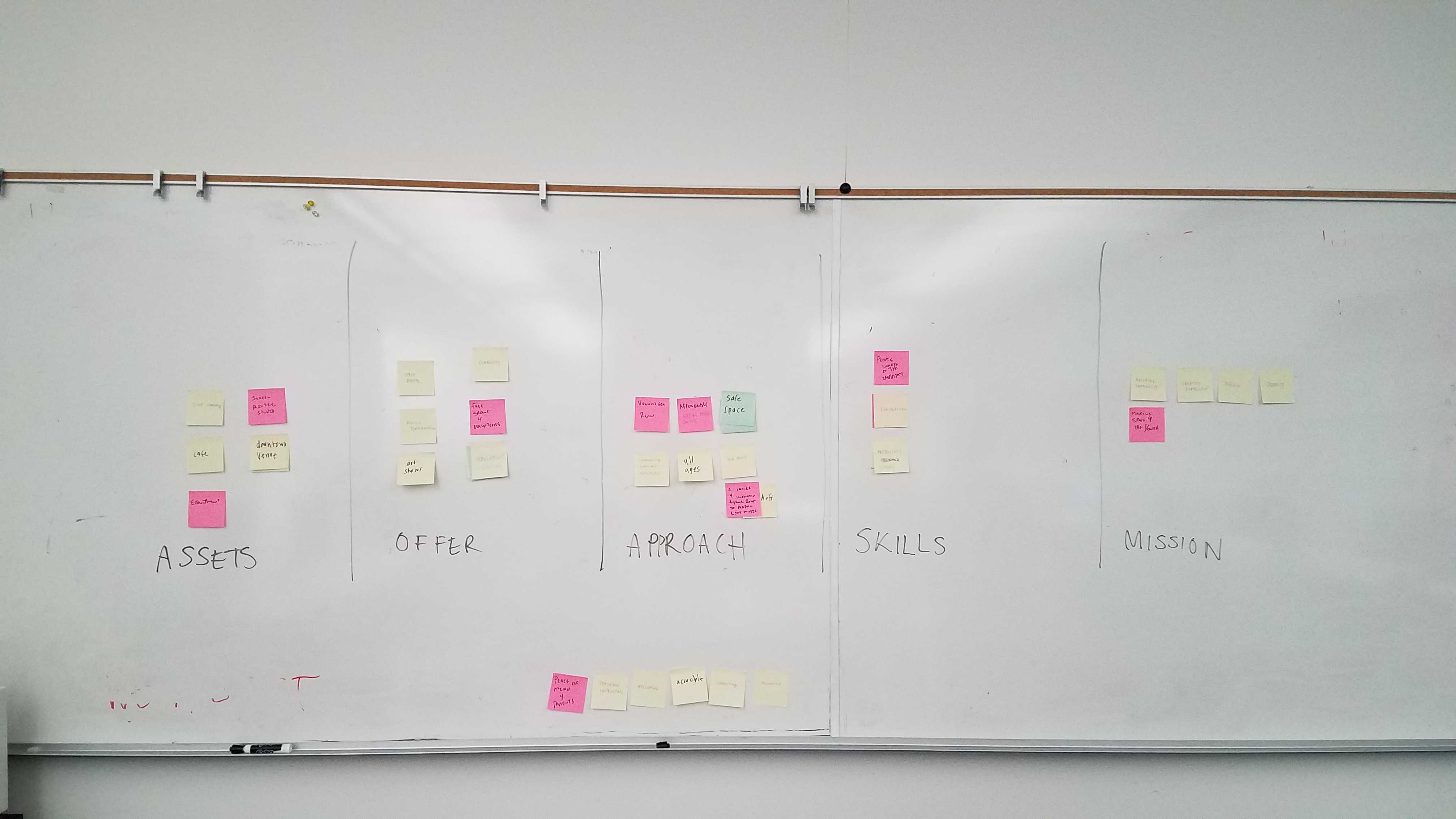
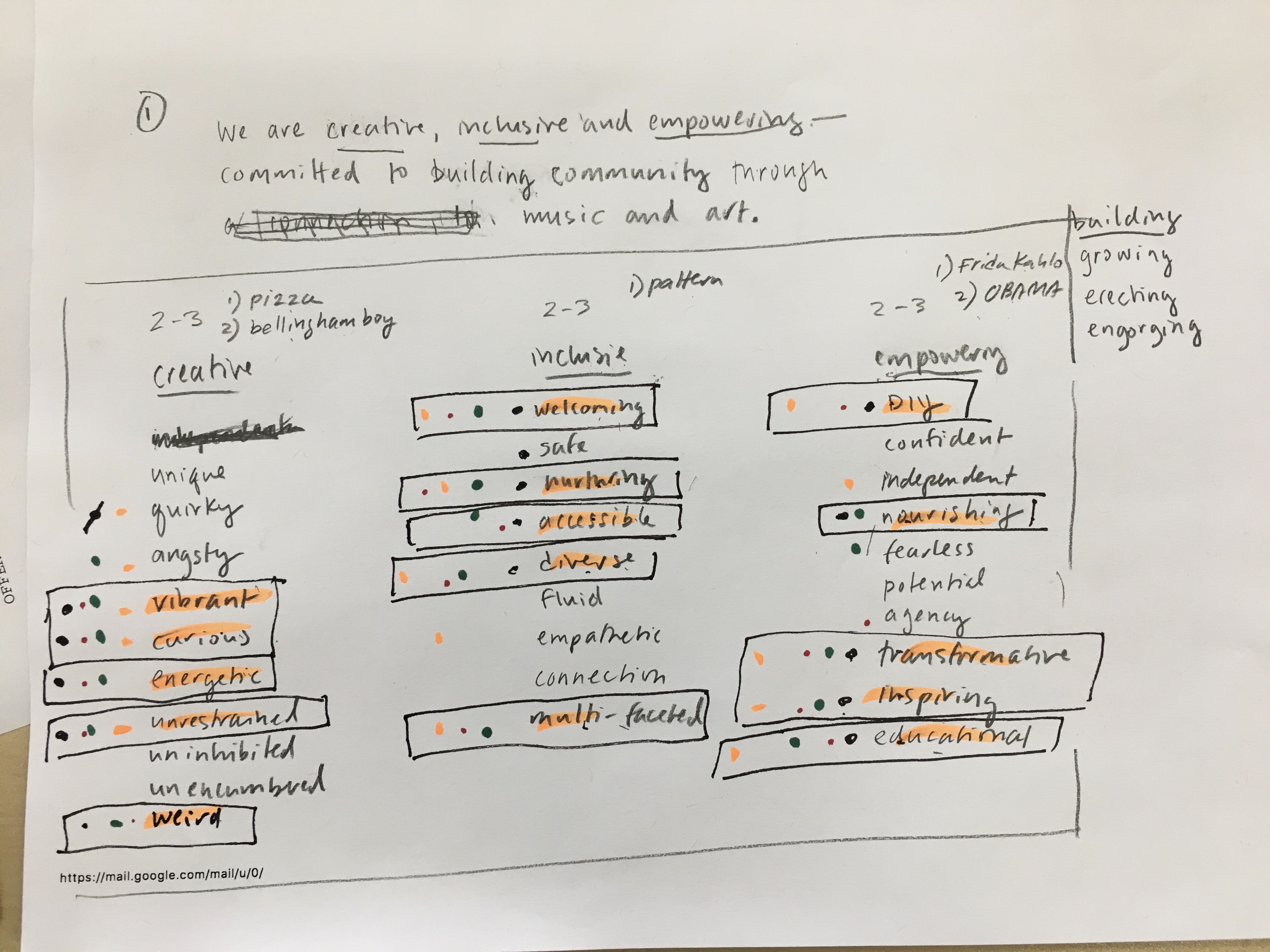
Whiteboard sessions finding tonal territories, approach, and promise.
Solution
The Vera project is an outlet for the musical and artistic creativity of Seattle’s youth, empowers them to grow as individuals with confidence, and works to include all, no matter their background, race, gender, religion, class, or ableness.
My overall concept became “Amplify your DIY,” with advertising and overall messaging promoting Vera as a platform to elevate one’s creativity, self-fulfillment, and self-actualization.
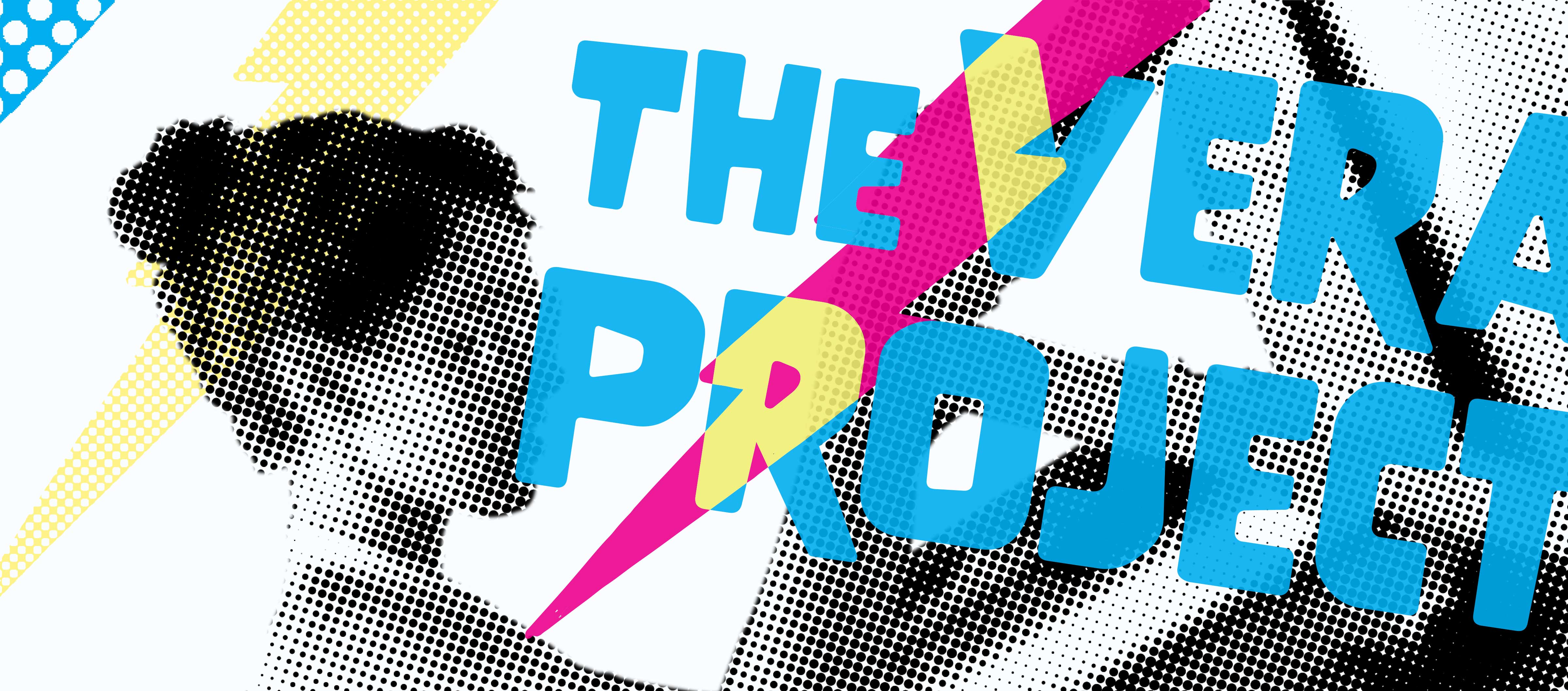
This also led to the most controversial decision I made: the color palette, which was almost, CMYK, utilizing the lightest Pantone shade of yellow available to make a distinction. This was to emphasize that just like CMYK, Vera provides the components to build something larger, more creative, and different.
This also led to the most controversial decision I made: the color palette, which was almost, CMYK, utilizing the lightest Pantone shade of yellow available to make a distinction. This was to emphasize that just like CMYK, Vera provides the components to build something larger, more creative, and different.
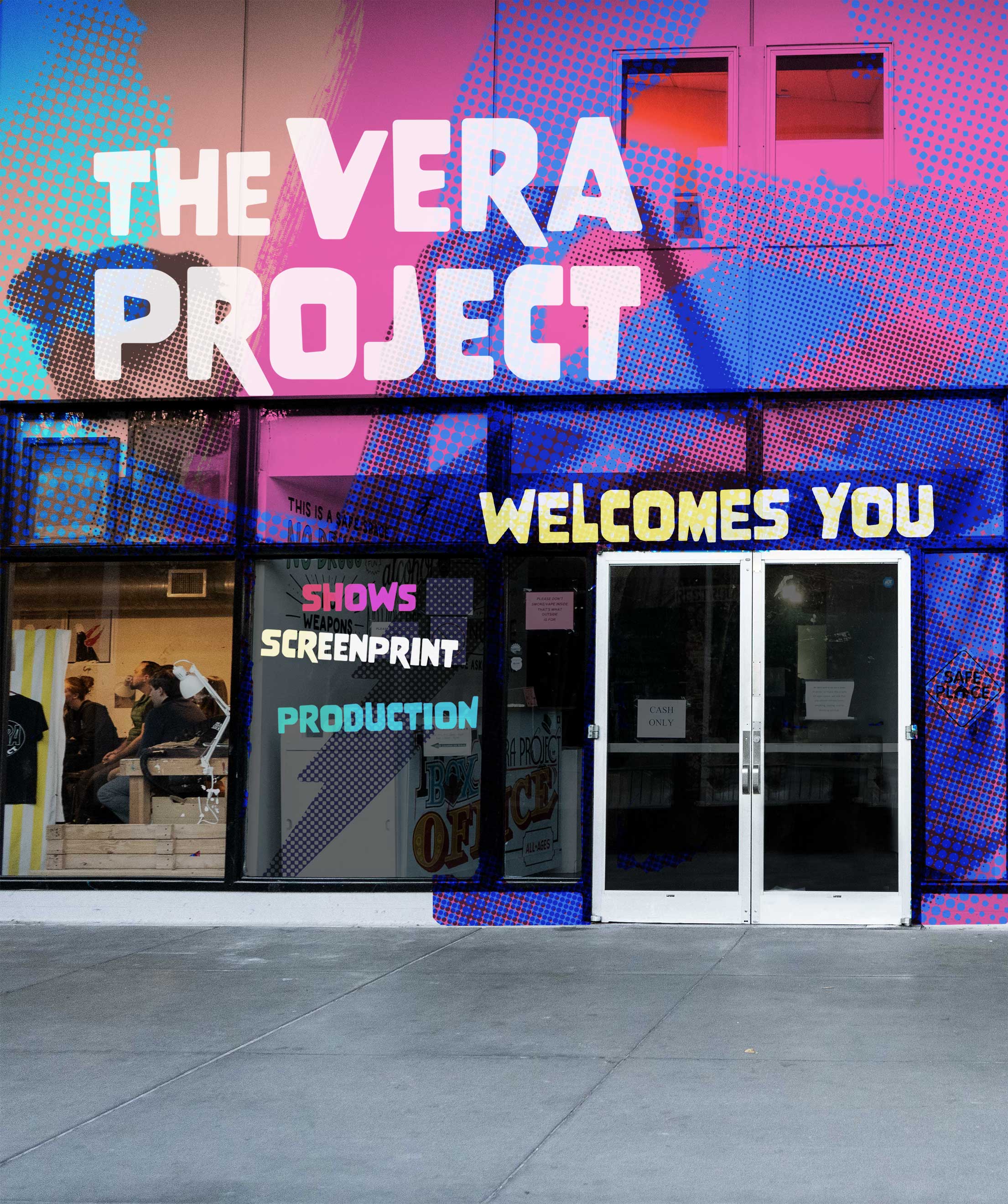
Main entrance
For the identity I utilized several elements such as:
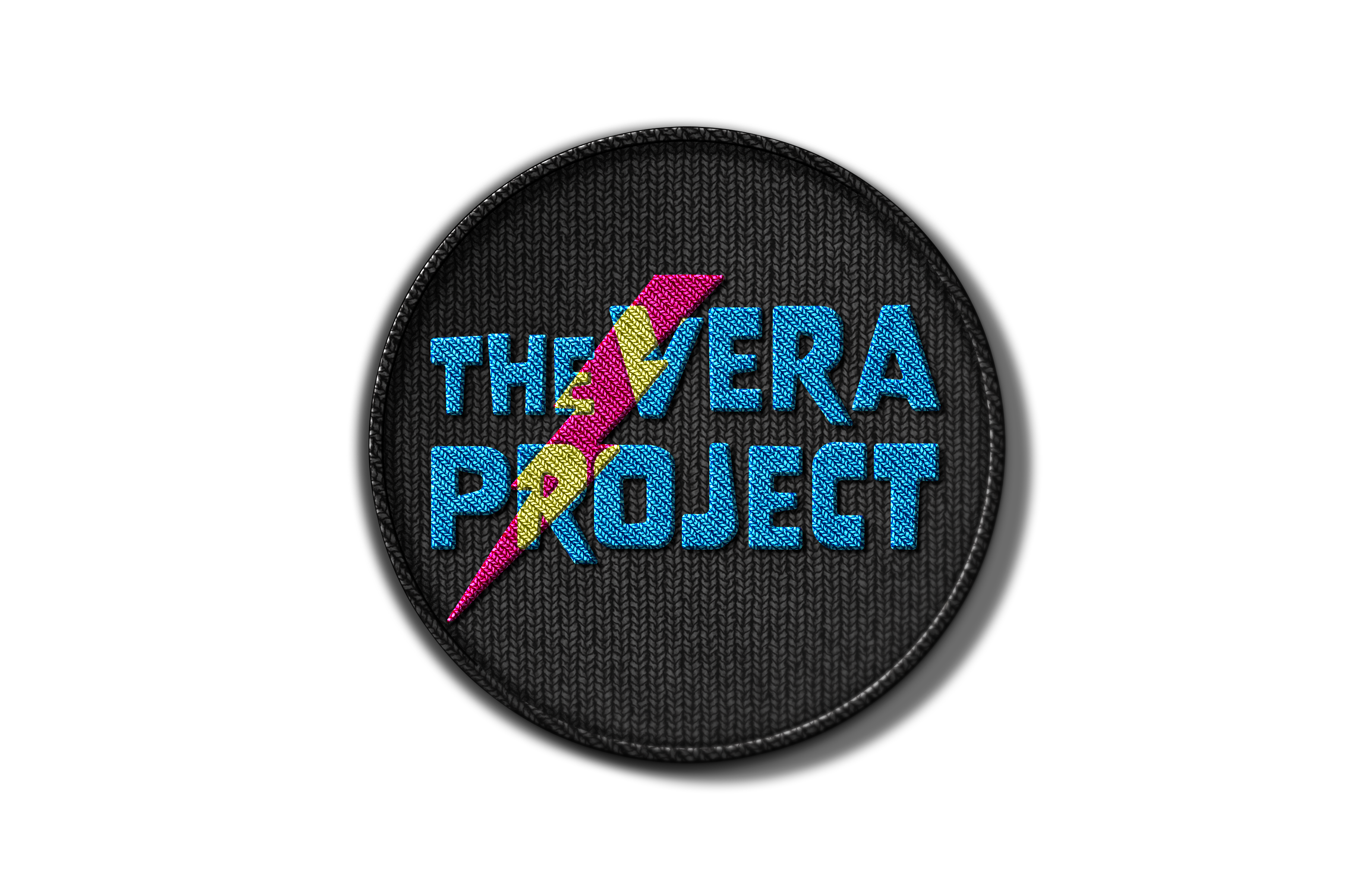
The lightning bolt
This has been repurposed from the original logo and Vera’s origins in the old Electic Union building, and has been integrated into the logo.
Ink smears/blobs
As one of Vera’s primary draws is the screenprinting studio, I used an element that is both a common sight inside the buildinb itself, but unique to stand out visually, especially when place unexpectadly or out scale.
Overlapping and blended visuals
Vera is an inclusive mix of folks from all ages and backgrounds, and the mixing of colors and elements is used to evoke that.
Legible type
Inclusion requires accessibility, which requires bold, but still legible type solutions.

Office Entrance
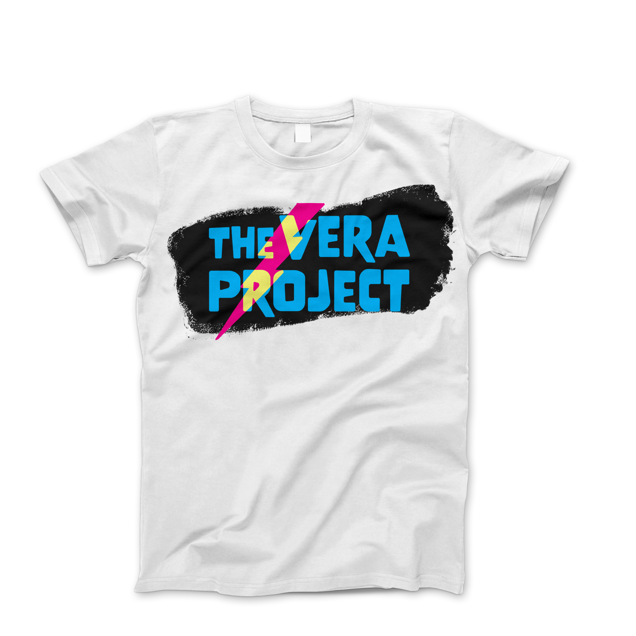
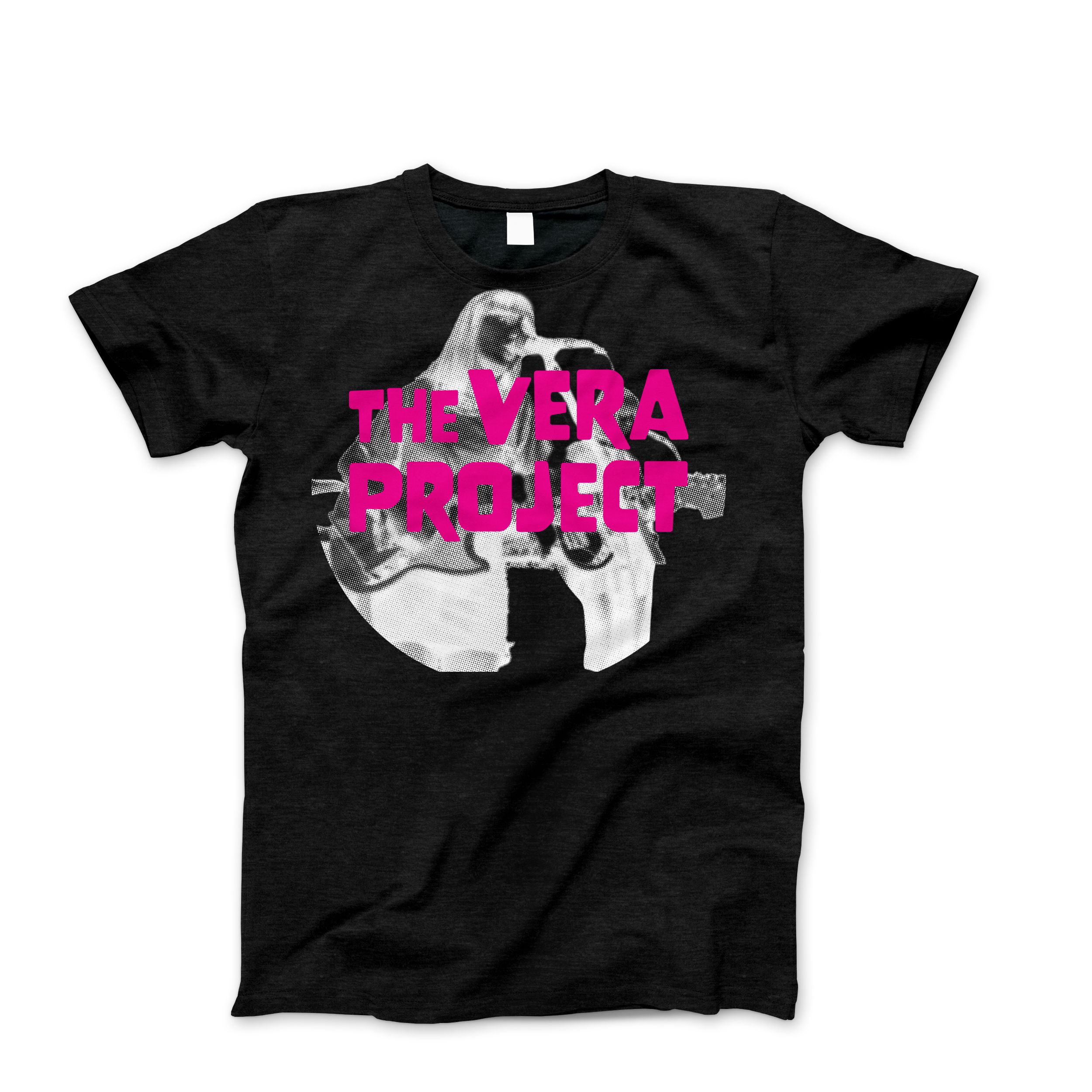
Couple of T-shirts
Application
The assets I built up besides the brandbook with its logo, type, color, and photo guidelines contains examples of:Exterior/Environmental Graphics
Vera is currently in a large grey building and is easily overlooked by its neighbor KEXP (in fact the barista inside KEXP said they frequently get guests who were looking for Vera).
New Website
A more fun and modern look, with an emphasis on the class offerings and show schedule.
Print Ads
To bring attention to programs and other offerings.
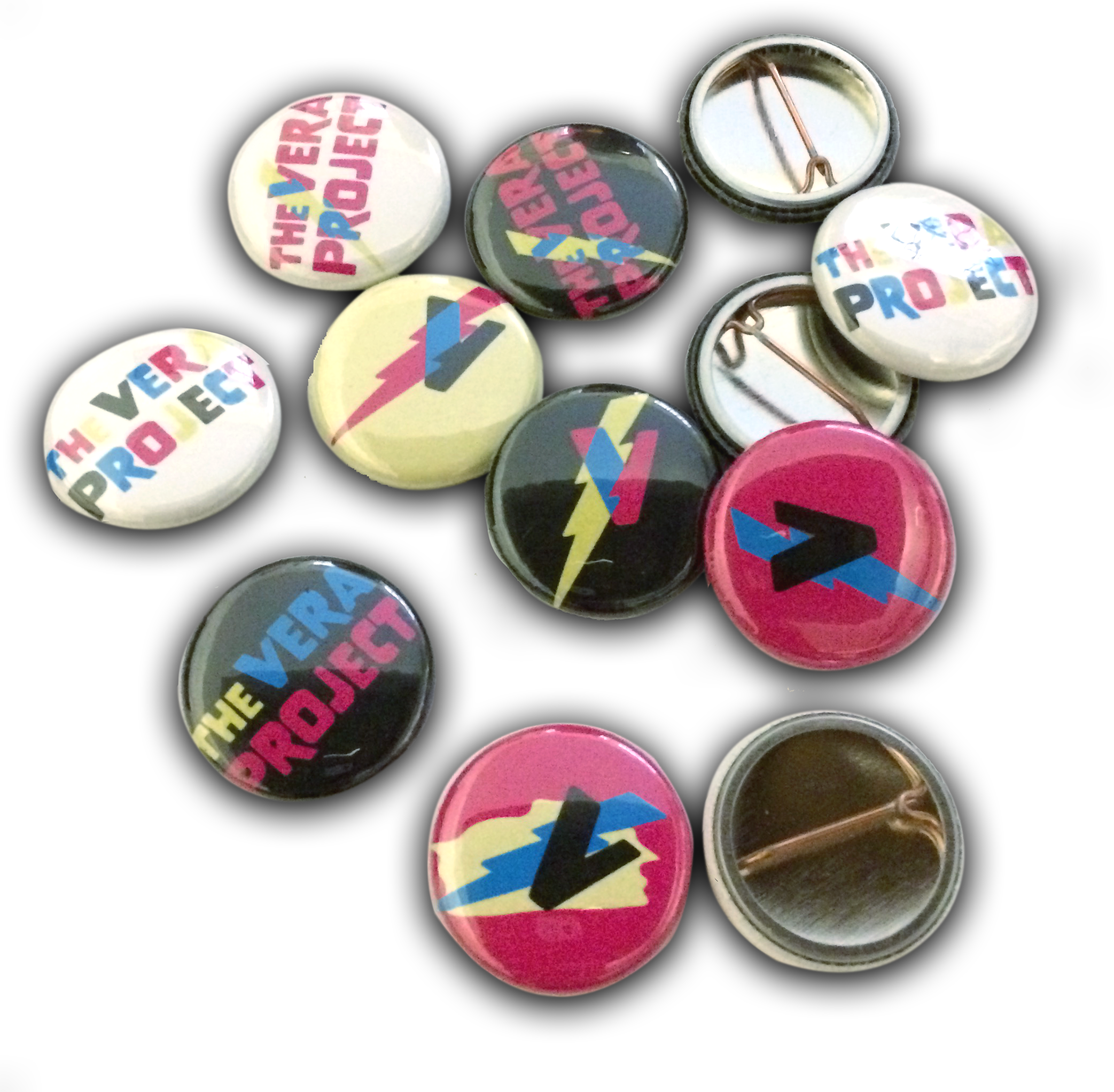
Merchandise
Vera runs largely on donations and city funding, merchandise can be sold to donors, alumni, and parents to help raise funds, with the added advantage of much of it being able to be printed in-house and onsite.
Vera is currently in a large grey building and is easily overlooked by its neighbor KEXP (in fact the barista inside KEXP said they frequently get guests who were looking for Vera).
New Website
A more fun and modern look, with an emphasis on the class offerings and show schedule.
Print Ads
To bring attention to programs and other offerings.
Merchandise
Vera runs largely on donations and city funding, merchandise can be sold to donors, alumni, and parents to help raise funds, with the added advantage of much of it being able to be printed in-house and onsite.

How to apply the photo treatment.

Reflection
When reviewed, all components in the guide were described as looking like what The Vera Project intends to project. The guidebook itself is extremely comprehensive and shows a full range of the tools and usage of how the brand is used.This project was a total roller coaster of emotions but overall was incredibly rewarding.