Illustration/Design
Timeframe: February-March,
April-May 2020
Solo Project
Roles:
Skills:
The Bug List
Poster SeriesTimeframe: February-March,
April-May 2020
Solo Project
Roles:
- Illustrator
- Designer
Skills:
- Layout
- Adobe Photoshop
- Adobe Indesign
- Procreate
- Creative thinking
- Copywriting
This was a big complaint of mine. Simpler times, my friends.
Problem
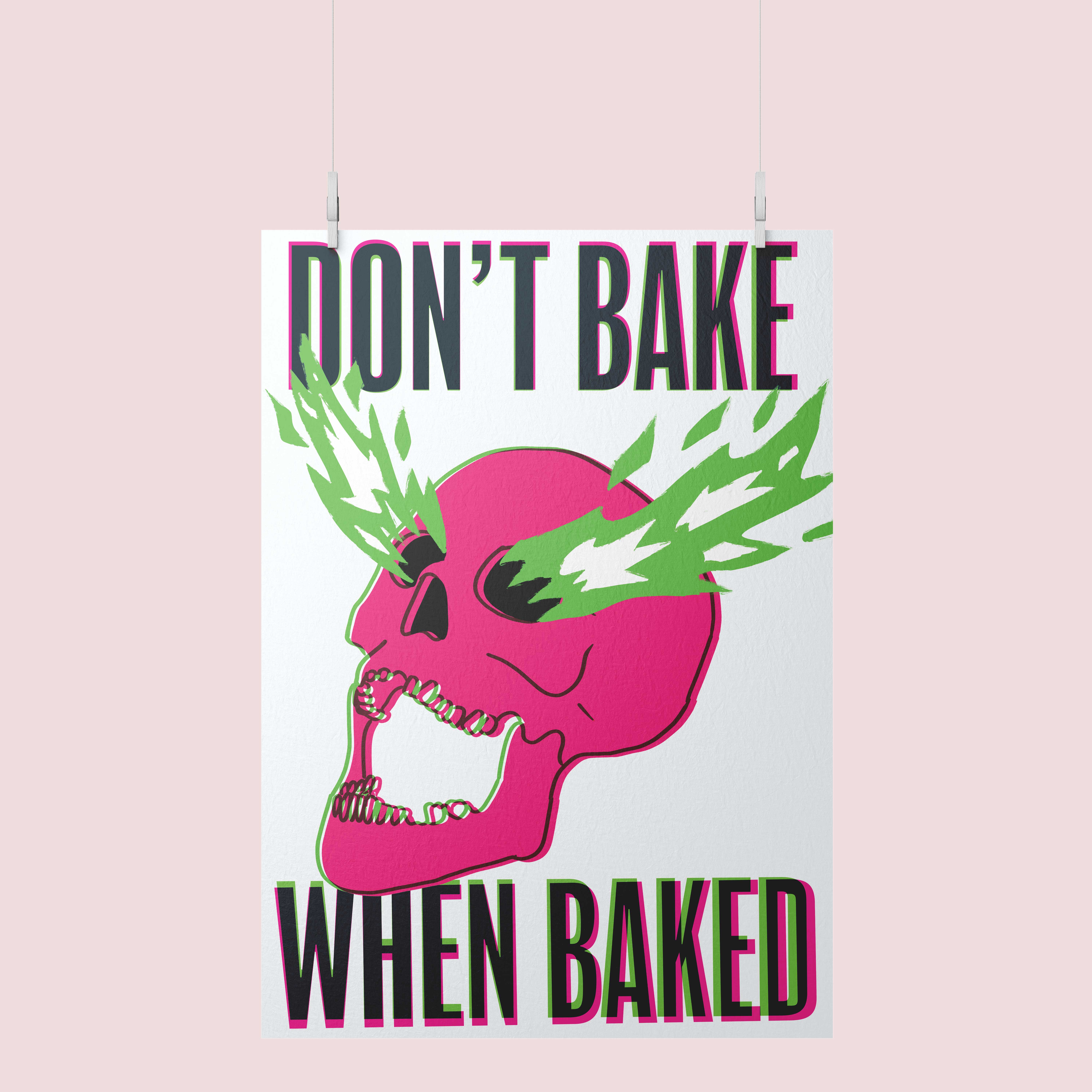
Some things really bug me. There are multiple lists of things that just REALLY GET MY GOAT. It can also be lifesaving for folks to adhere to my advice. So what better way to save lives and my attitude, by a poster?My biggest complaint at the time was people getting high (I’m high like, all the time, so not gonna judge) and decide to cook a freezer pizza, toss it in the oven, and fall asleep. Next thing you know, we are standing outside in our pajamas in the rain waiting for the fire department to reset the fire alarm.
So really the problem is: How do you create a safety poster that people can read when they are high that will help them to not burn down the house?
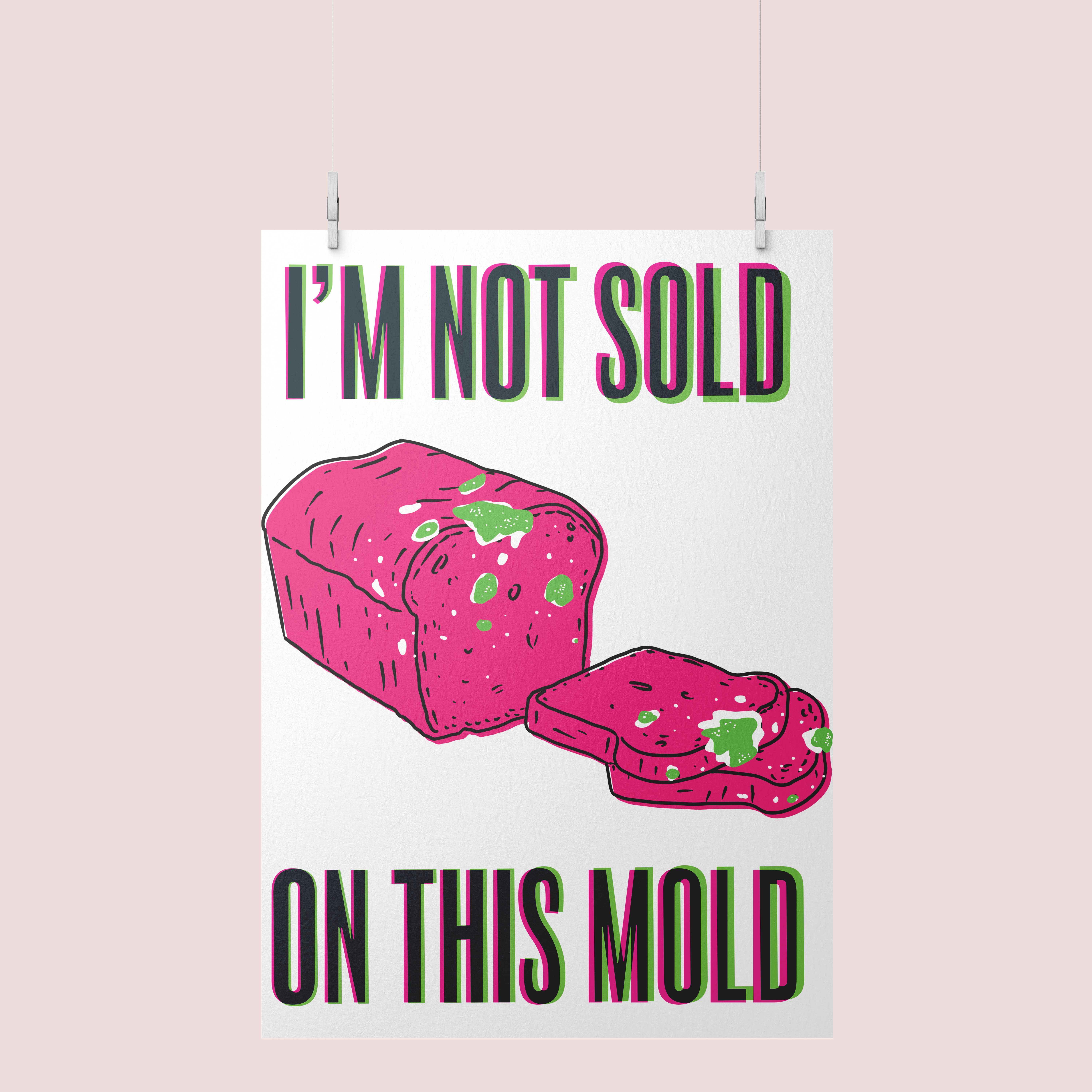 In an ideal world, there would be a tube coming out of our kitchen walls that dispensed freshly baked french loafs, that we can cut off as much as we want, whenever we want it.
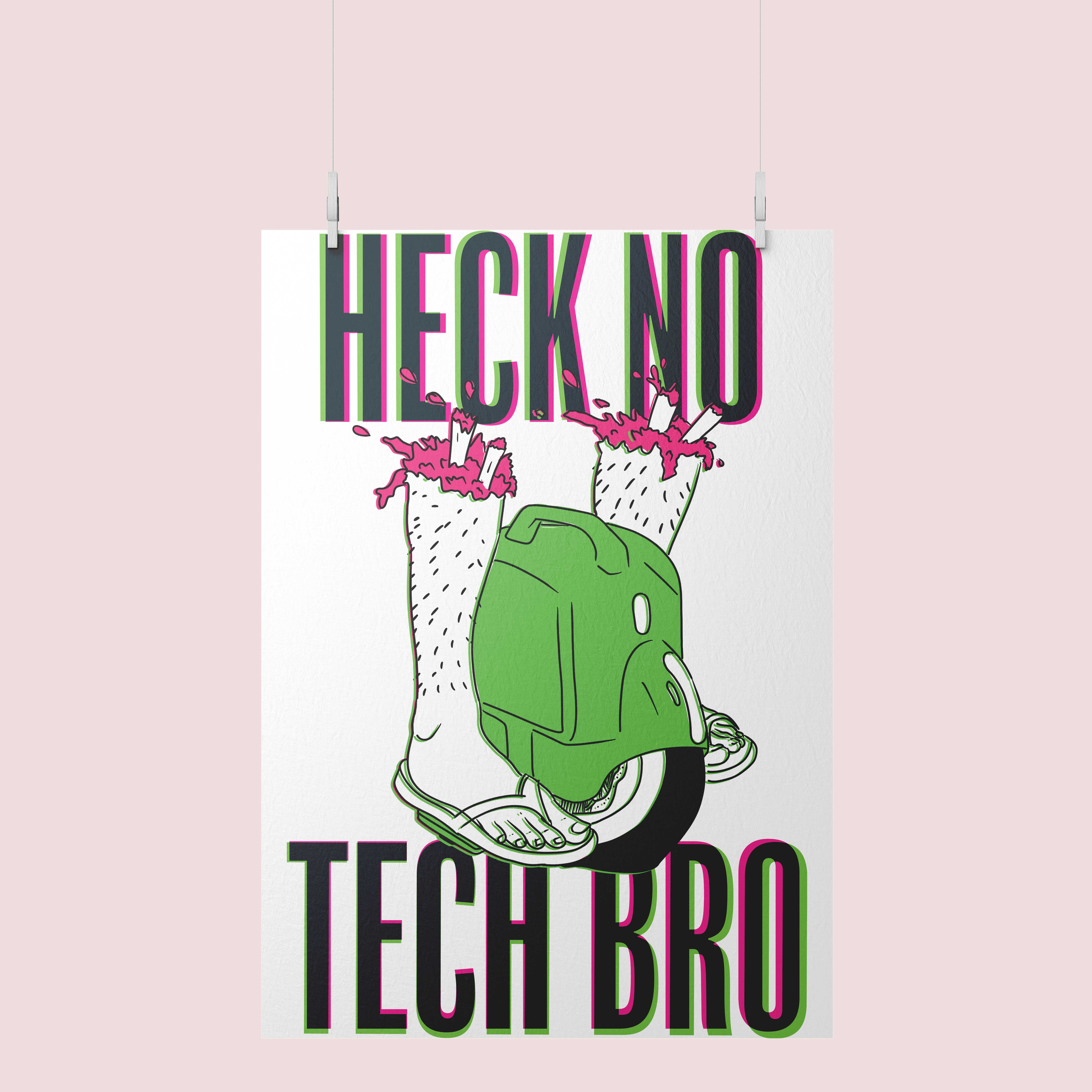
Dude.
Objective
Once again, this was really to practice creative thinking, copywriting, story telling, layout, and illustration, etc. But this is taking a weird turn and is now becoming an outlet for me to both get things off my chest, and potentially save lives in the process. We all can be heroes, in our own unique way.Background
The original intention of this project was as a public safety announcement. However, my list of safety issues I care about really became a manifesto of things that piss me off. This was a one week assignment that honestly, will probably never end, as the list of things that frustrate me GETS LONGER EVERY DAY.Process
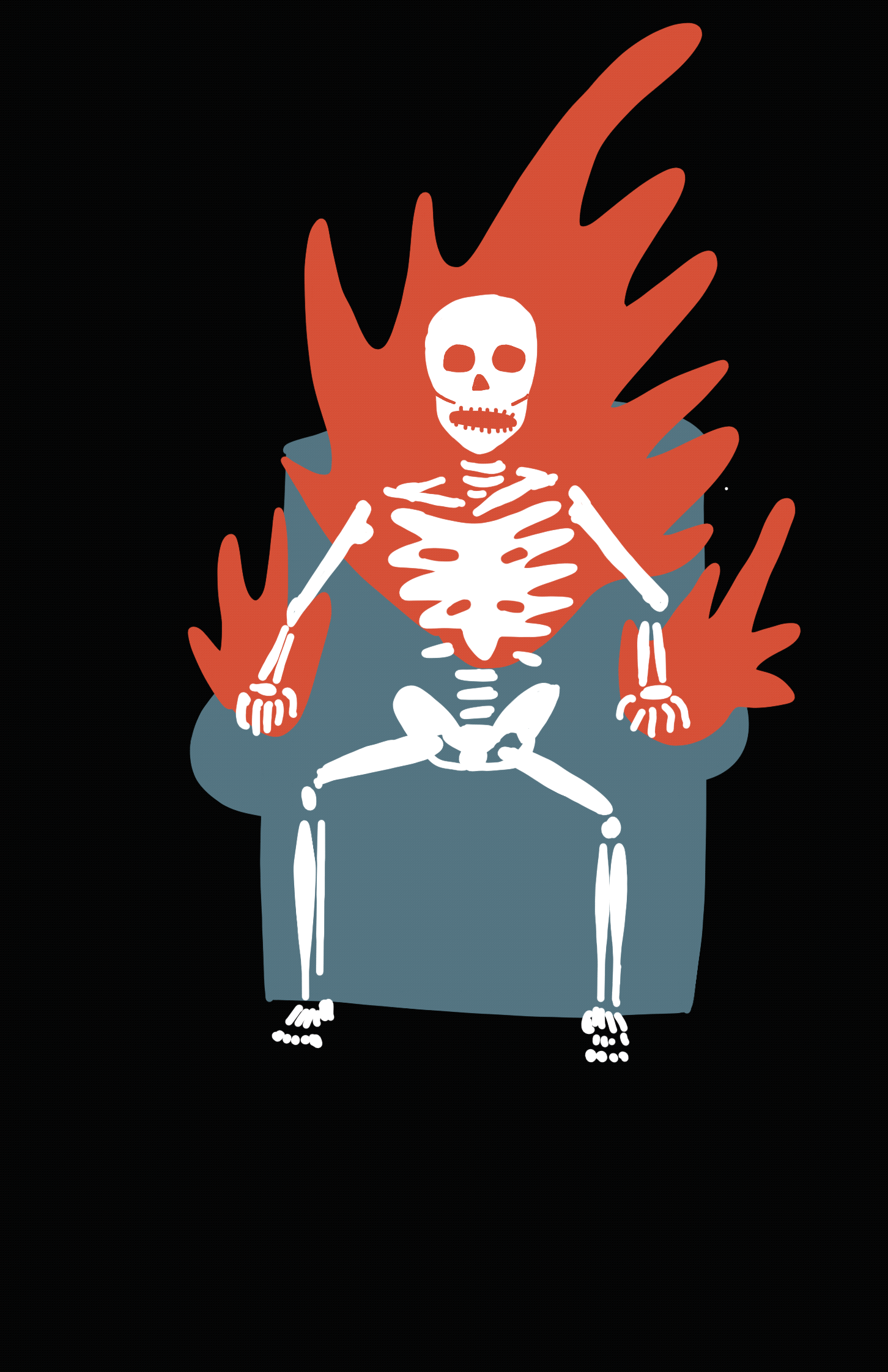
So, the initial process in this was researching existing public service announcements, especially old WPA posters, and finding a color palette, and structure based off of those. I initially picked a green and red and off-white palette because it complemented the four main components of what I was trying to express: Weed, Pizza, Fire, and Death. It was ok, and I love the skeleton in the chair (I HAVE BEEN THERE), but it was attention grabbing.From feedback from my peers, I had to embrace what would really catch someone’s eye when they are stoned, and that is much brighter colors.

The original poster
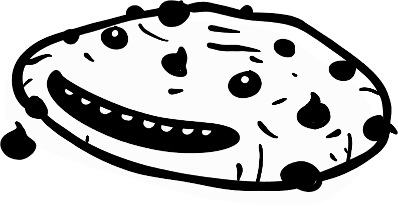
 I like this, but it reallt just says “don’t burn your tongue”
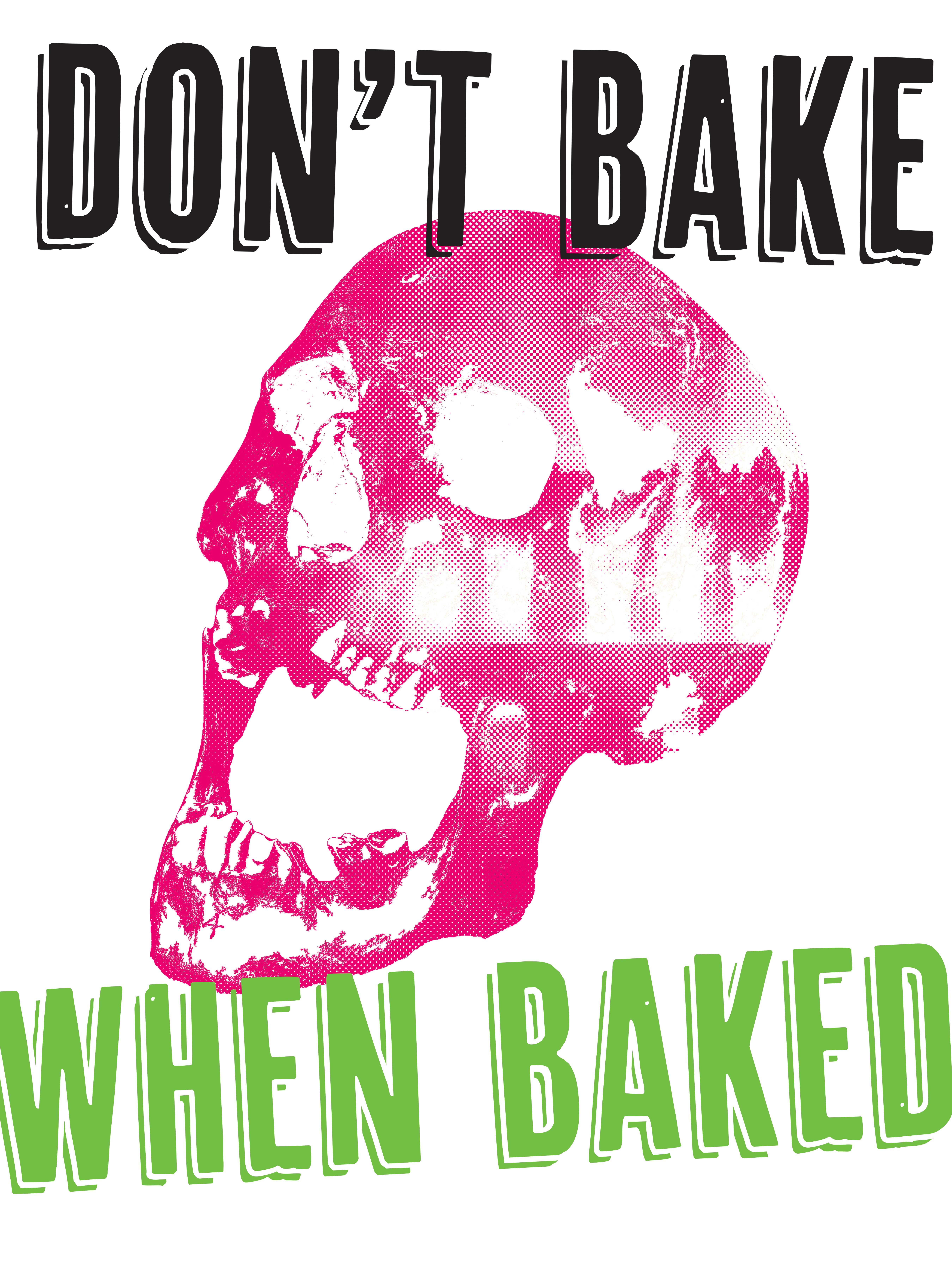 Fiery death? Yes. Pizza? No.
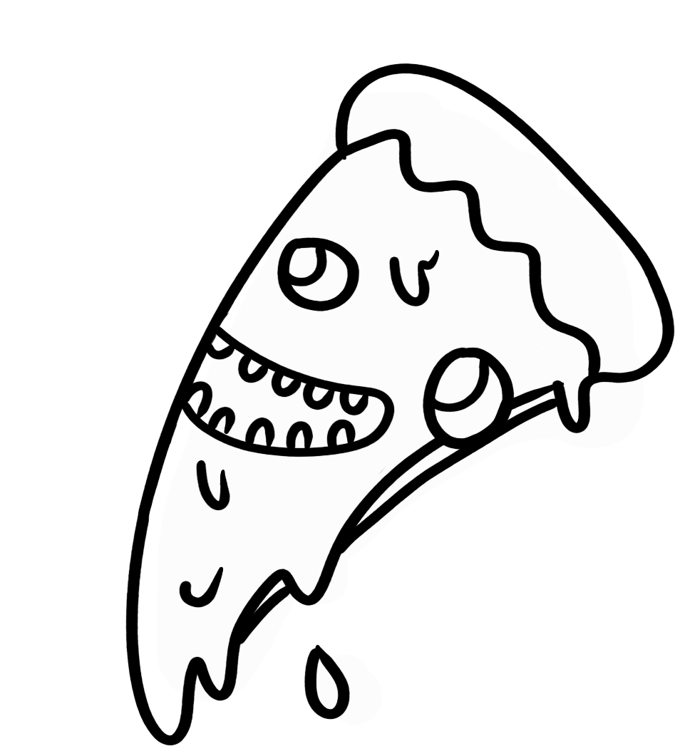
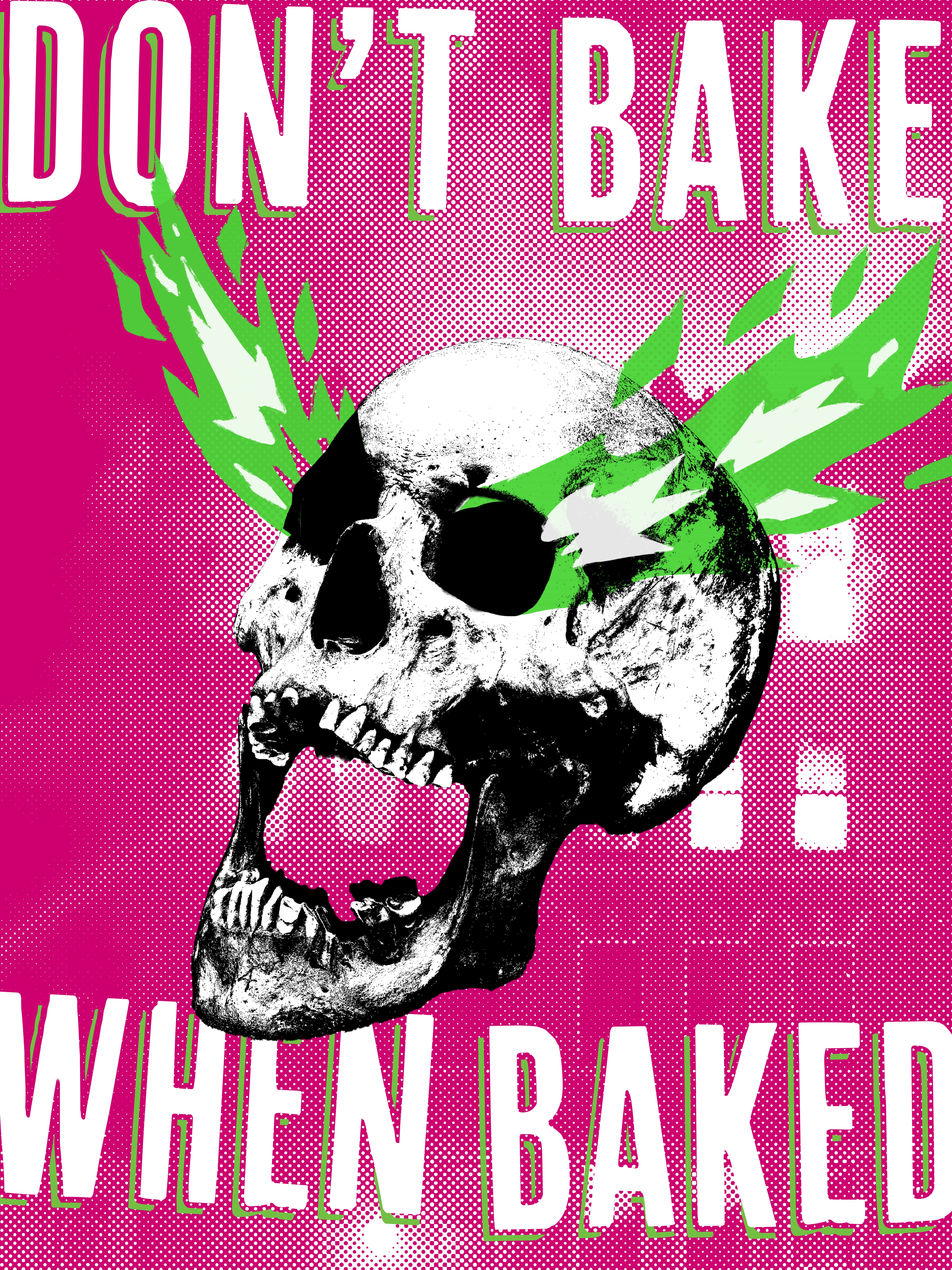 This was the “final” version, but not final enough for me.
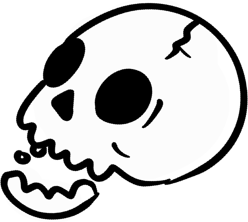
I just wasn’t quite sold on these. The fact is, I’m a great complainer, and I need a format that I can easily add a new complaint to, quickly. I went back to distilling what the message was, and looked at the type with the perspective of what is this going to be like when I’m high? (ok, I was a little stoned). With that perspective, I took my iPad to bed with me, and drew what I really saw as a stoned-fiery-death being like, and it worked. And after putting it all together, I found a system that can accept all of my transgressions and gripes.
Summary
One day, maybe these posters will hang in everyone’s offices and kitchens, and many lives will have been saved, and pizzas unburned. No need to thank me, it’s all in a day’s work.