Goldfish Crackers
Organic Social Content for Goldfish Crackers (a Campbell’s brand). From 2023-2025 I worked alongside several other creatives forging fun and engaging posts across Instagram and TikTok.
Timeframe: Jan 2023 - June 2025
Collaborated with: Tamara Tripp (Copywriter 2024-205), Rachel Slakter (Art Director 2023-2024), Chad Fenoglio (Creative Director 2023), Michael Skoog (Copywriter 2024), Joey Livingston (Copywriter 2023-2024), Chris Bailey (Creative Director 2024-2025)
Roles:
Timeframe: Jan 2023 - June 2025
Collaborated with: Tamara Tripp (Copywriter 2024-205), Rachel Slakter (Art Director 2023-2024), Chad Fenoglio (Creative Director 2023), Michael Skoog (Copywriter 2024), Joey Livingston (Copywriter 2023-2024), Chris Bailey (Creative Director 2024-2025)
Roles:
- Graphic Designer
- Art Director
- Illustration
- Production

TINNED FISH
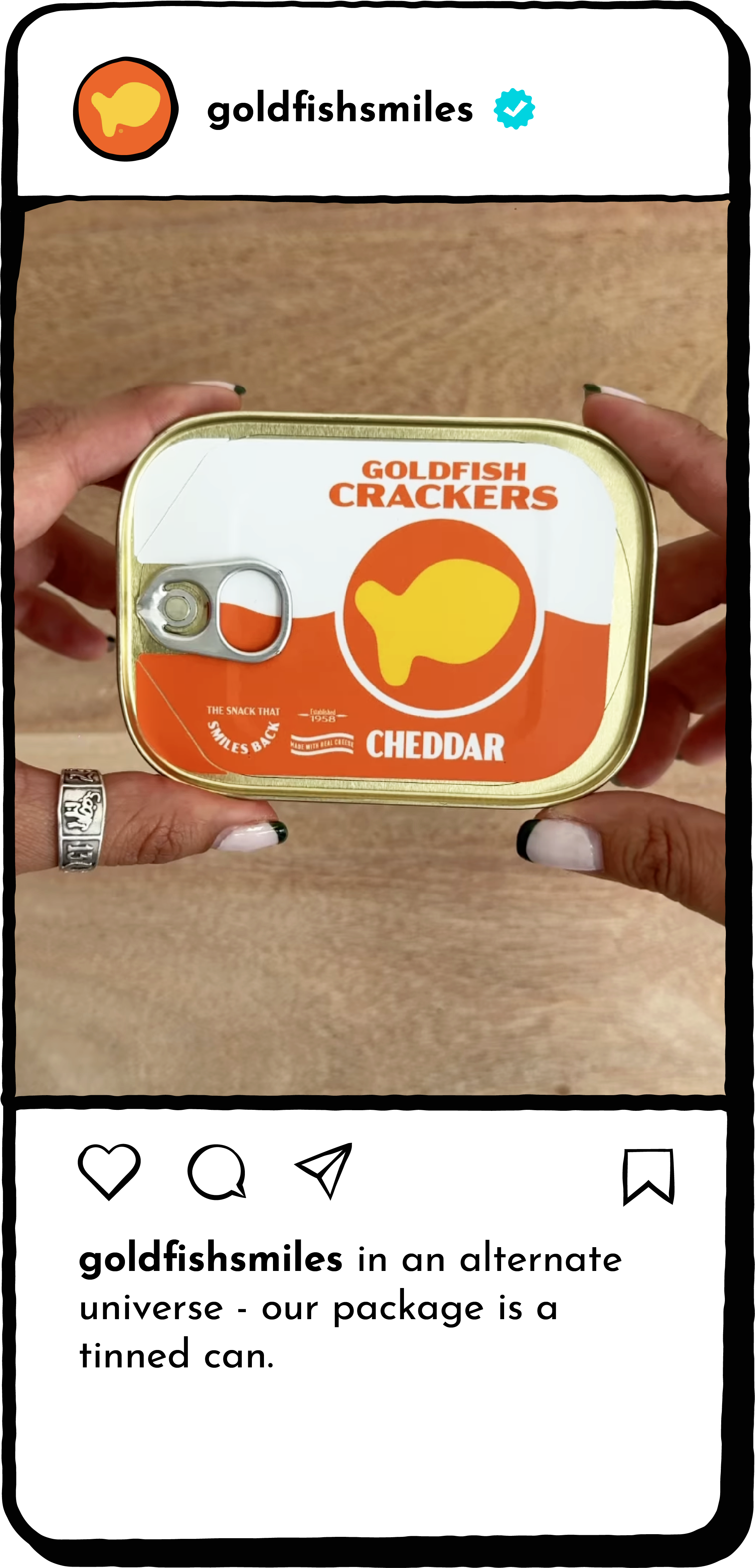
Tinned fish have been trending lately, with the colorful and quirky designs of the tins appealing to both consumers and art enthusiasts. As a fish-free fish, Goldfish is clearly meant to exist in a tin...in some capacity.
While the logistics of actually creating sealed tins with the crackers in them is beyond what we could realistically do with our budget and time-frame, using a little bit of stage magic, we were able to create it for social media.
I had a timeline of about 6 weeks from ideation to posting date to design and manufacture tins, and then get the production of the video and photographic deliverable options. My budget for creating this was $200 (Tammy, who was the copywriter/hand talent and I were on retainer, so our hourly cost was not factored in).

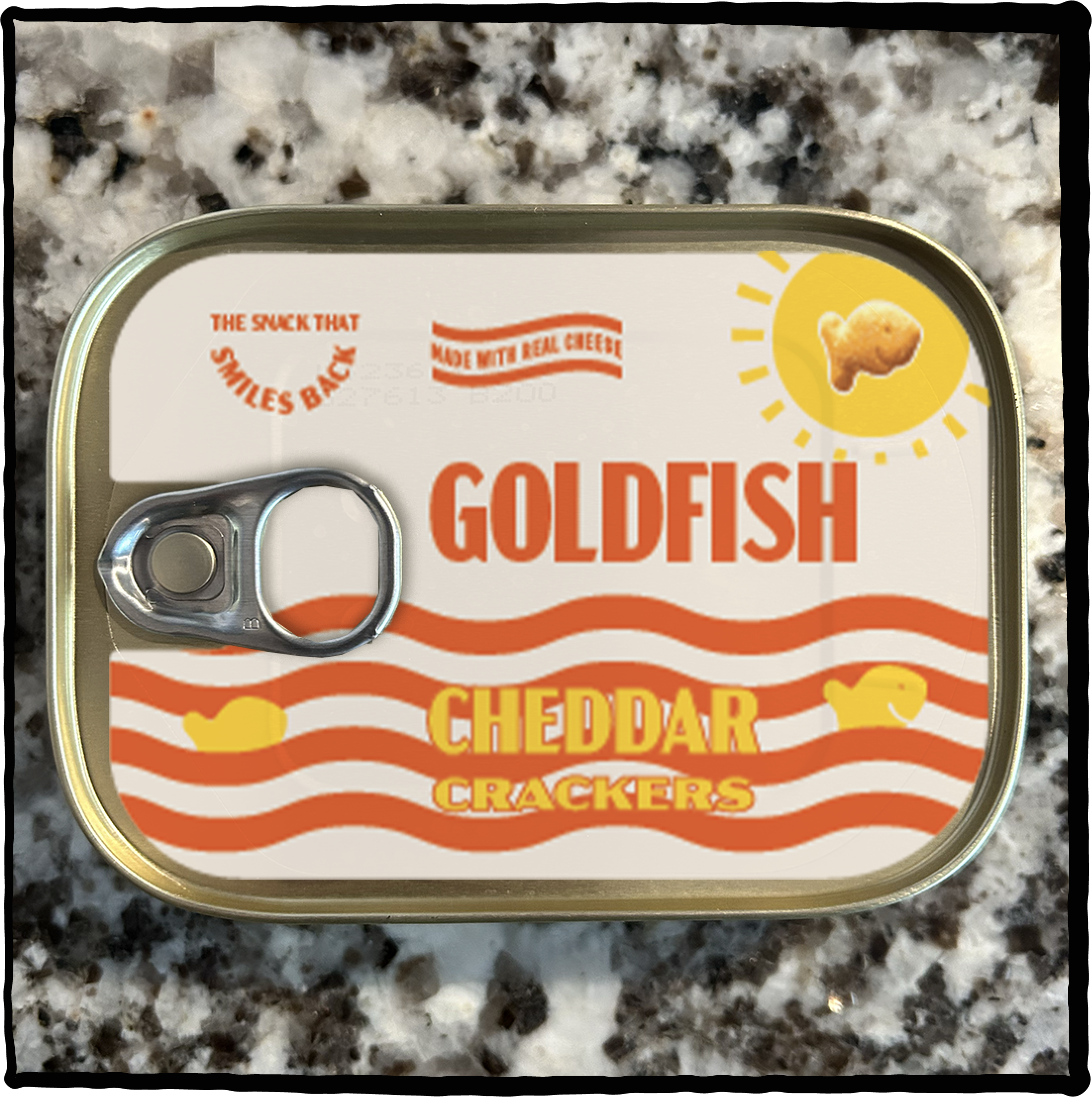
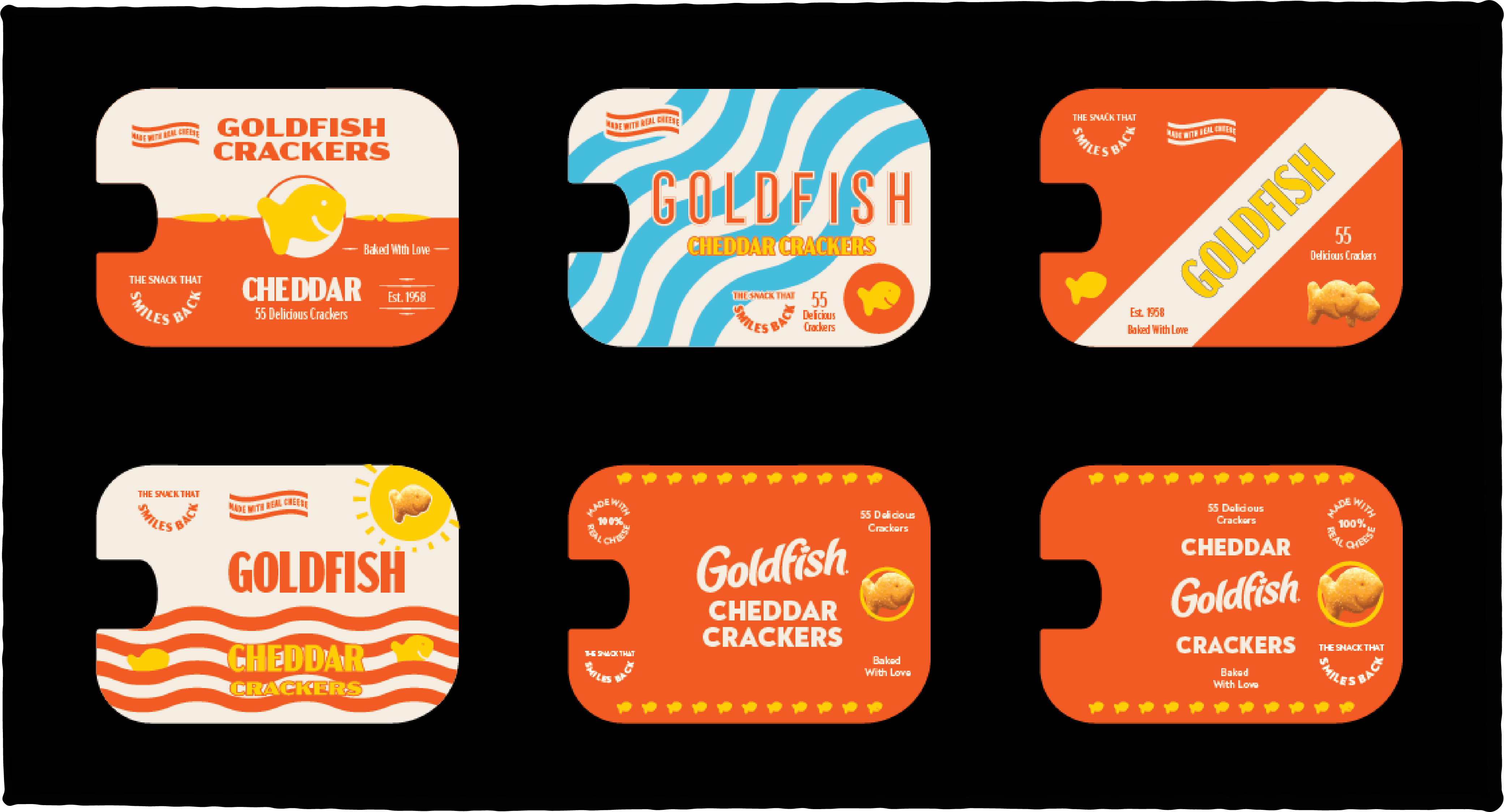
Early round mockups of the tin design were here. Mocked up on a tin as a proof of concept as what it would look like with the pull tab ove rthe design. I also had to design around the label breaking cleanly and not tearing in any sort of ugly way when opening.
For the actual preparation of the tins, I went on a mission to find an existing fish tin that could hold *roughly* 55 crackers—which is a serving, and I could order a decent amount of as each tin can only be opened once.
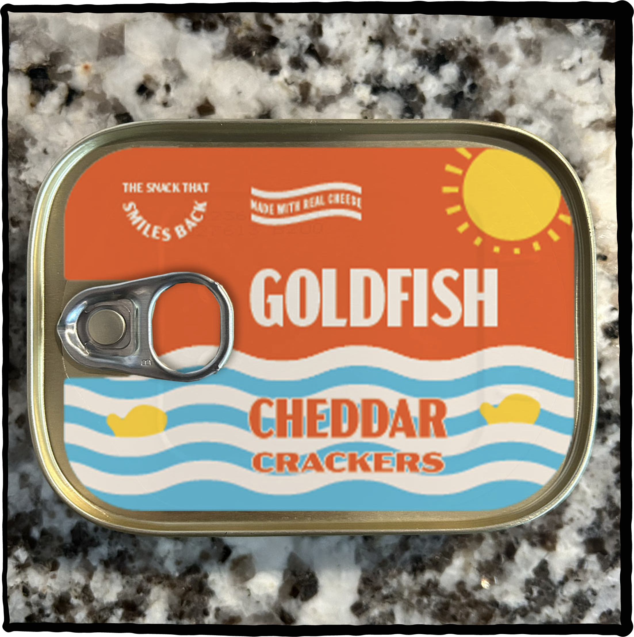

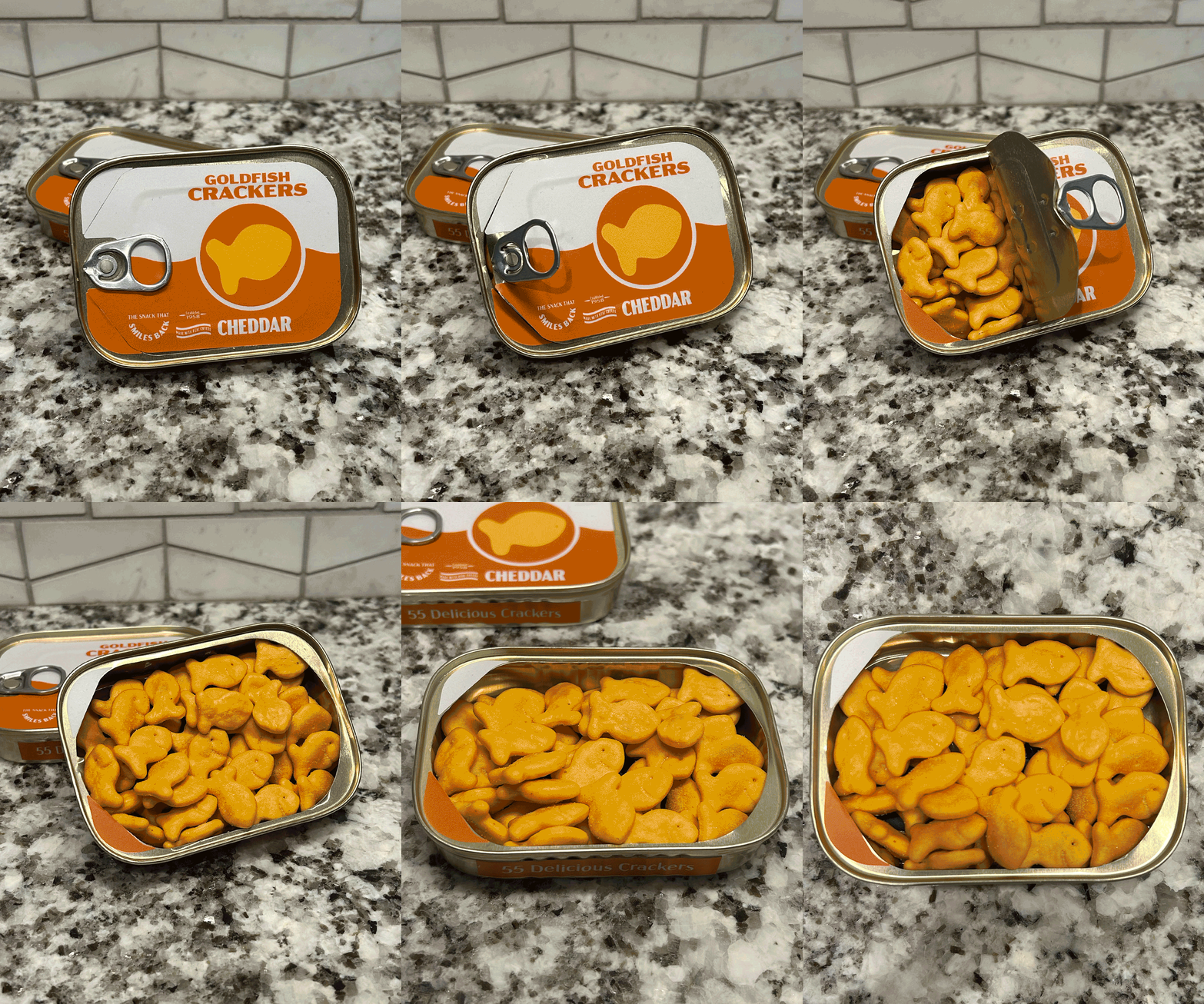
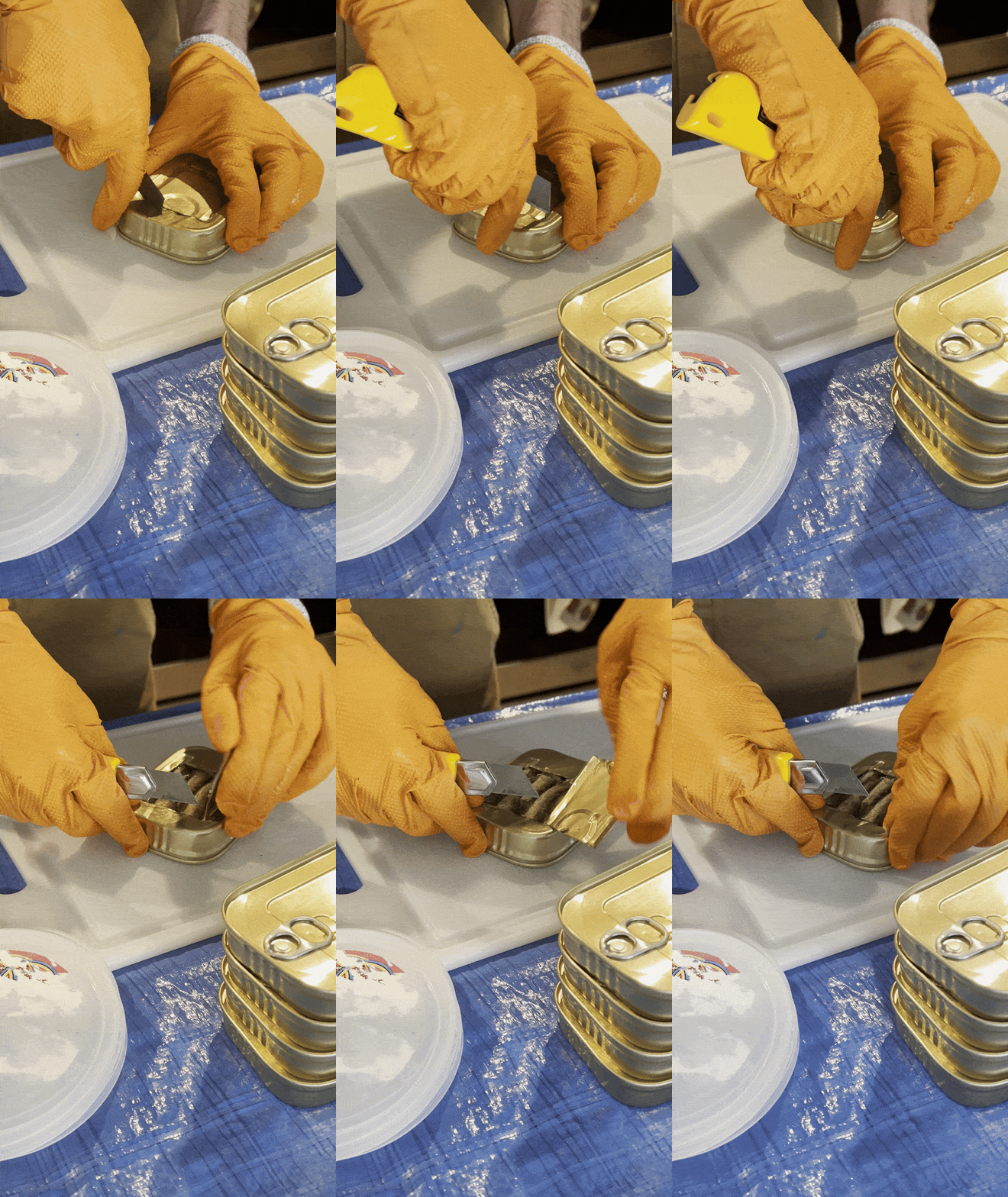
After finding the most ideal tin (King Oscar) I sliced out the back, and manually emptied out the sardines. I ran the emptied tins through my dishwasher three times to ensure it wouldn’t smell awful or leave any residue on the crackers. Believe me, my apartment smelled like fish for a solid week.
I then applied the label (a sticker sheet I ordered, which was the most economical way to get the label made), filled up the tins with crackers, sealed them up with a bristol board backing, and then boxed up and mailed half the tins down to LA for Tammy to make use of her hands for video purposes.
With the client going for a video of Tammy opening the tin as the final deliverable, this ended up as one of our best engaging and performing posts of the year, on
time and even under budget.

SPOOKY SNACKS
For 2023’s Halloween, the client was asking for some sort of “retro or throwback” kind of post with their product. It was pretty open ended, and we had felt inspired by old Halloween illustrations from when we were kids. Client loved the idea, and I then made a set of illustrations inspired by those Halloween images of yore.

HOUSE OF GOLDFISH
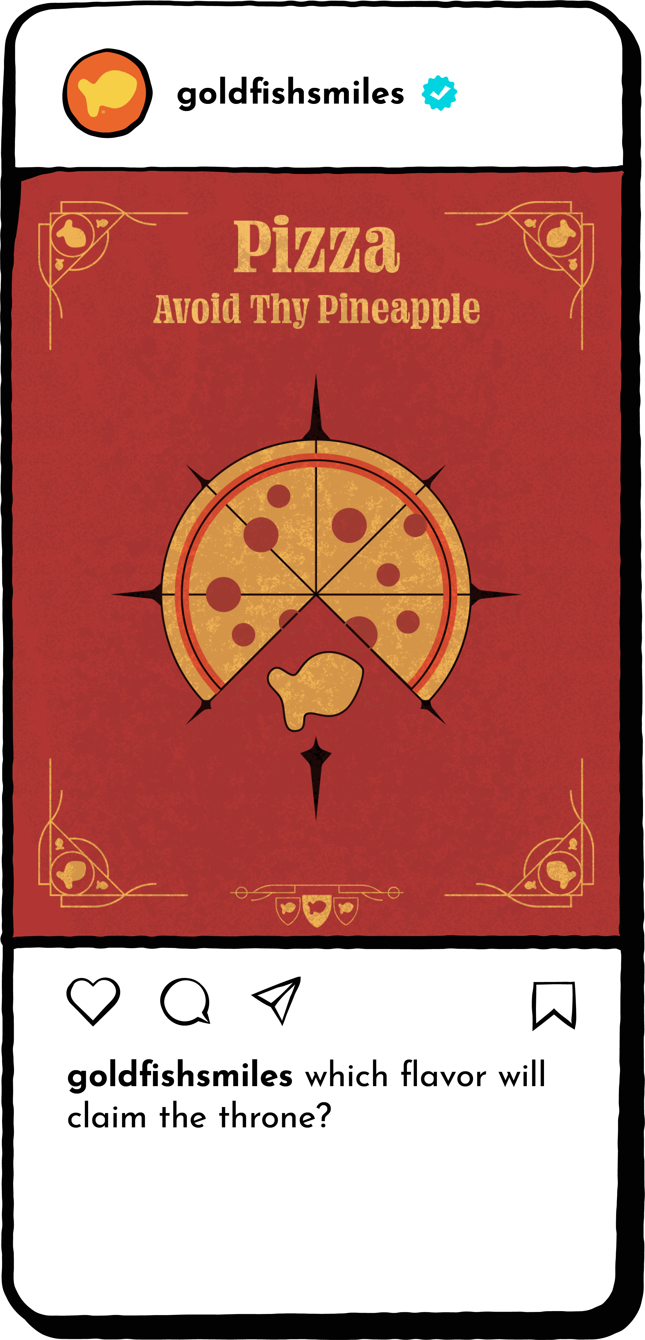
As a social media presence, Goldfish loves tying in with cultural moments, and had wanted to find a moment with HBO’s House of the Dragon returning in 2024 for a second season. Keeping in mind we did not have any feasible way to create a direct co-branded ad, as a team we thought out: well if the flavors(SKUs) were living in Westeros, what houses would they be? A bag is kind of a house anyways? (The carton—a castle?) And for the audience to relate, what would the houses’ sigil be? I then created a set of illustrations for the five flavors they were focusing on most for summer 2024—Pizza, Cheddar, Pretzel, Colors, and Vanilla Cupcake.FINNDER
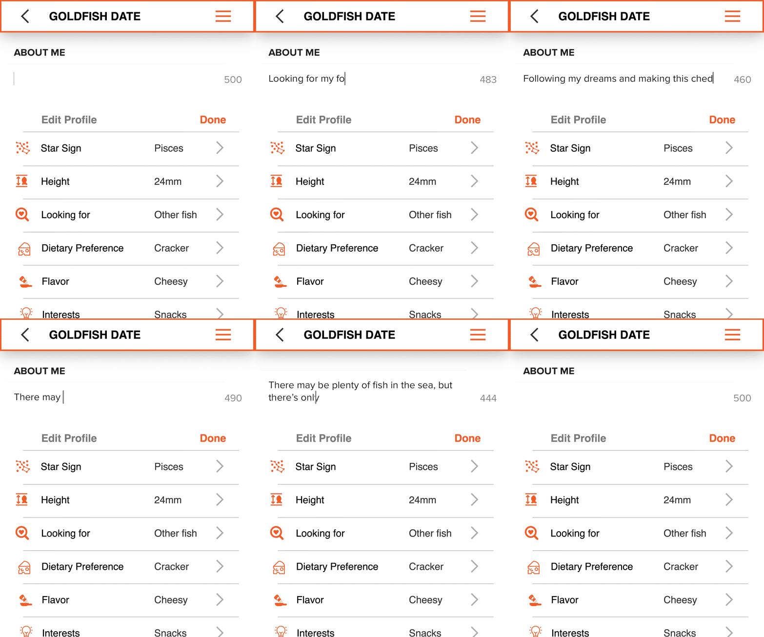
For Valentine’s Day, we mocked up a Tinder-inspired dating app to showcase the range of cracker’s available to take home *wink wink*.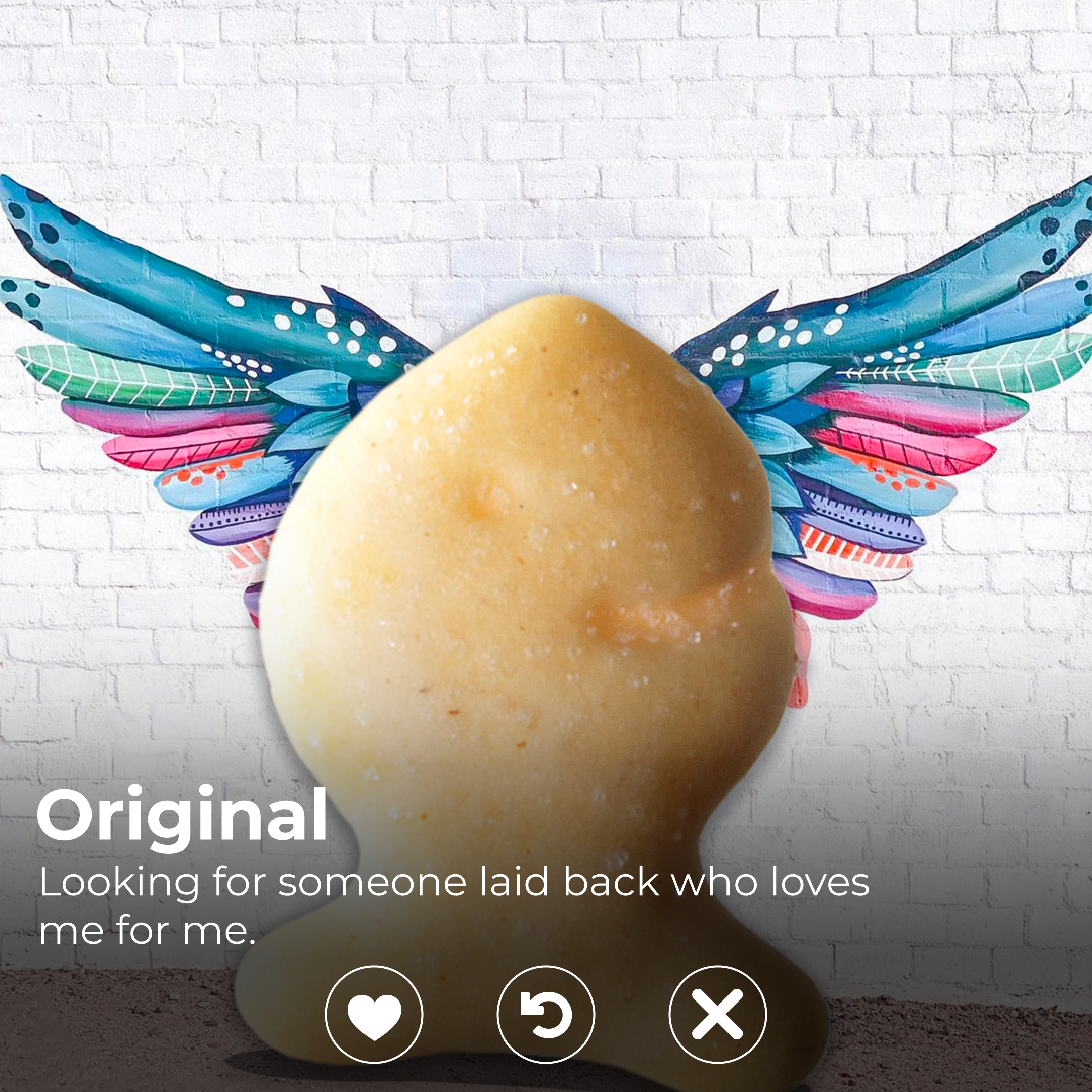
T-Mobile’s 2023 Post-Holiday
Reset
Un-Holidazzling T-Mobile’s stores
Timeframe: September-December 2022
Collaborated with: Ryan Harvey (Design Director), Nicolae White (Copywriter)
Roles:
- Graphic Designer
Objective
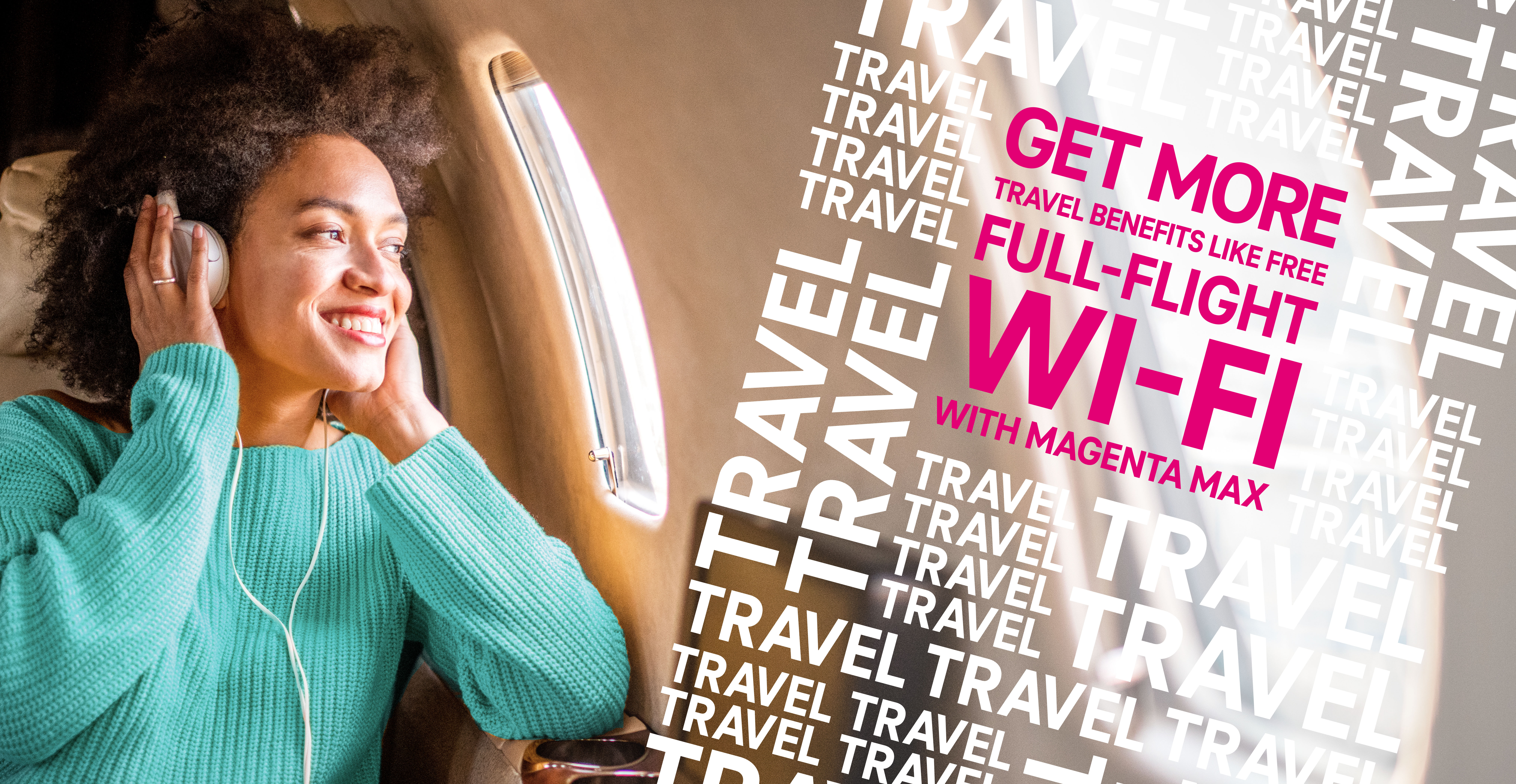
Following T-Mobile’s annual holiday treatment to their stores, they asked for a fresher take on what would normally be seen as a “default” state for their stores. The client had asked for an approach that prioritized value and benefits messaging, and adhering to the T-Mobile brand’s visual guidelines (utilizing the square shape in the logo, magenta, and a focus on the perspective being that of the customer—capturing the scene as if it was from their eyes/phone).

Process
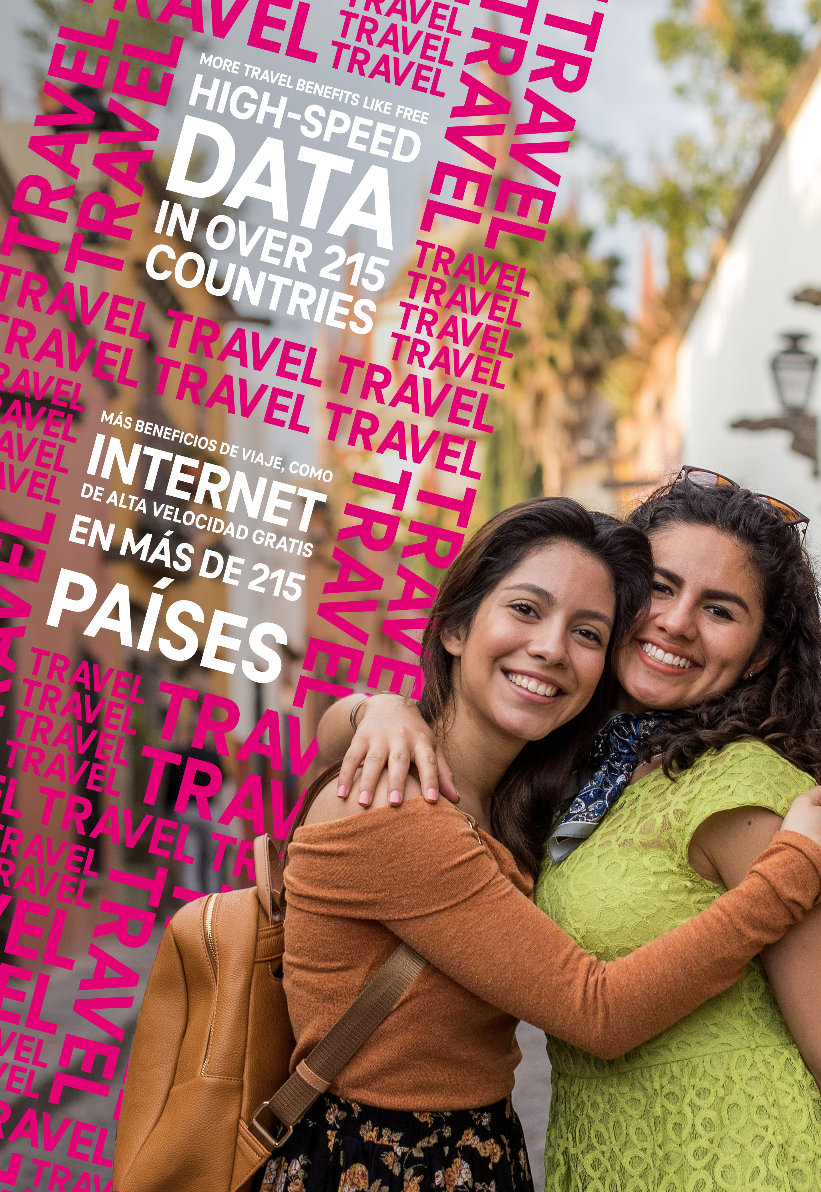
Prioritizing T-Mobile’s needs and how to adhere to their brand vision, I knew I had a limited color palette of white, black, and magenta (100% M of course) and needed to incorporate photography that focused on family and travel. Type repetition had been used frequently over the past campaigns, and I wanted to develop something more visually compelling.
Using the main benefit as a textural pattern, I used it to frame the headline, while still keeping the frame clear for the talent to engage with the audience.
All in all, about 10 patterns in white, magenta, and a magenta outline were developed to frame 8 different value headlines.
The headlines and patterns were all tilted 15º to the right, which came up as the best balance between visual interest, tension, and legibility.
Fun fact: I had to build most of the patterns in every/any color besides magenta, because I couldn’t tell if I would go blind or crazy first, due to an overwhelming surplus of magenta.

All patterns, headlines, and rules on placement and scaling were collated into a visual design guide provided to the production team who were absolute heroes, and created over 400 (!!!) different deliverables across over 6700 stores.
 Winning concept for the pitch to client
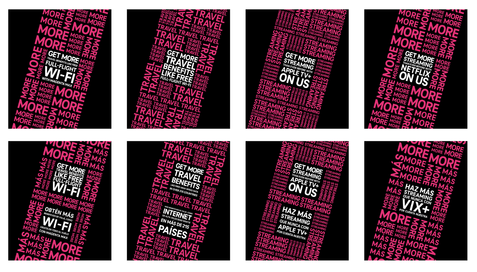
8 patterns in the visual design guide
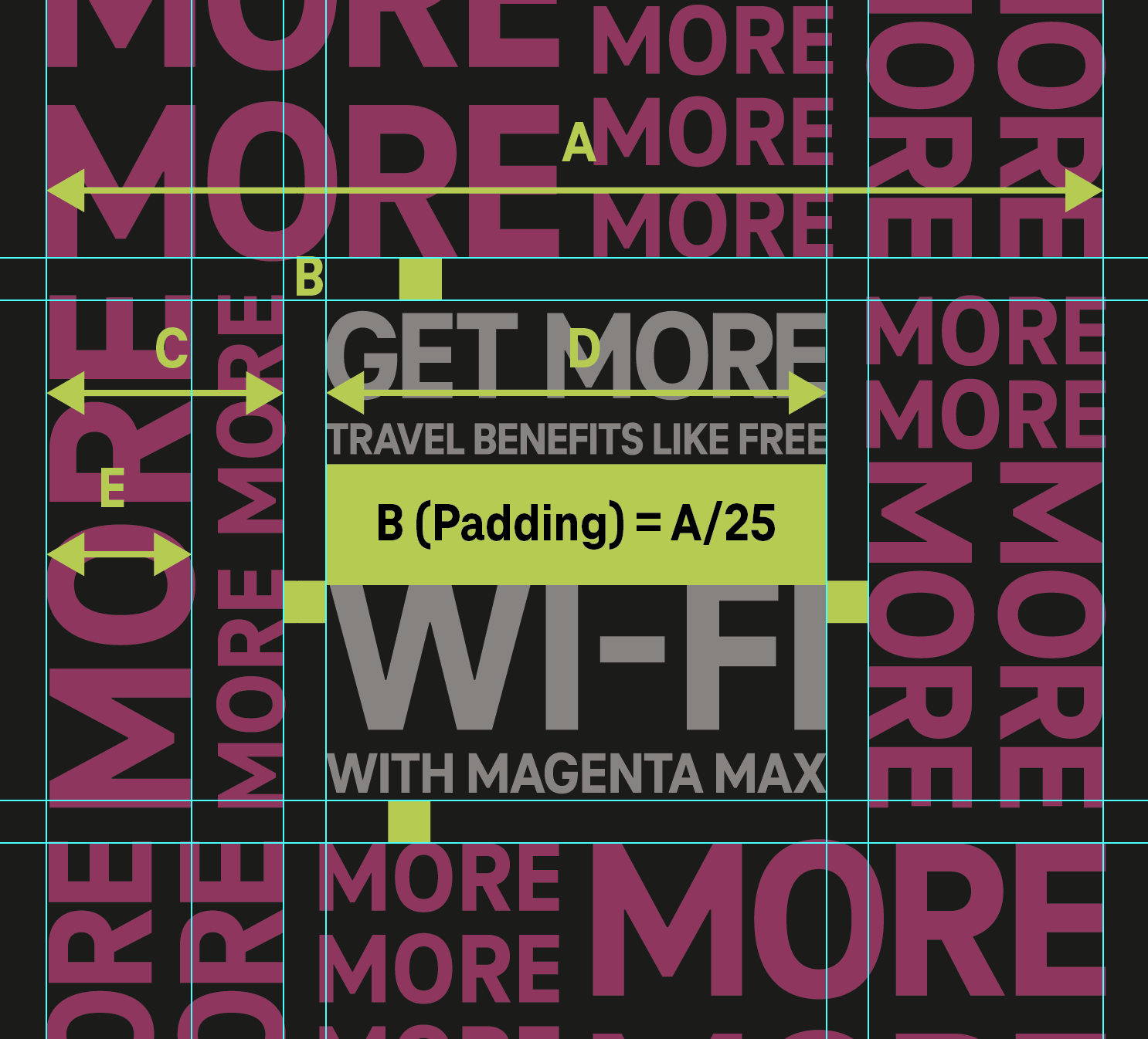 Excerpt from visual guidelines
An obstacle that had not presented itself to us immediately (our agency had just been awarded the fleet stores and this was a new territory for all) was that 200+ of the 6700ish stores would have all signage and graphics in both english and spanish. Learning that for most of the deliverables it would need to be a bilingual approach, I had to find a way to keep the same visual approach, but allowing for both languages to be displayed as equal as possible.
We referred to this internally as “the colon” which was to create another hole on the pattern to stack the headlines, hence a “:” shape.
Additional challenges were adapting non-mural sized, wayfinding, and less photo reliant signage to a complimentary visual style. This was done by applying that 15º angle to other elements, and finding more opportunities to use a texture and repeating pattern.

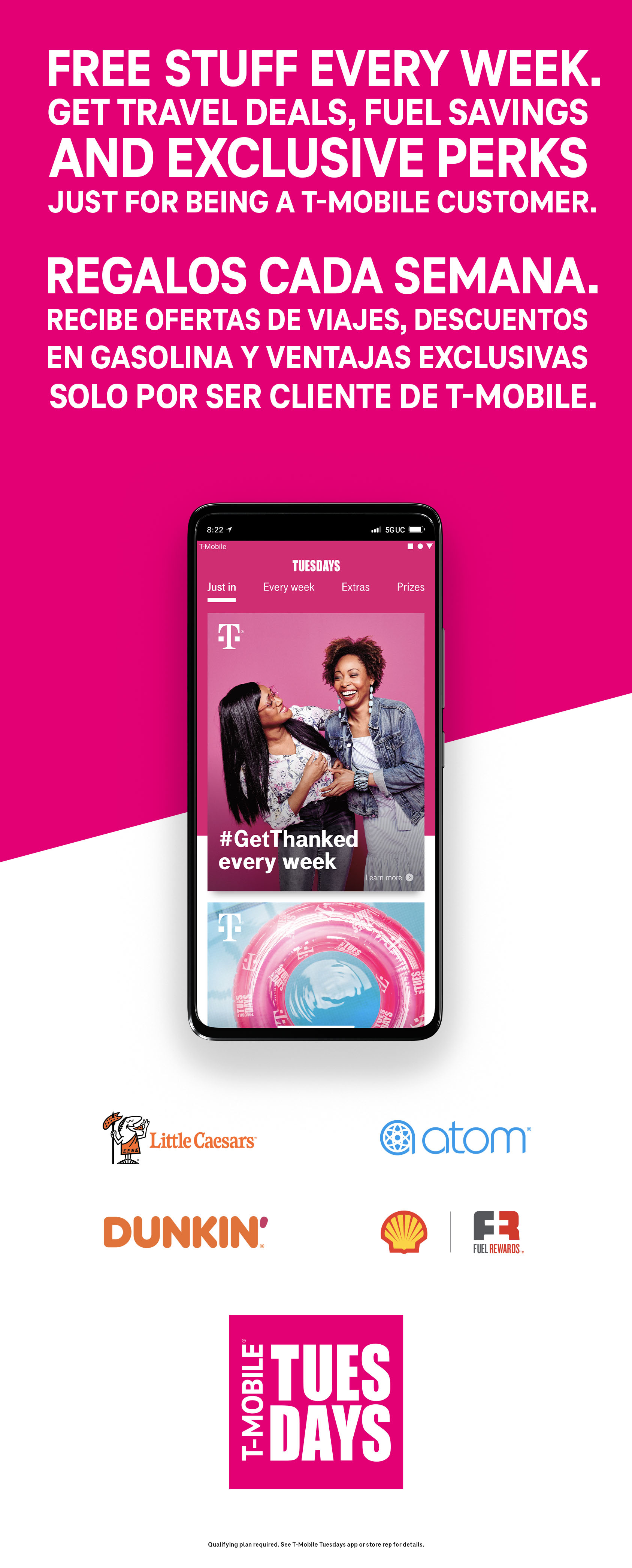
 English only layout
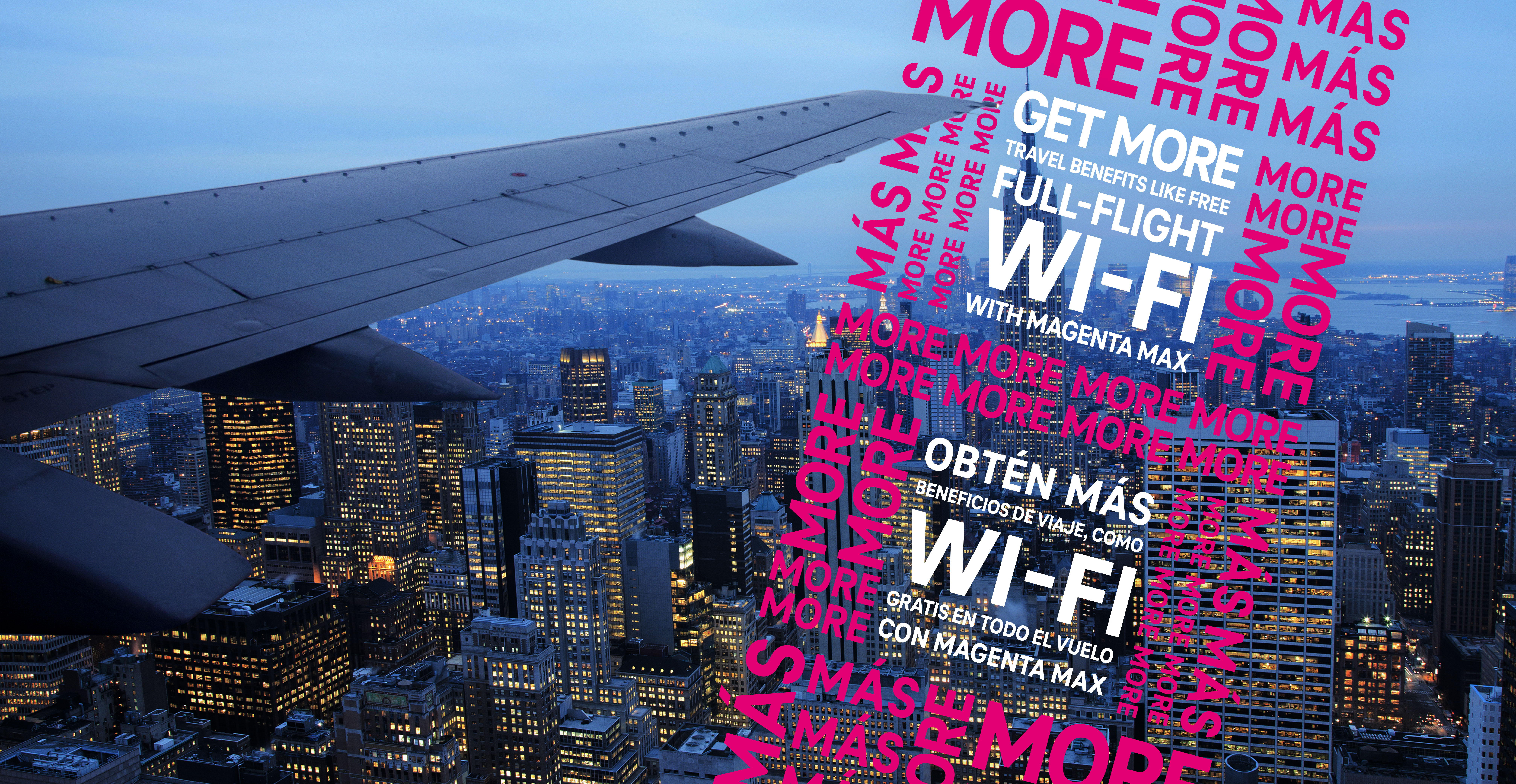 Bilingual layout
KEXP Summer Drive
Summer One-Day Fundraiser
Timeframe: May-June 2021
Collaborated with: Michelle Billings (Design Director)
Roles:
- Graphic Designer
- Illustration
- Production
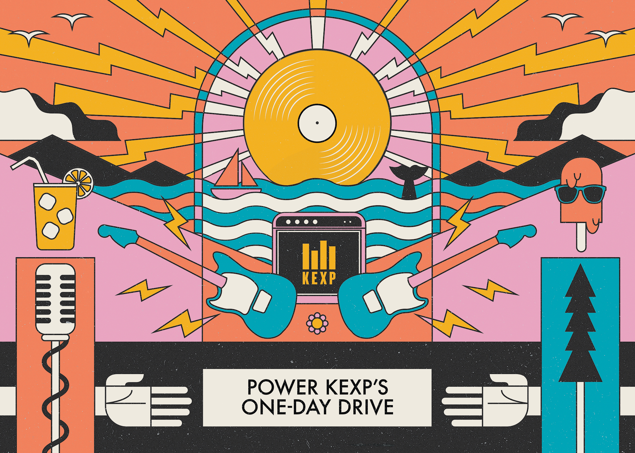
Postcard front for drive announcement
KEXP is almost entirely funded by listener donations, and has four(ish) drives a year. The 2021 Summer drive was based off of a postcard design I made as a reminder card for existing donors to continue their monthly donations/membership.
The reminder card was from a request for something geometric, vintage looking, and maybe a little agit-prop inspired—with all the elements that make up KEXP included. We went through some old posters and found some styles we liked and found a palette we could add the KEXP gold into. The “golden record” as a sun (it’s also a space reference btw—they love space) along with coffee, nature, and music equipment.
The reminder card was from a request for something geometric, vintage looking, and maybe a little agit-prop inspired—with all the elements that make up KEXP included. We went through some old posters and found some styles we liked and found a palette we could add the KEXP gold into. The “golden record” as a sun (it’s also a space reference btw—they love space) along with coffee, nature, and music equipment.
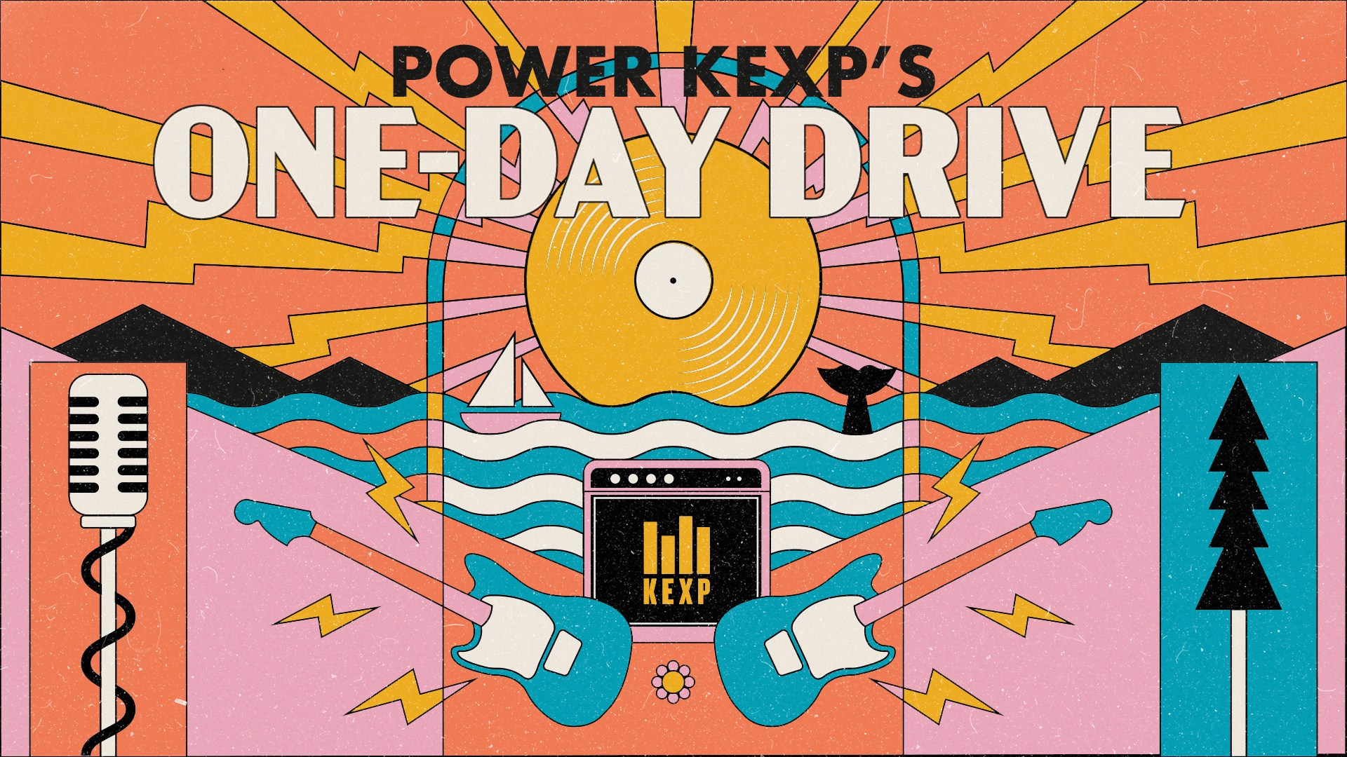
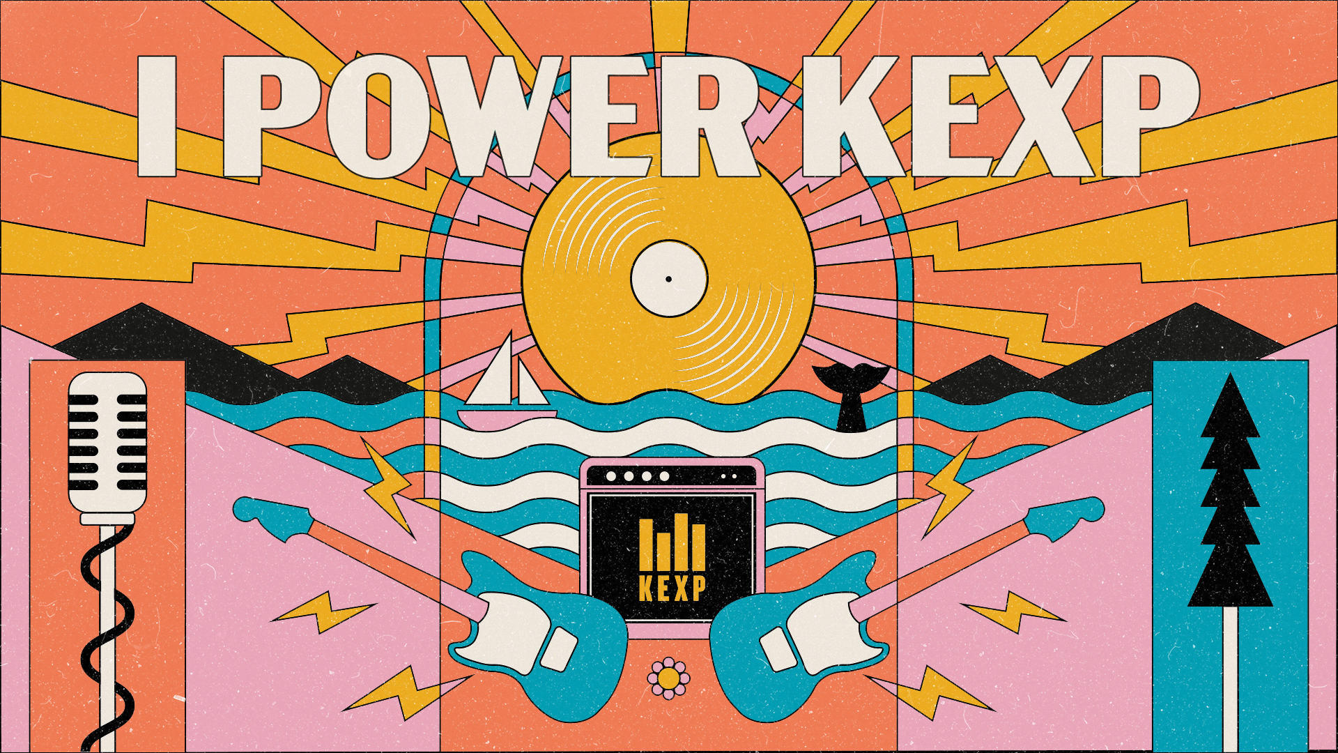
Two variations for social media
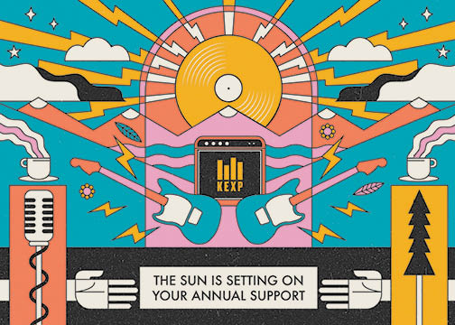
Initial postcard made for a spring-time reminder message

Large social media header (for end of drive Thank You)
To make it into the summer drive, we did a rotation of the same color palette, and changed some of the elements into a more summery/warm theme. For the record, just between you and me—I don’t know why a popsicle with sunglasses made the cut, but a hotdog with sunglasses didn’t. Anyways, for the end of drive thank you messaging, I felt that having the sun/record setting behind the water and mountains would be a nice way to show a bit of sentimentality in the end. This also required another color rotation to make it look more like a sunset.
The only swag item for this drive was their request for a tote bag that was supposed to look as “publicly funded media as possible” (boring) and emphasized to pick a font that’s probably default on MS Word. It was a huge hit and all were snatched up within hours.
This ended up being KEXP’s most successful fundraising to date.
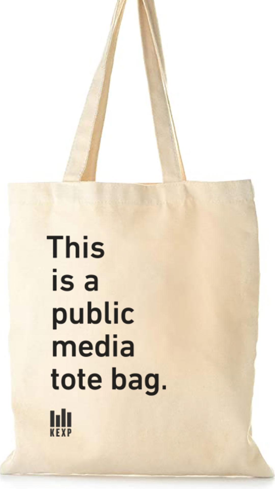
The ever-popular KEXP tote

Mobile Splash-page


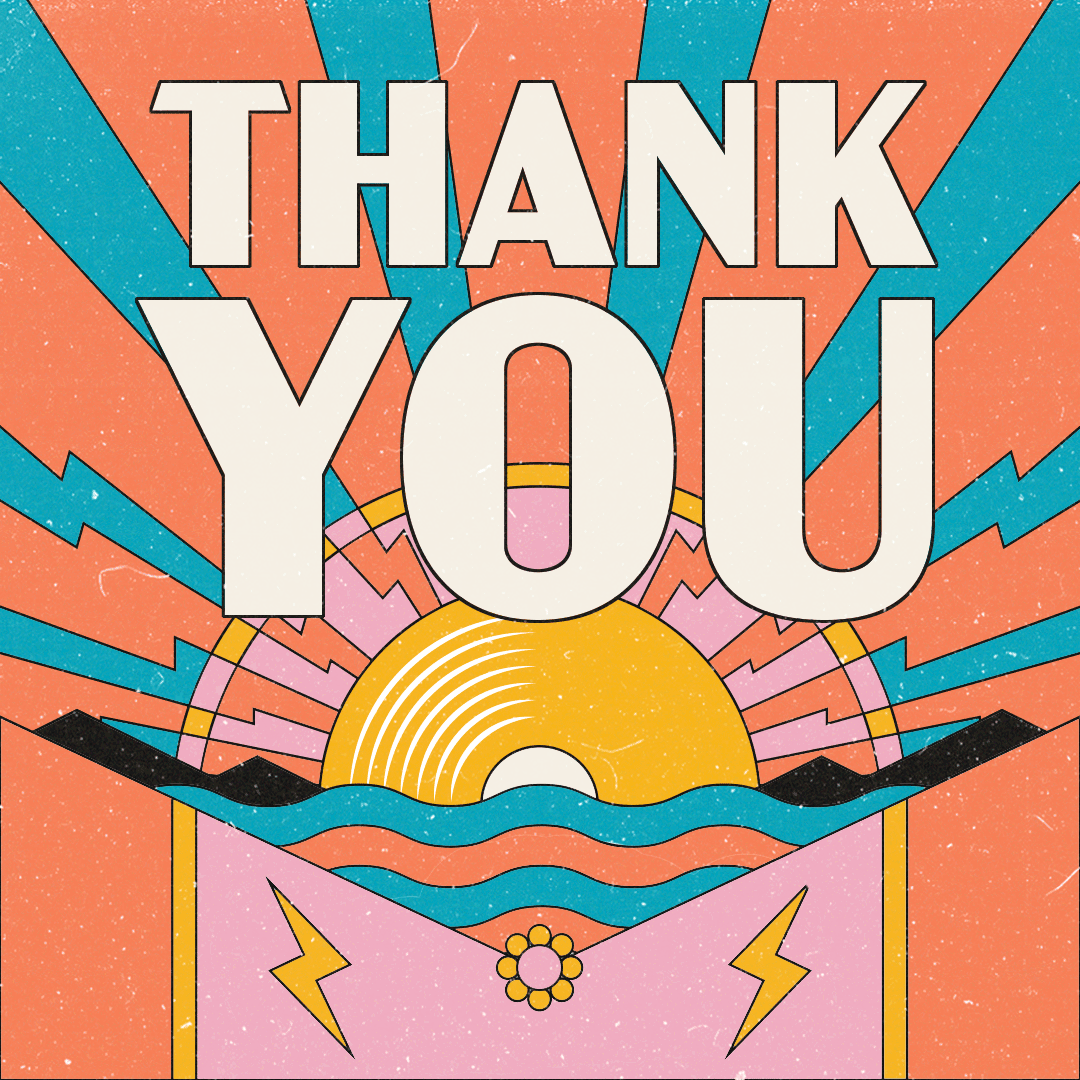
KEXP Fall Drive
Annual Fall Week-long Fundraiser
Timeframe: August-October 2021
Collaborated with: Michelle Billings (Design Director)
Roles:
- Graphic Designer
- Illustration
- Production

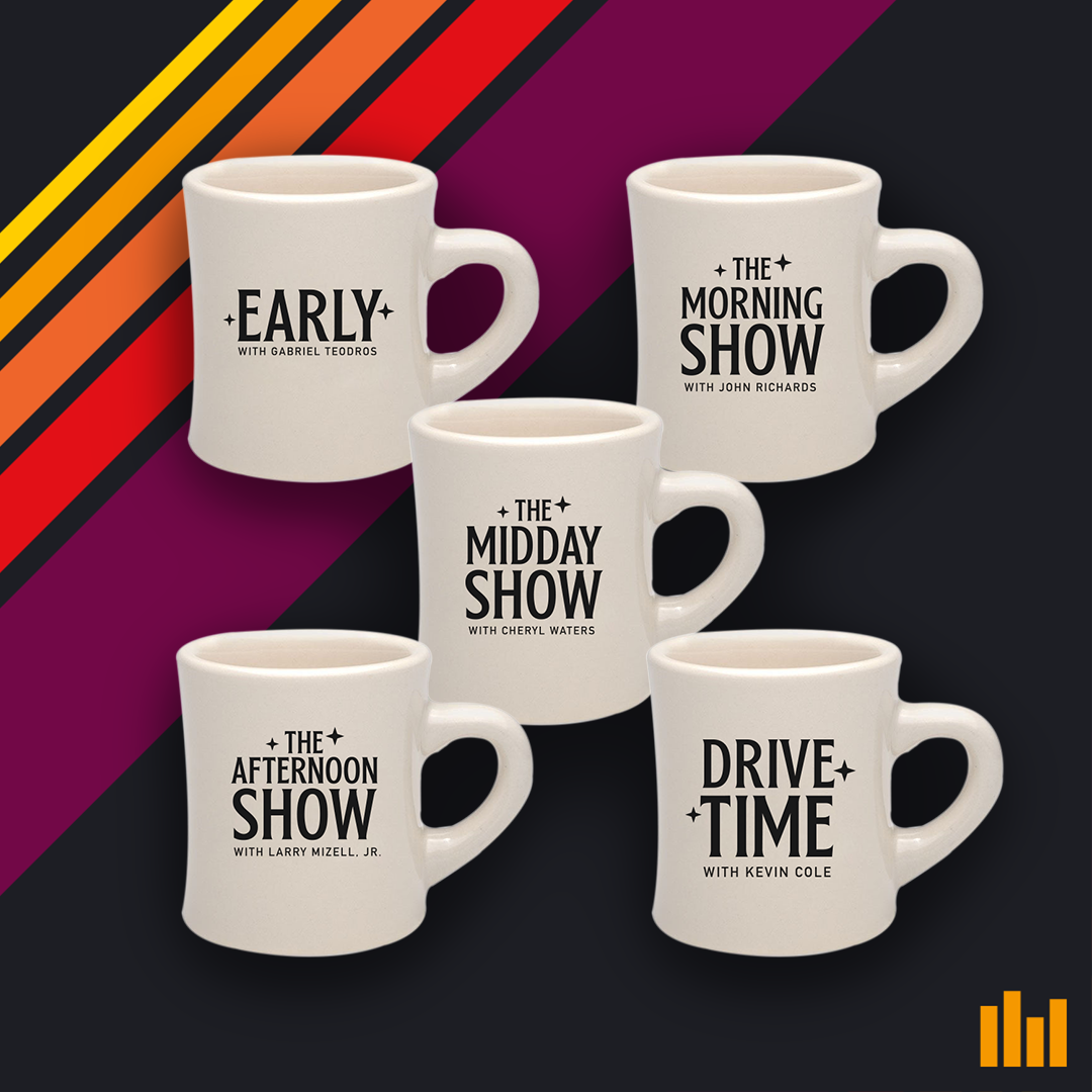 A mug for every daytime show
With their show’s tagline on back
 So much swag/giveaways!
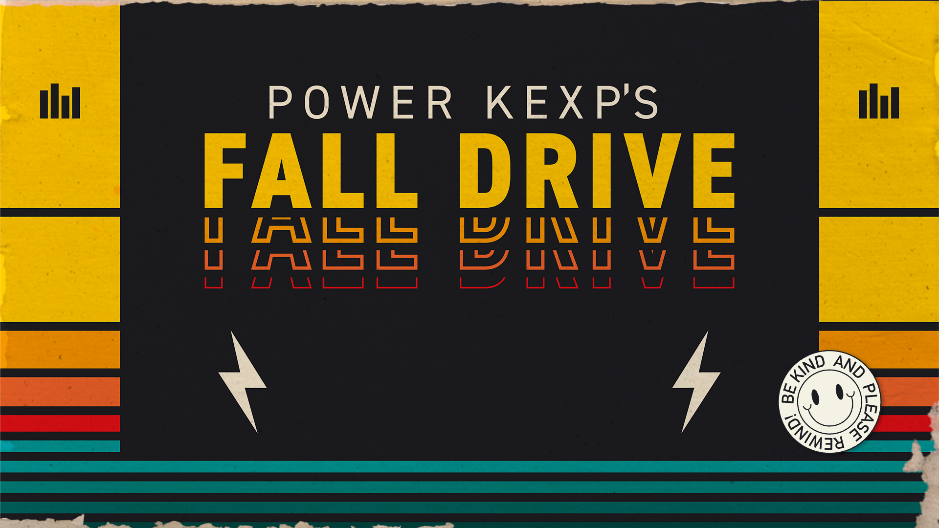
We started the Fall Drive in August working on the t-shirt that was a piece of the supporting swag. This was a very swag heavy drive, by the way! They wanted a type focused design that could be evergreen as well. The goal was for the shirt design to lead the rest of the drive’s direction, but mid process we were given new direction to make it “inspired by 80’s cassette and vhs tapes.” We eventually found a balance between the Amplifier Love Day type style (see below), and tape covers, and brought that to fruition.
There was a bit of simpliciation involved as my concept with the distressed cardboard cover was too much for the time frame involved, and eventually replaced the teal with a purple to warm up the palette.
There was a bit of simpliciation involved as my concept with the distressed cardboard cover was too much for the time frame involved, and eventually replaced the teal with a purple to warm up the palette.
 Concept art that was reduced to a simpler style for final execution
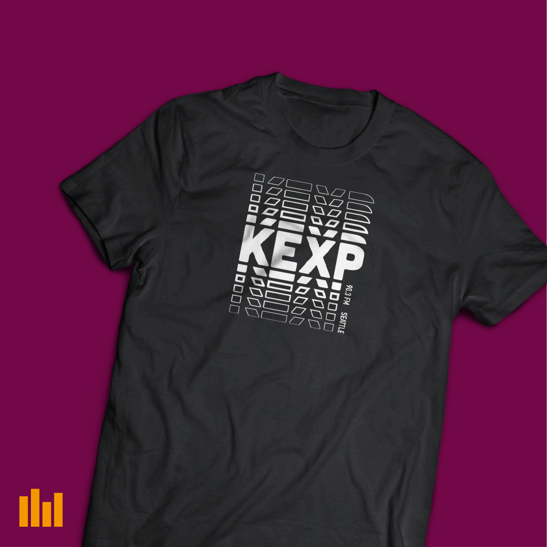 Final t-shirt design
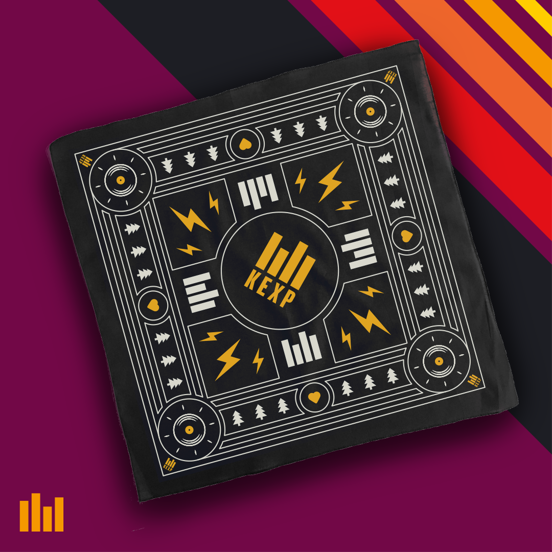
As this was a swag heavy drive, in addition to the t-shirt, there were also five mugs (one for each daytime show) with the show title and slogan, a bandana, a beanie (much requested), a sling bag. The latter two were just logo slaps, but I needed to make them look real for the donors, as the product was yet to have been ordered.
Amplifier Love Day
One-Day Drive/Appreciation day for monthly donors
Timeframe: July 2021
Collaborated with: Michelle Billings (Design Director)
Roles:
- Graphic Designer
- Illustration
- Production
- Animation
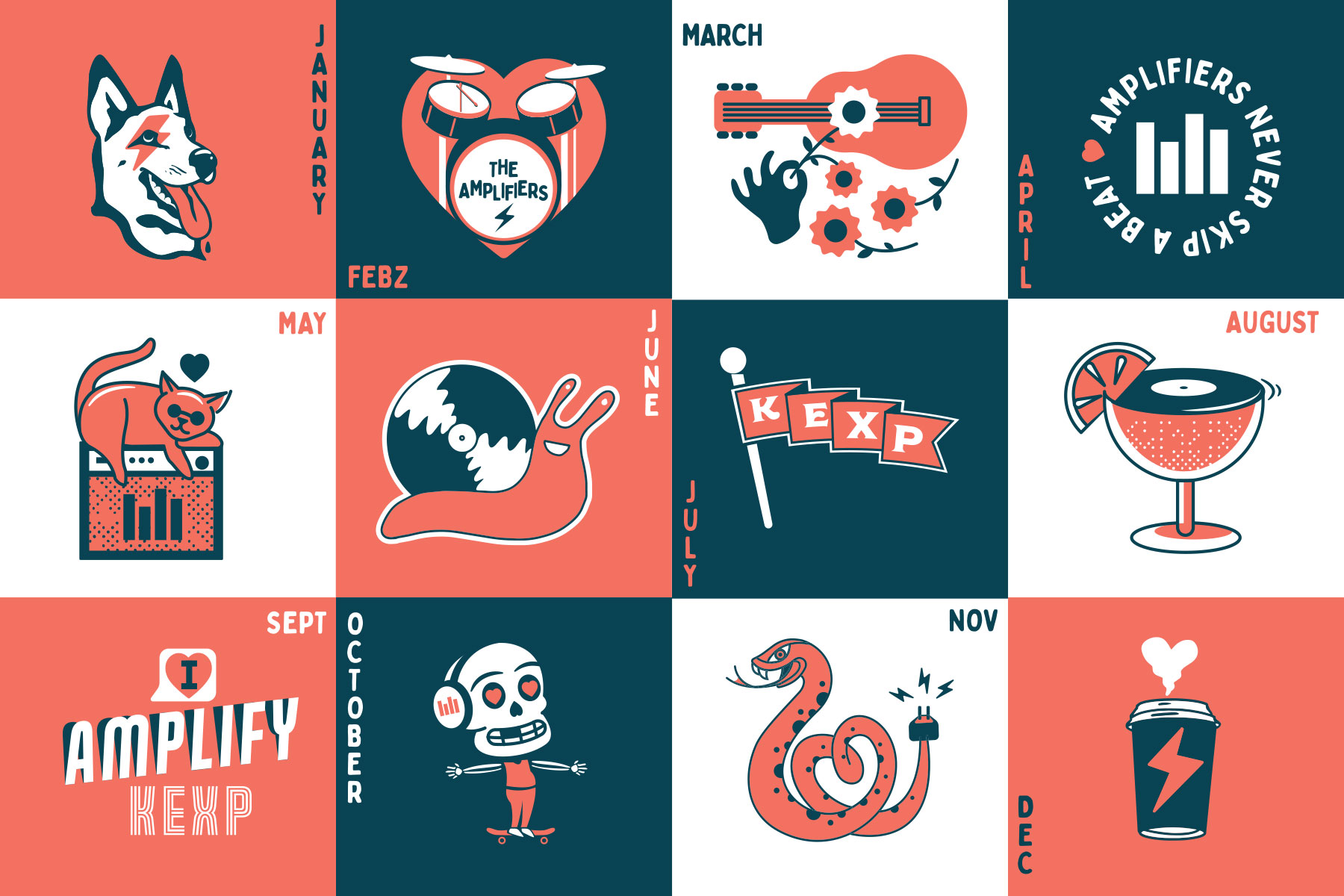
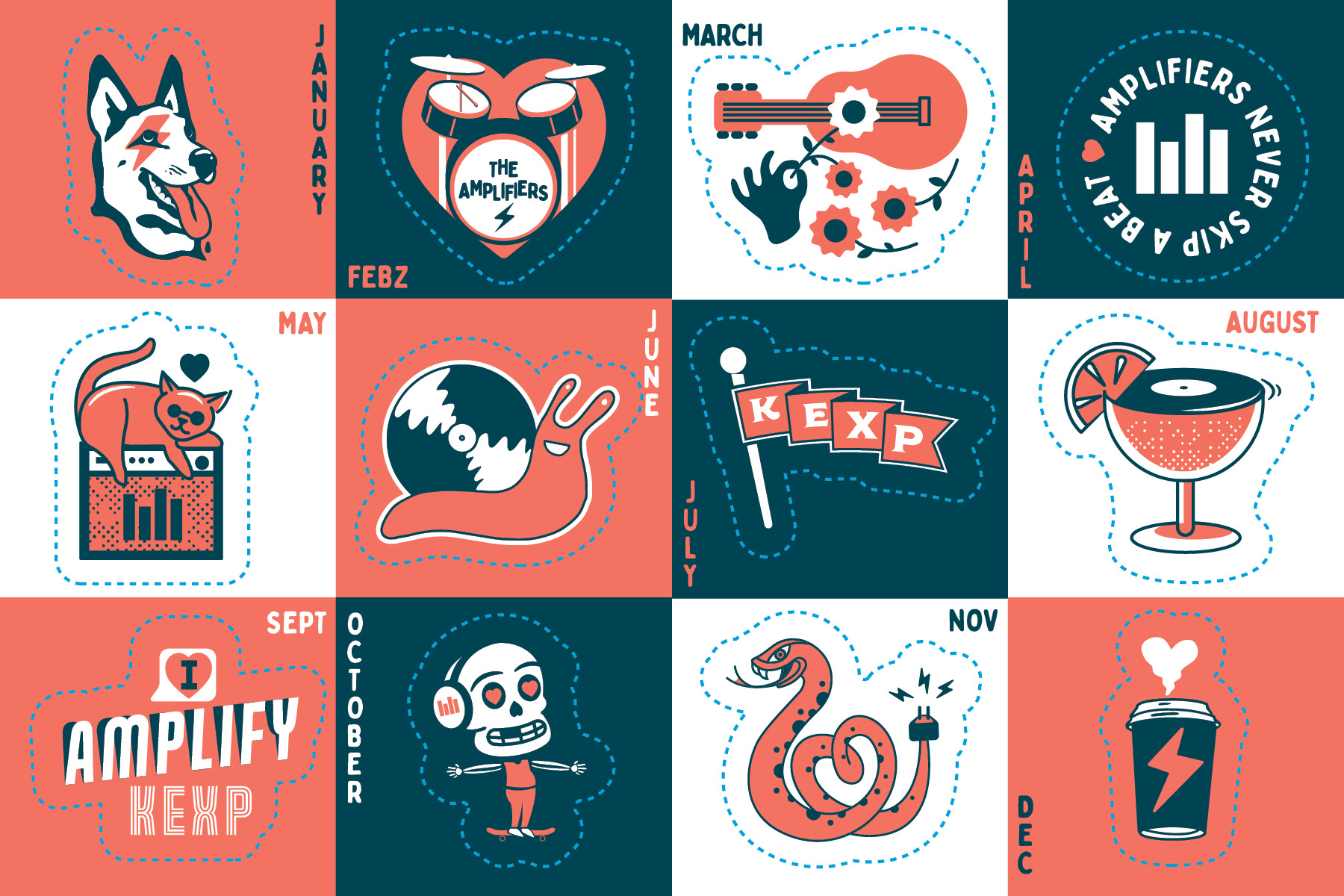
This was a two part project, the initial part was creating a sticker-postcard. The ask was for something like a calendar, and they wanted 12 stickers on a 5”7” card. Michelle and I basically just went to town making a ton of illustrations with the concept of “Amplifiers help us keep a beat.” We tried a couple iterations of things that suggest or rhymed with beat, along with some seasonal images. The end product was kind of a grab bag of the client’s favorite drawings we made, that I layed out and scaled to look as much like a calendar as possible.
Part 2 was making a logo and style lockup to suggest beating. I added in some motion to the logo and lockup, feeling that the “Amplifiers” should actually amplify, and the heart should have some sort of beating to it. They hadn’t had anything animated for social usage for a while so were delighted to have a little bit of motion to post on their Instagram.
Part 2 was making a logo and style lockup to suggest beating. I added in some motion to the logo and lockup, feeling that the “Amplifiers” should actually amplify, and the heart should have some sort of beating to it. They hadn’t had anything animated for social usage for a while so were delighted to have a little bit of motion to post on their Instagram.
 Social media announcement
Dielines!
Miscellania
Just a collection of various illustrations from drawing challenges, stickers I’ve made, and just whatever other fun stuff I make in my own time. It’s fun, I promise.
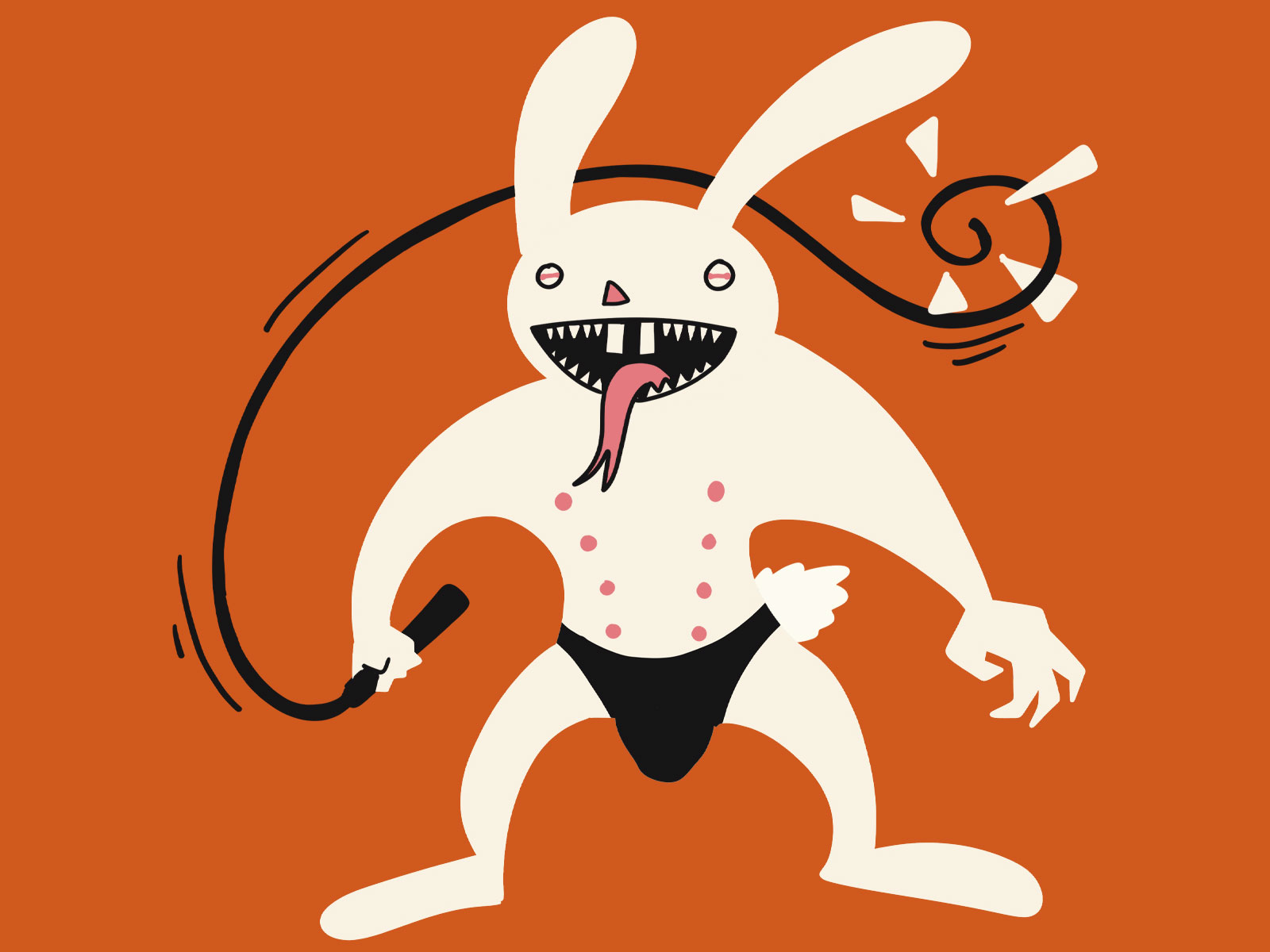
“Hellbunny” prompt from a Halloween/October drawing challenge.

My contribution for the alumni poster show to celebrate Seattle Central Creative Academy’s 75th year of existence. Our prompt was just what part of school struck us as the most memorable.
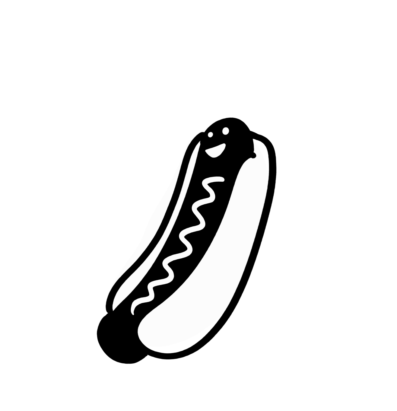
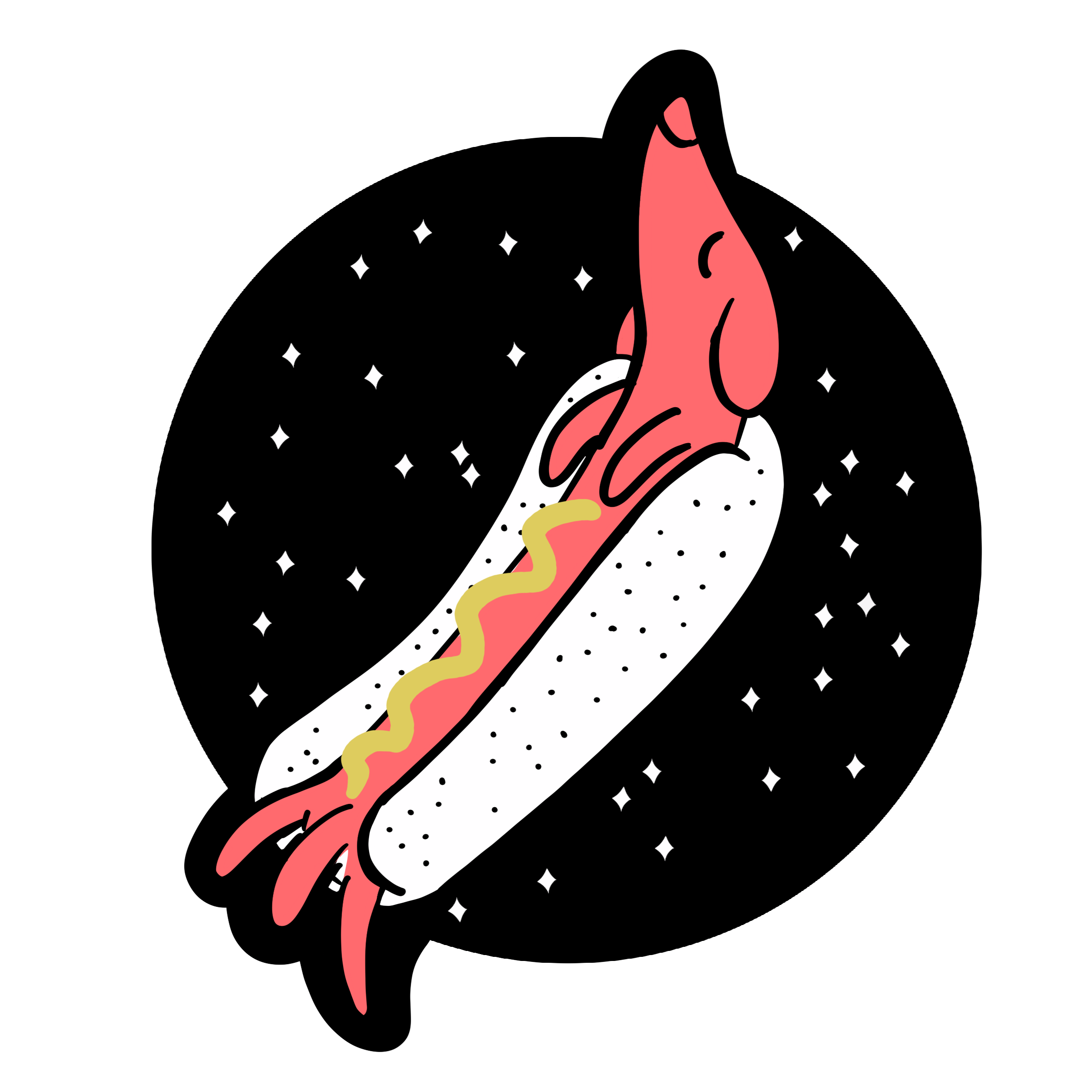
While for many folks it was the friends we made along the way, I was not alone in remembering Jason Hoppe (our Adobe Suite instructor) telling us to “hot dog” the ends of our strokes.
While for many folks it was the friends we made along the way, I was not alone in remembering Jason Hoppe (our Adobe Suite instructor) telling us to “hot dog” the ends of our strokes.
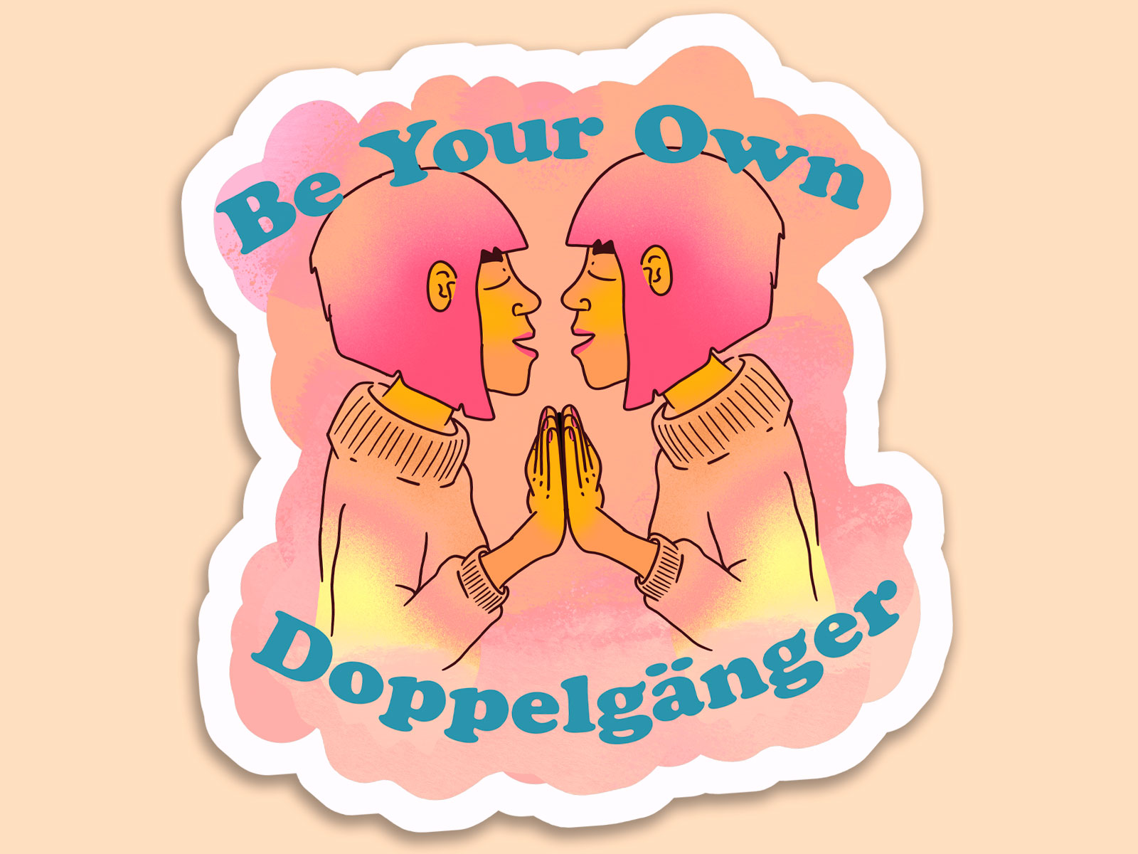
Various stickers I have made in the past couple years. I *try* to come up with a new sticker every month.
 I just wanted to make a positive feel good sticker
 This was inspired by a dream maybe?
 I misread some street art that said “you are *stronger* than you think”
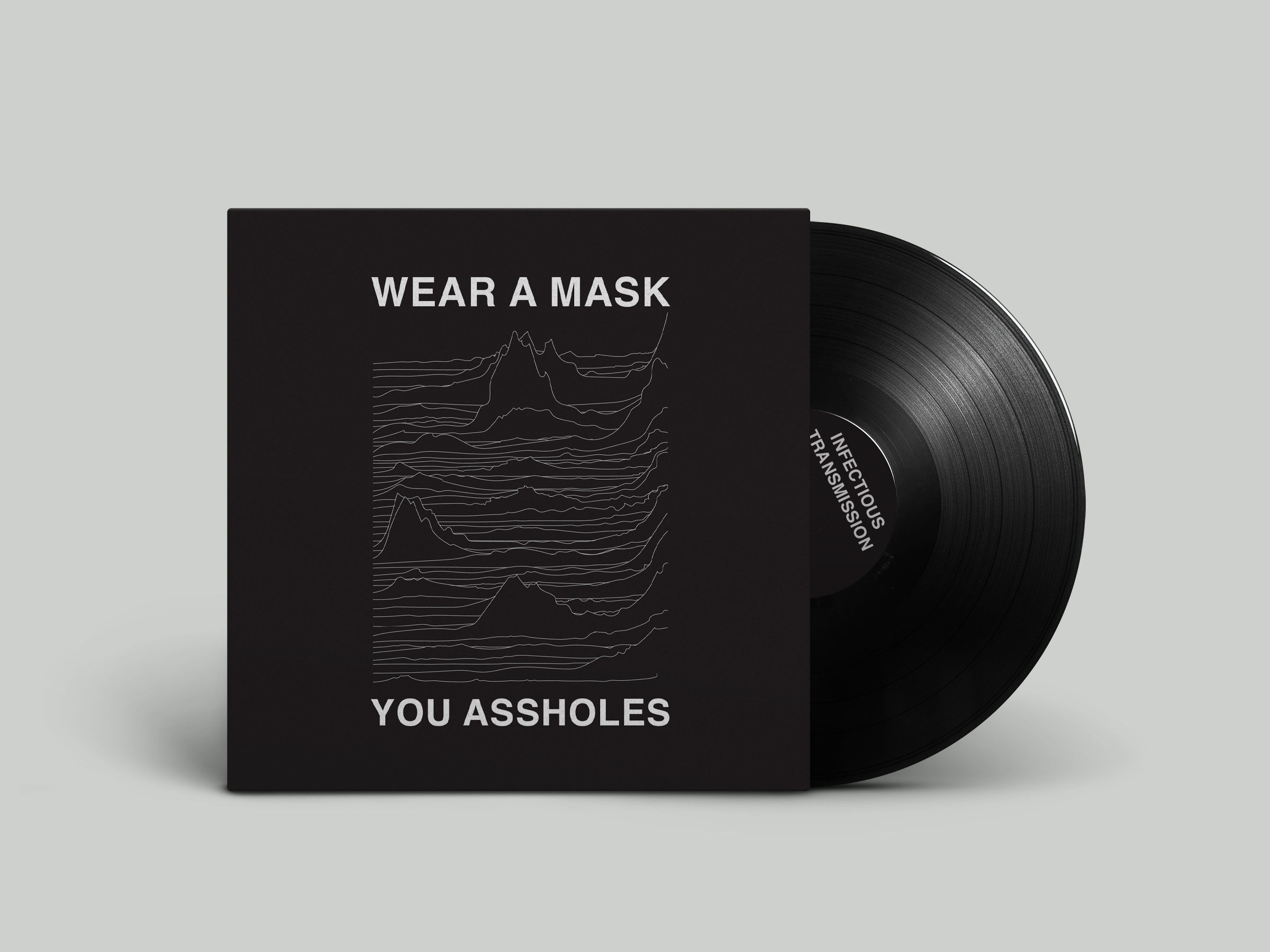
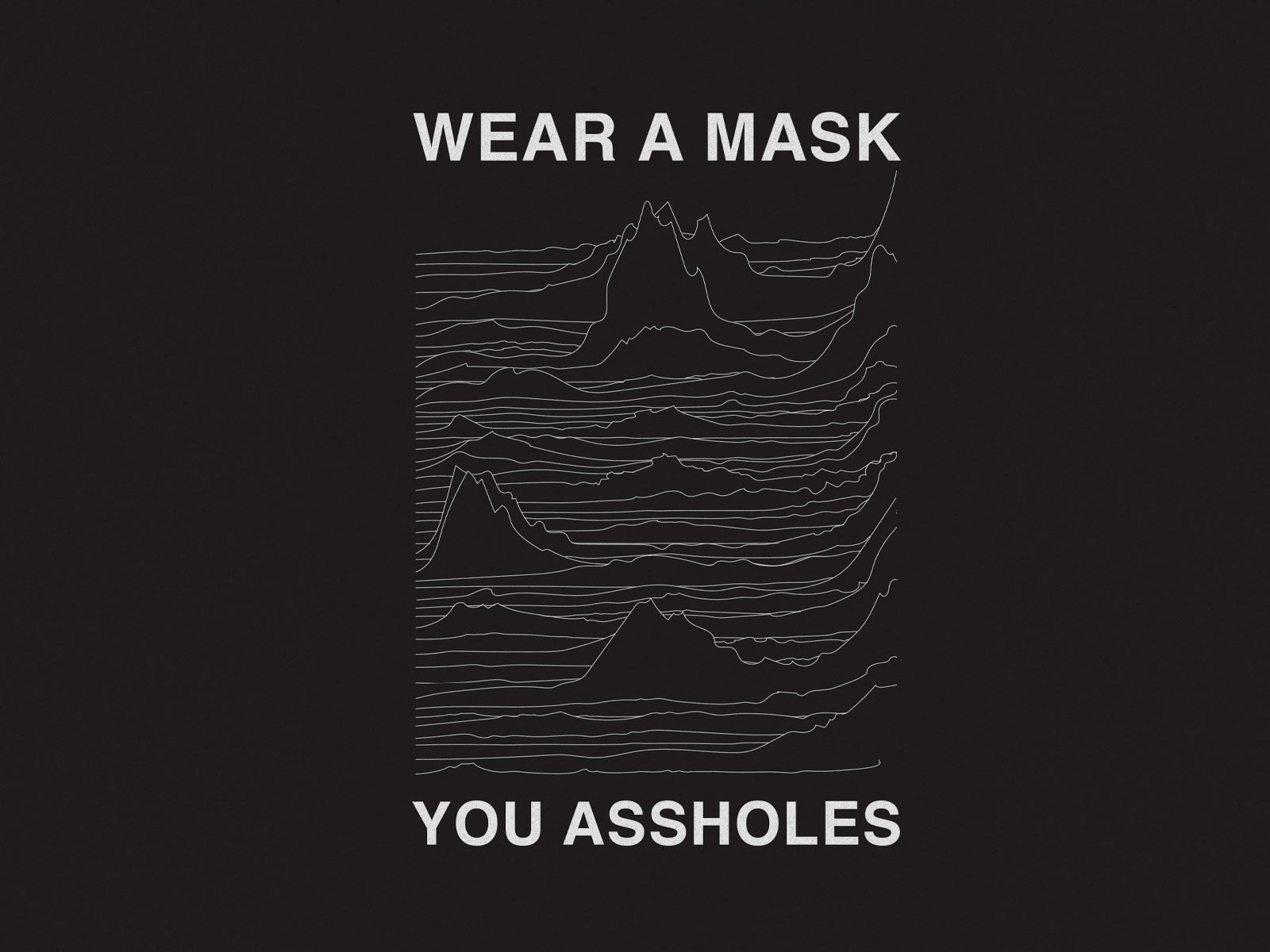

While doom-scrolling some pandemic news, I noticed that the graphs for case counts looked a lot like Joy Division’s ICONIC album cover for Unknown Pleasures (designed by Peter Saville). I took the weekly case average’s from the beginning of this pandemic to the end of November 2020 (the most recent data at the time) and compiled the graphs for all 50 US states descending alphabetically.
Fun Fact #1: This was from late 2020, this would have been MUCH more work to make today, unfortunately (this is more true everyday).
Fun Fact #2: I started selling this shirt on my Etsy for some passive income, and it got reported and sent me to Etsy jail 3 times. Not for copyright infringement, which I probably deserved, but because it offended someone,
Fun Fact #2: I started selling this shirt on my Etsy for some passive income, and it got reported and sent me to Etsy jail 3 times. Not for copyright infringement, which I probably deserved, but because it offended someone,
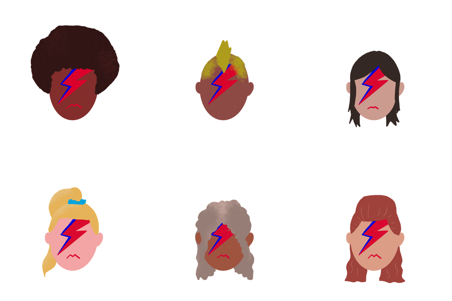
Be A Bowie
Little gif that is part of an internal identity system developed for a silo/division of the Publicis Groupe. One of the five core cultural values is “Be a Bowie”— be original, take a risk, create something new, and inspire others to collaborate.
Peloton Seattle
Peloton Seattle is a bike shop and café in the crossroads of Seattle’s First Hill and Central District neighborhoods.
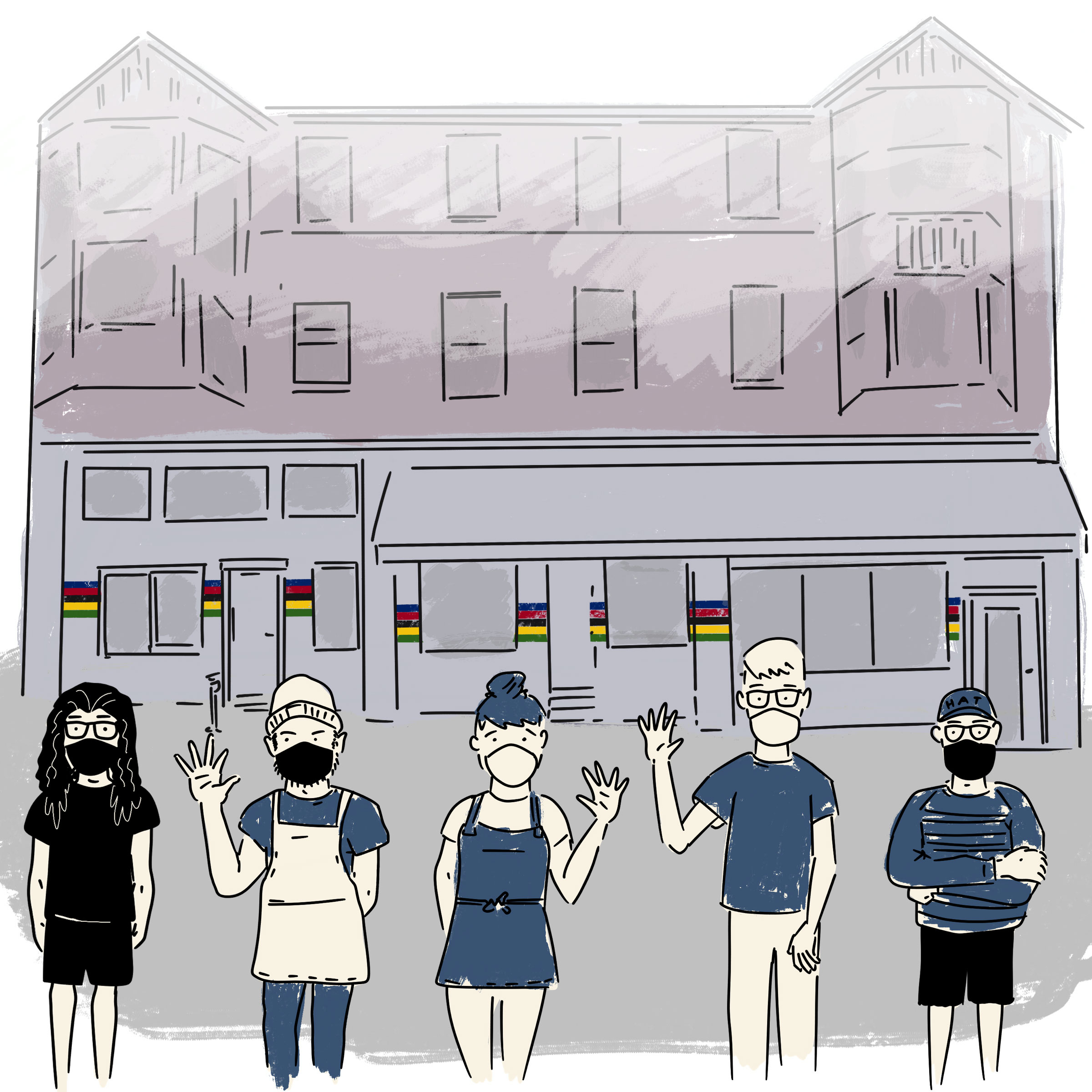
Illustration for their shop expansion announcement
(with their owners/staff in front of their future space)
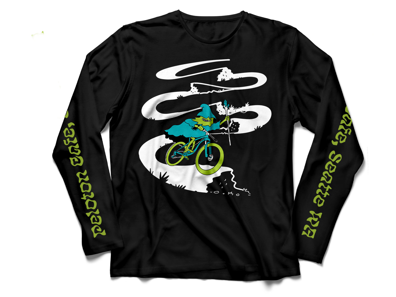
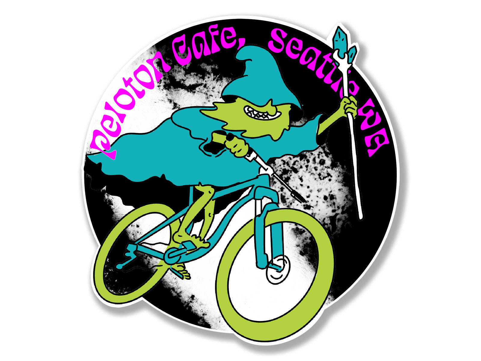
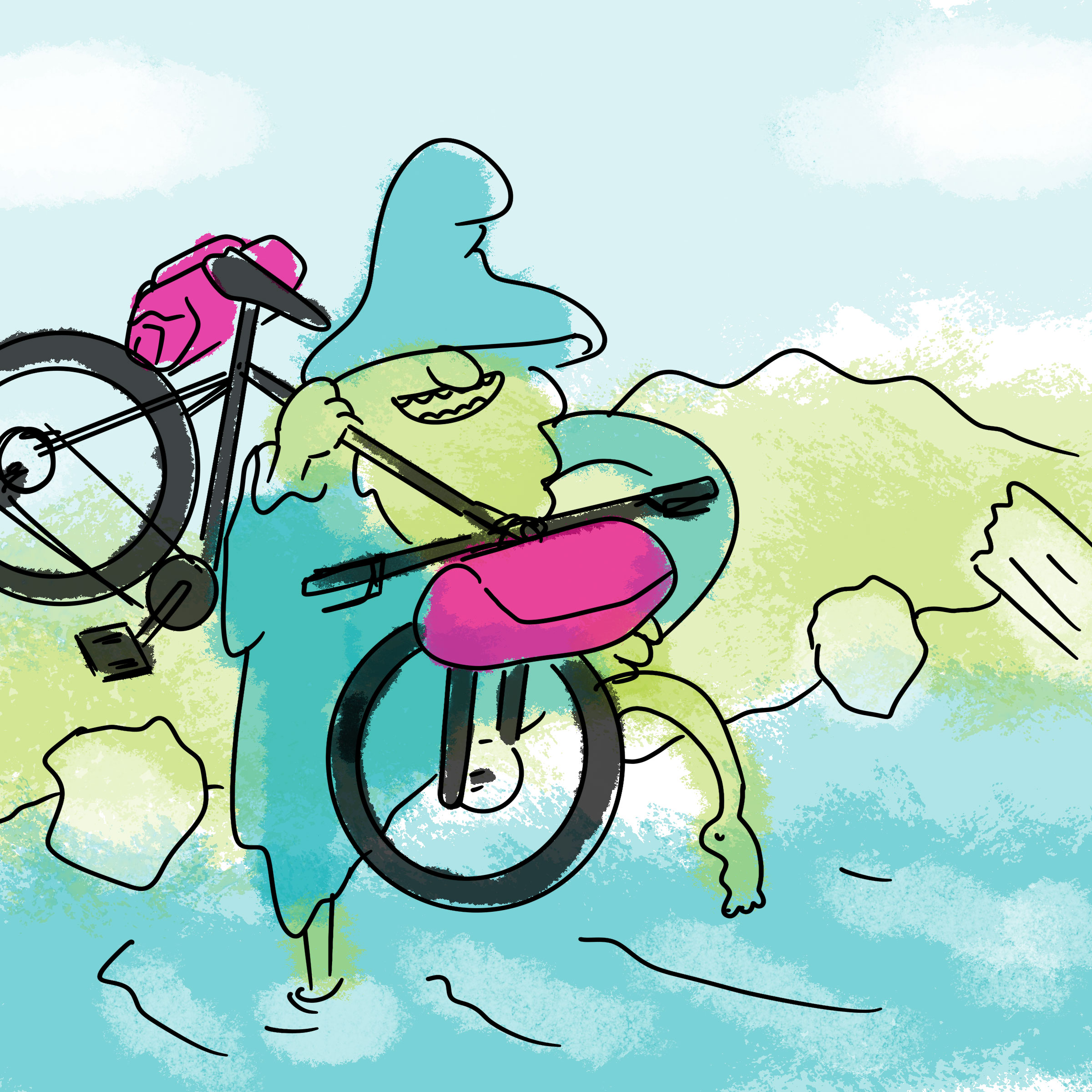
T-Shirt for Peloton’s 5th anniversary.
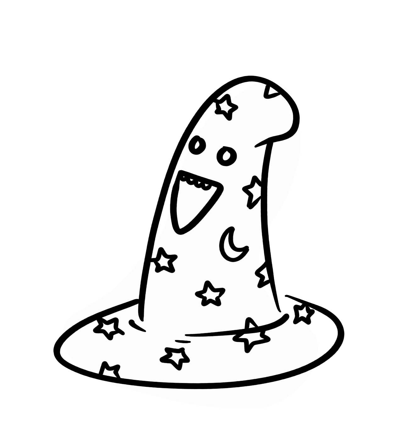
The ask was for a wizard (based on one from a halloween drawing challenge) on a mountain bike, going down 5 hills/jumps (one for each year). 2 colors+white, along with accompanying sticker.
The ask was for a wizard (based on one from a halloween drawing challenge) on a mountain bike, going down 5 hills/jumps (one for each year). 2 colors+white, along with accompanying sticker.
Peloton X Swift Industries
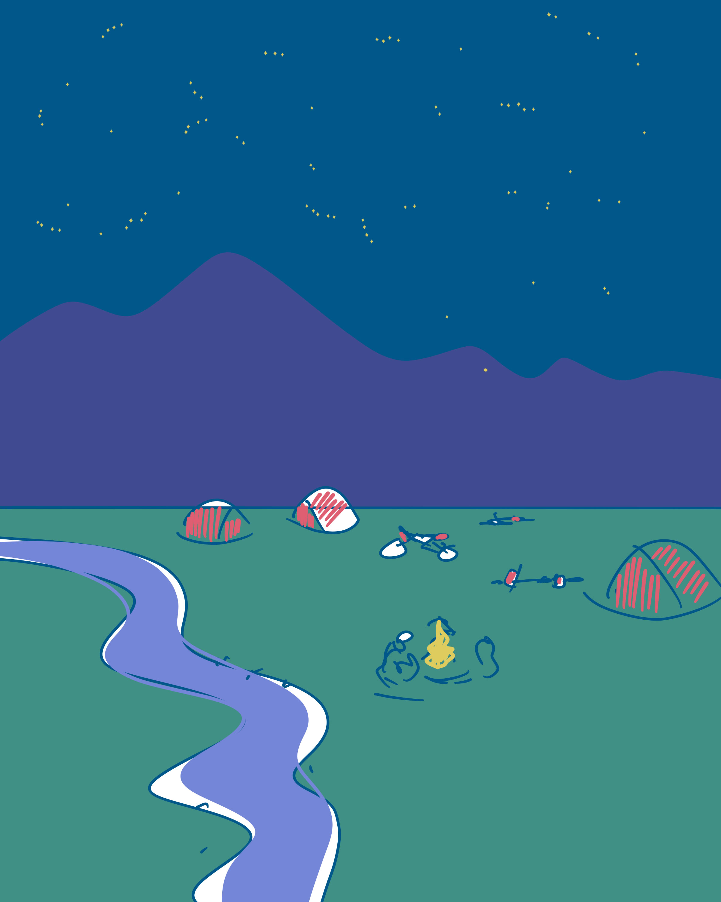
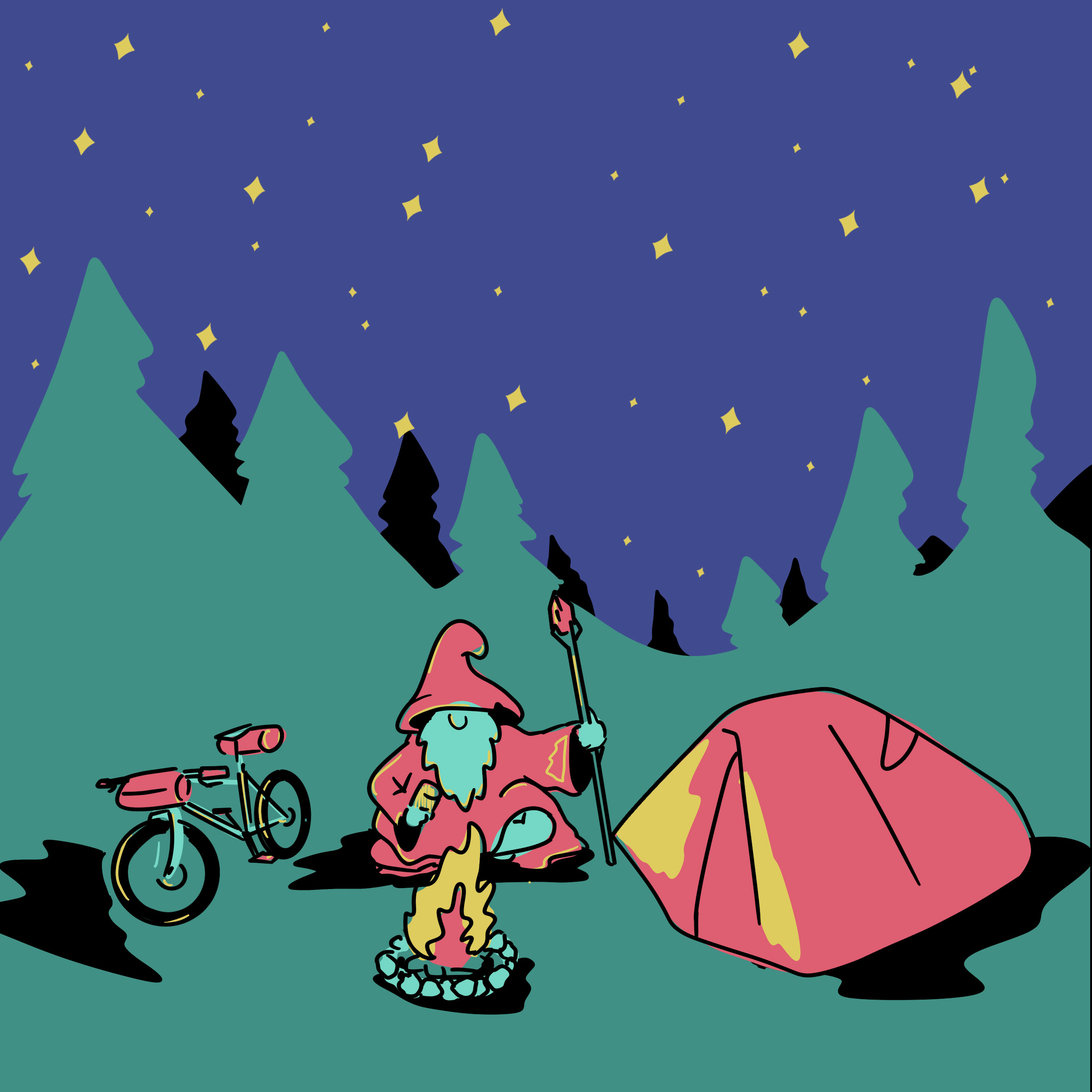
Coinciding with Peloton’s expansion, they collaborated with Swift Industries (a local cycling bag manufacturer) setting a Swift product wall in the dining area. I was asked to make an illustration for social media to announce the collaboration and support it’s opening. They additionally asked for usage of 4 of my concept sketches for ongoing event announcements.
Coinciding with Peloton’s expansion, they collaborated with Swift Industries (a local cycling bag manufacturer) setting a Swift product wall in the dining area. I was asked to make an illustration for social media to announce the collaboration and support it’s opening. They additionally asked for usage of 4 of my concept sketches for ongoing event announcements.
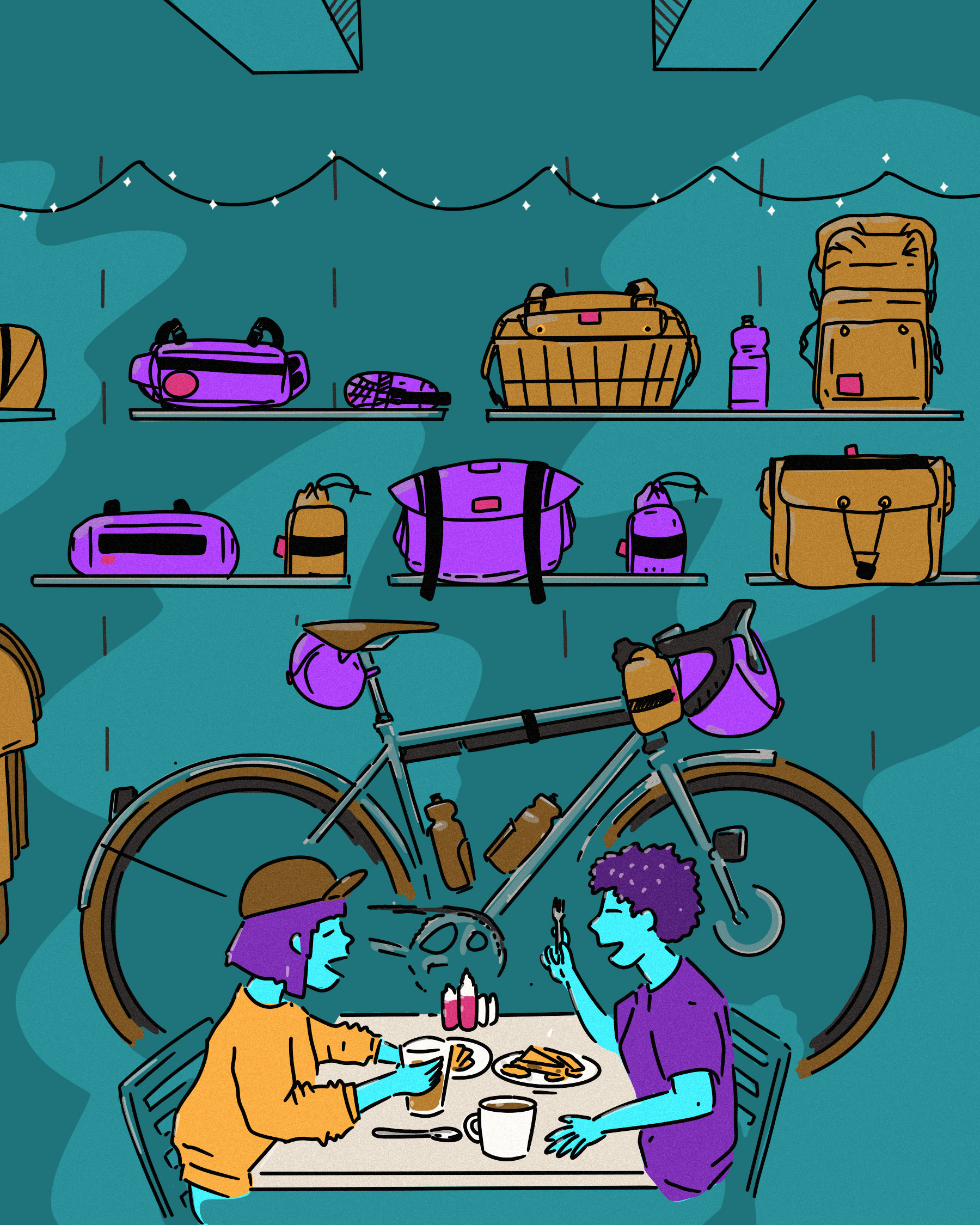
Final image for Instagram story post

A Farewell to Tacos
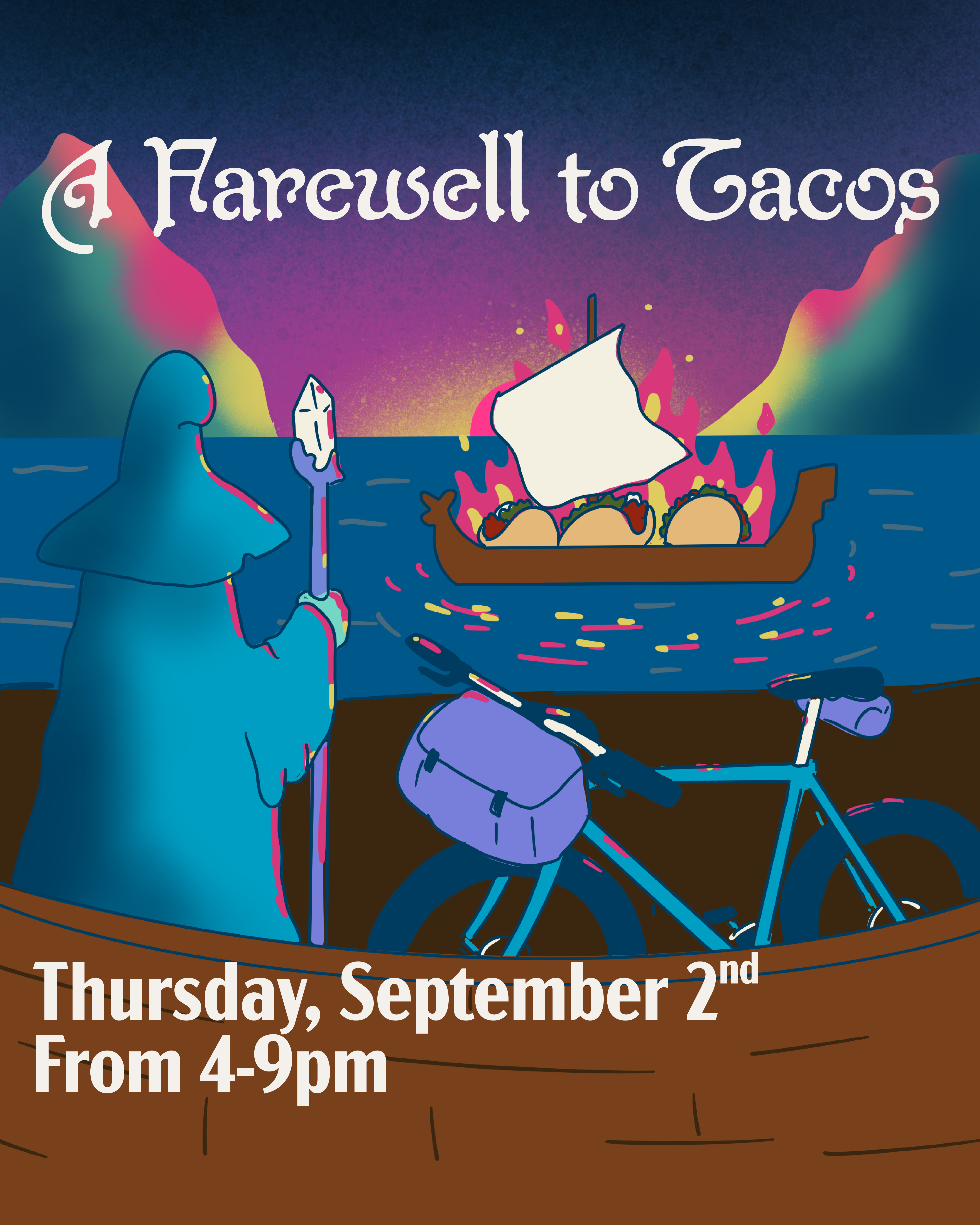
For several years Peleton had a weekly taco night, which was their biggest sales day of the week. But during *early* pandemic, it was suspended because...just everything. Once covid calmed down for a minute they had one-night, one last time, taco night, and wanted a special illustration for social to promote it.
For several years Peleton had a weekly taco night, which was their biggest sales day of the week. But during *early* pandemic, it was suspended because...just everything. Once covid calmed down for a minute they had one-night, one last time, taco night, and wanted a special illustration for social to promote it.
