UX/Illustration
Timeframe: November-December 2020
Team Member: Carol Camilleri (UX researcher and writer)
Roles:
Skills:
Free Range Cycles
A a client ask that started in socks, and ended up as a website.Timeframe: November-December 2020
Team Member: Carol Camilleri (UX researcher and writer)
Roles:
- Designer
- Illustrator
- Researcher
Skills:
- Design
- Adobe Illustrator
- Adobe Photoshop
- Figma
- Illustration
- Customer Research

Objective 1:
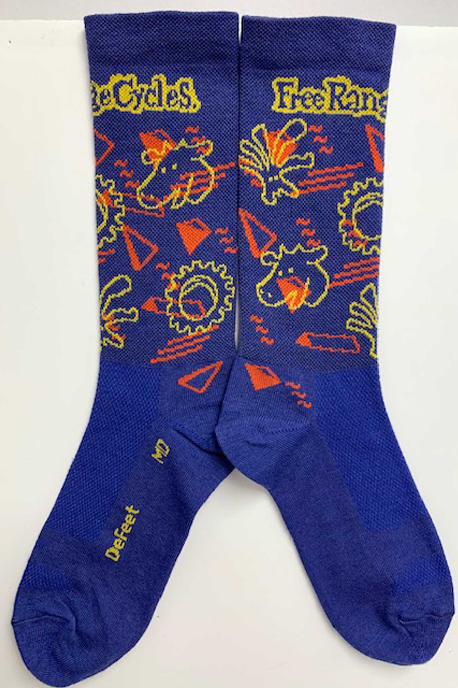
Design a matching cycling cap and sock setOk, for some background on this: This was the initial ask, just a set of socks and a cycling cap (it’s not called a hat) that matched. Nothing else!
Requirements:
• Must appeal to full spectrum of Free Range Customers
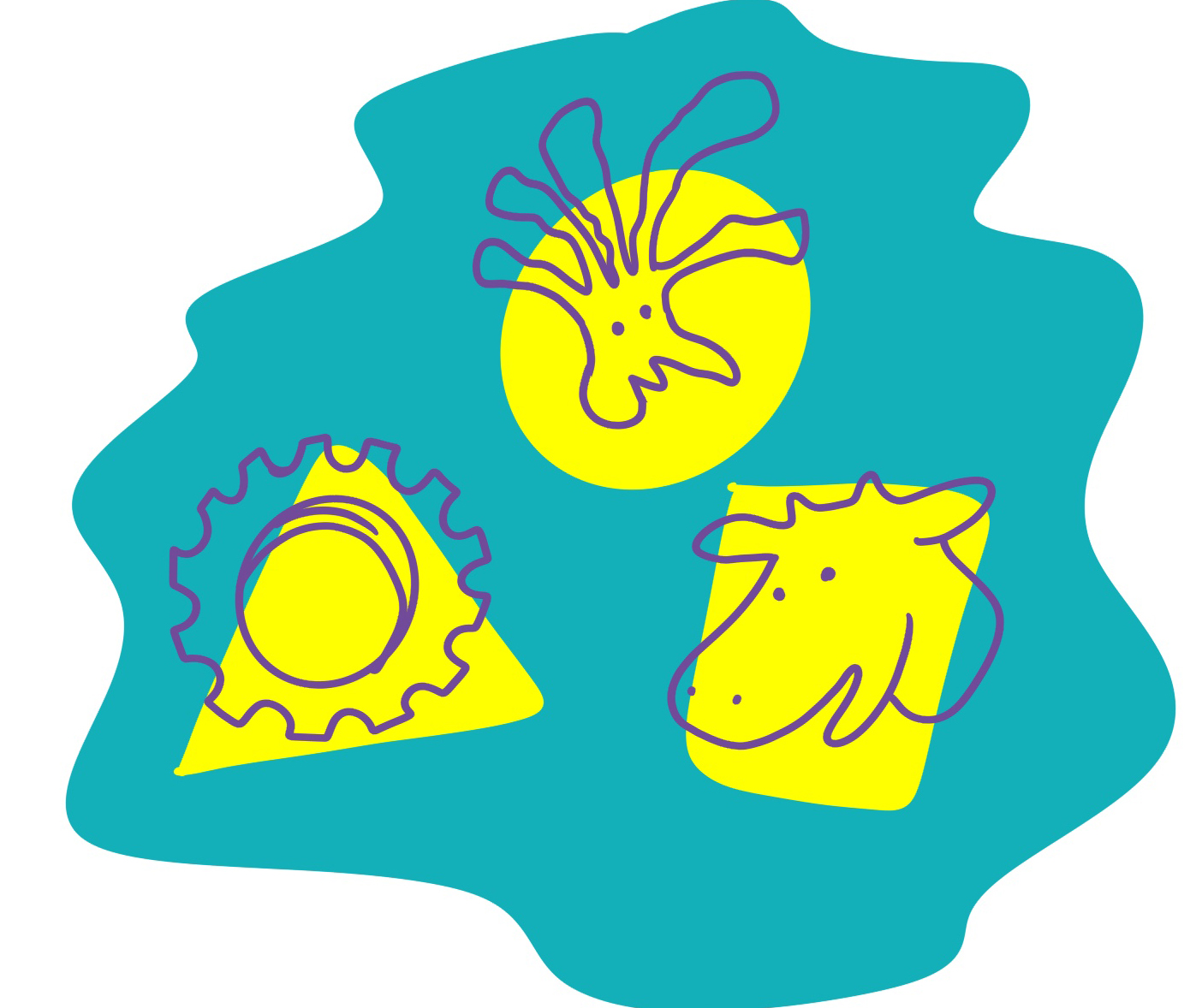
• Be an illustration in “My Style”
• Contain elements suggesting “Free Range” “Farm” and “Bicycles”
• Look very 80’s with weird shapes and squiggles
• Not cost a fortune
• Meet the vendors specifications and requirements
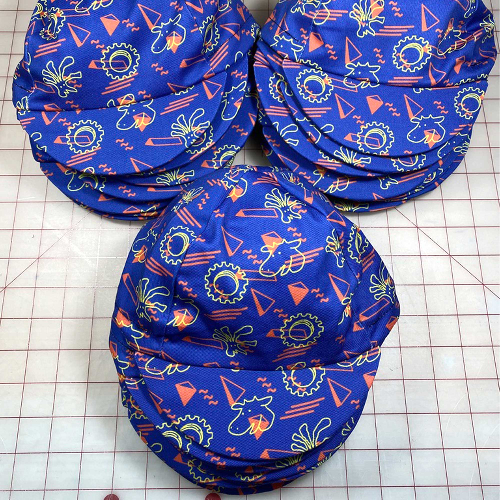
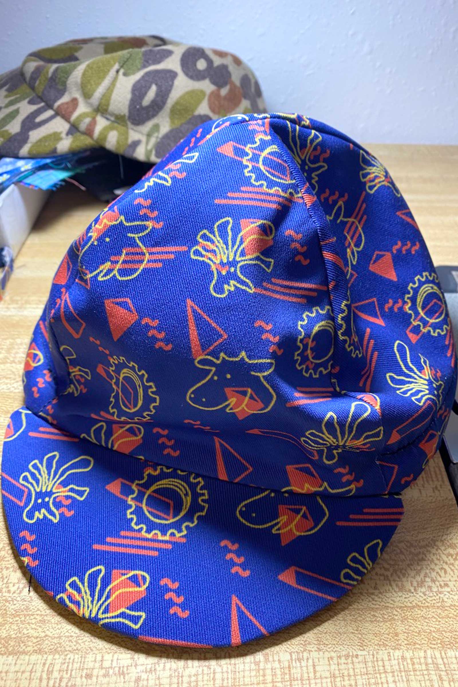 Finshed Cap
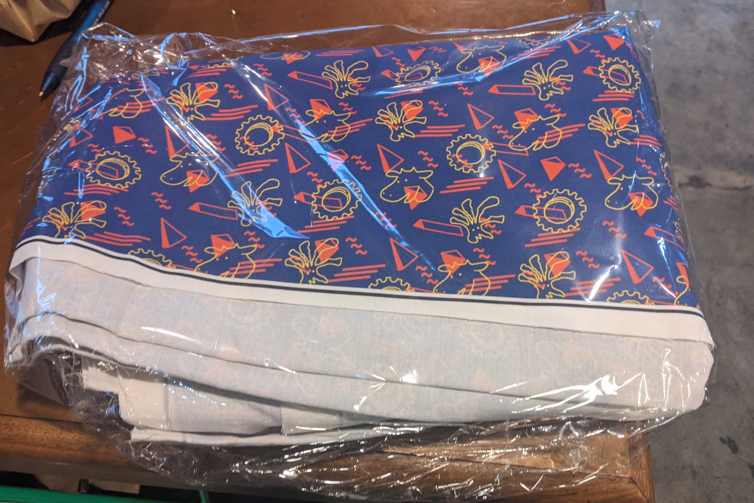 Just a big ol’ pile of printed fabric
Looking for inspiration besides the shapes and squiggles, I thought about a random small ask from the owner, which was to make a logo alt with the chicker head removed. She had a love/hate relationship with the chicken (loving the idea of it, hating it being tied to the logo) and I included an option of illustrations with the now disembodied head paired with other animal heads and bike parts. We ended up narrowing it down to just a chicken, a cow, and a cog.
Color palette was ultimately decided on what wool blend colors were available and we ended up crowdsourcing our top 5 color palette options through a customer survey.
While sourcing the socks was easy (the owner had a favorite brand that did customs), finding a custom cap manufacturer was...interesting. Most cycling cap manufacturers have minimums in the 50 cap range and the bulk pricing doesn’t kick in until the hundreds or thousands—unobtainable for a small shop. After getting quotes from half a dozen manufacturers I gave a holler to a local bike guy who (at the time) made cycling caps as a hobby. He had the time, and told us if we could source the fabric ourselves he could make as many caps as we wanted at a rate the shop could afford.
Caps sold out, socks flew off the shelves, end of story, right?
Objective 2:
Redesign their websiteWhile working on the socks and caps, everytime I visited their site I kind of died a little inside. It was bad. It was not helping them at all. Finally, I got the courage to say something, but the owner beat me too it.
Paired up with a customer who is a UX researcher (the amazing Carol Camilleri, who had similarly noted the site), we worked to create a much more successful web experience.
For the website redesign the primary goals were:
- Reduce the volume of emails and phone calls
- Reduce duration of time customers are in-store
- Integrate social media
- Make it look better

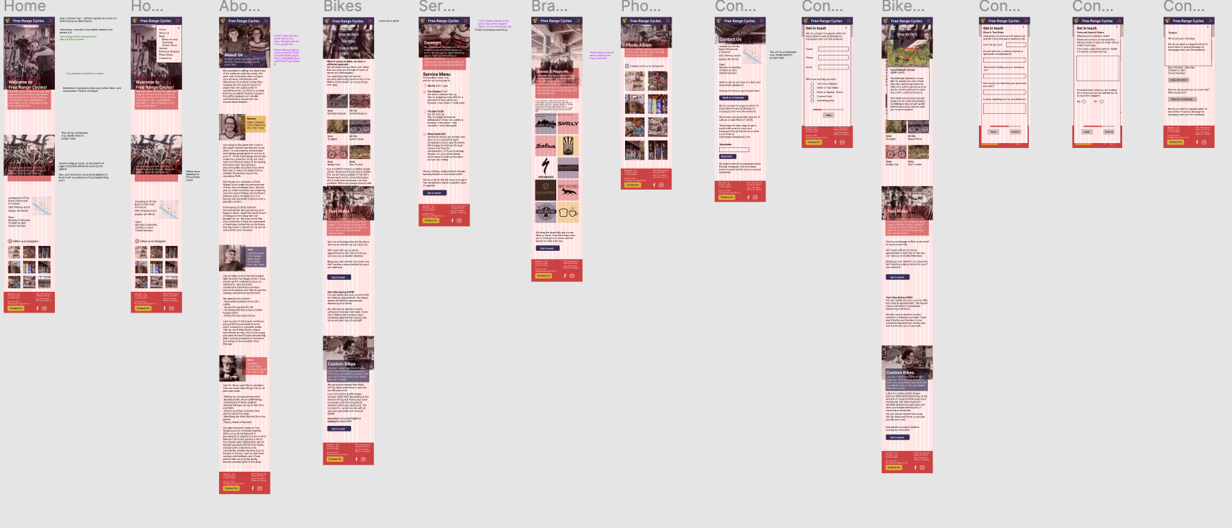
This was the existing website
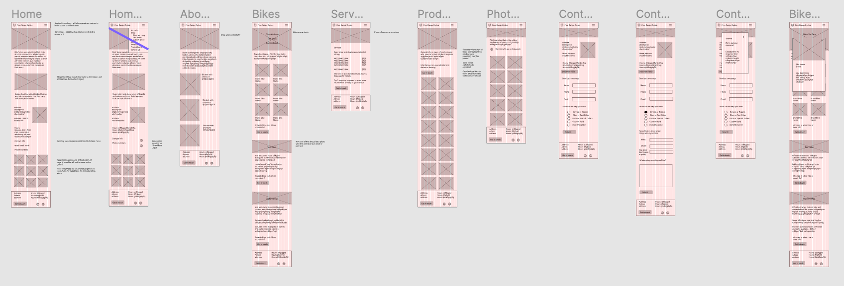
Knowing what the shop wanted, we began with researching who the customers were, and what they wanted from a website.
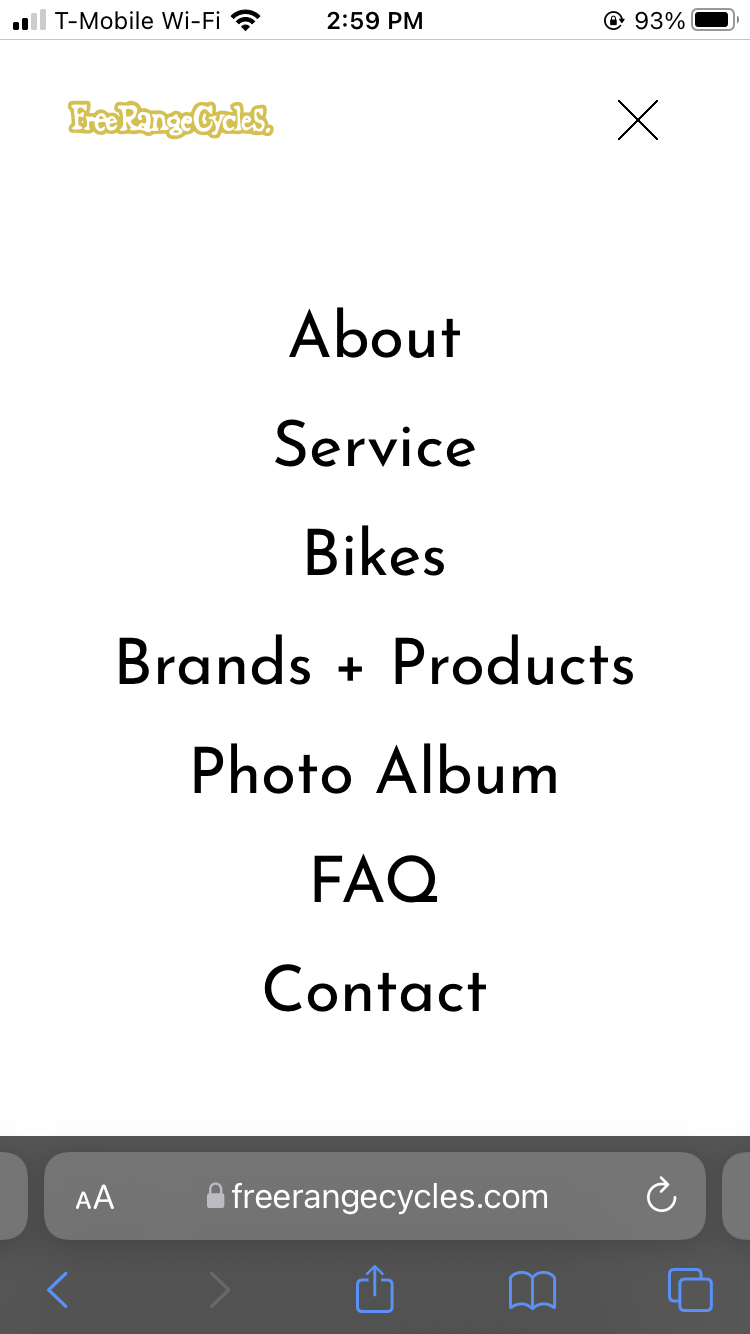
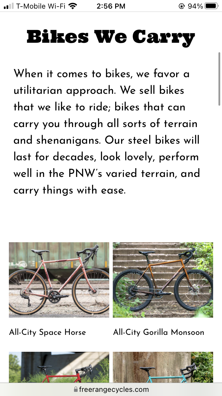
Starting on designing the site we focused first navigation, having a section for repair, purchasing bikes, social media, contact, and FAQ’s.
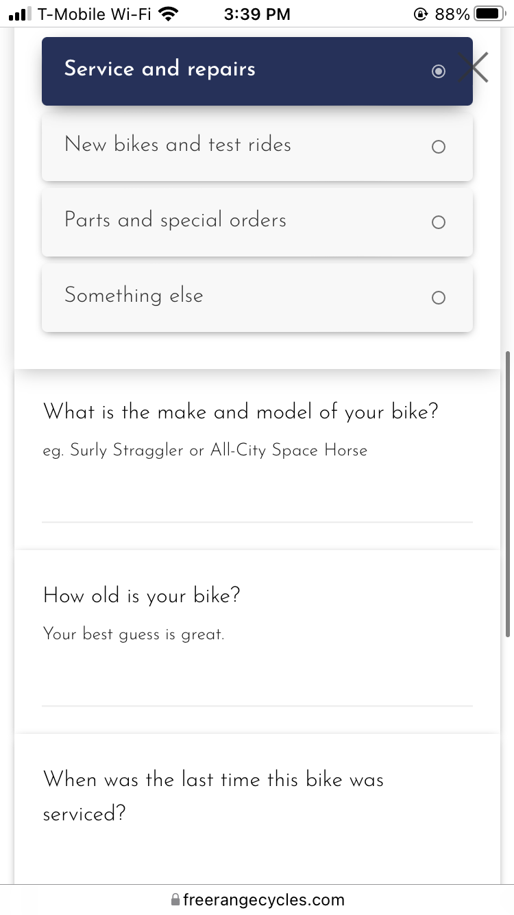
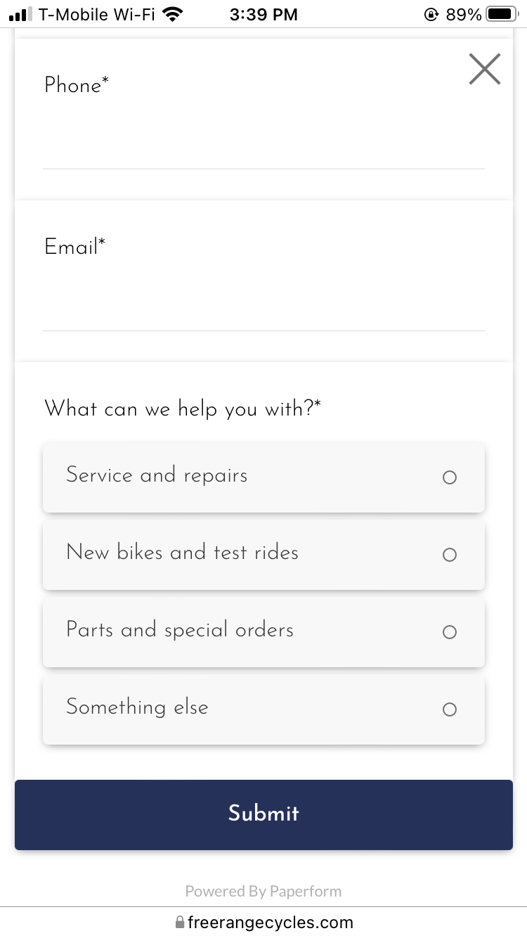
Carol took the lead in contact, and had an amazing insight in turning that into a total flow of the site: by filtering what the customer wants to know and leading them to an answer or sending them to a form to email the shop and have filtered for the shop in regards to what topic the inquiry is.
Meanwhile I organized the pages, found content, and made a style to use for the site.
- Middle-aged women who ride bikes (commute +recreational)
- Tech workers who live in the general neighborhood (all genders 20-45 years old)
- Folx aged 20–35 who value that the shop is woman and BIPOC owned
- People who are upgrading to their first “adult bicycle” (like from a Craigslist or department store bike)
Starting on designing the site we focused first navigation, having a section for repair, purchasing bikes, social media, contact, and FAQ’s.
Carol took the lead in contact, and had an amazing insight in turning that into a total flow of the site: by filtering what the customer wants to know and leading them to an answer or sending them to a form to email the shop and have filtered for the shop in regards to what topic the inquiry is.
Meanwhile I organized the pages, found content, and made a style to use for the site.
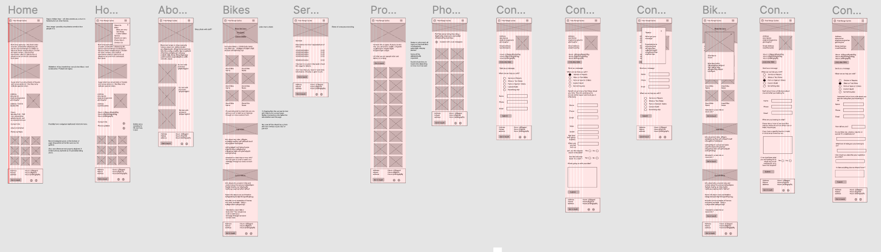
After several iterations protyping we found a good direction, and presented to the owner what it would look like. Her feedback wasn’t concern over the design and research, but that she wanted to make sure she could actually touch the website and make changes if she needed to.
This made a slight change to our design, but ended up saving everyone some time and money, we ended up setting up a Squarespace for her, as it allows her to make simple edits without any code, is affordable, integrates social well, and didn’t kill Carol when she was integrating the plug-in for the contact form (but got close.)
This made a slight change to our design, but ended up saving everyone some time and money, we ended up setting up a Squarespace for her, as it allows her to make simple edits without any code, is affordable, integrates social well, and didn’t kill Carol when she was integrating the plug-in for the contact form (but got close.)
When doing user testing we had some great (and sometimes humourous) insights from the folks trying out the site, with feedback such as:
In regards to navigation:
- Several users went back to
the page that had linked them there to ensure they had clicked the correct
thing
-
“Didn’t
expect that the get in touch would send to contact page. I always try to send
the message to the right person. “
-
Users did not experience
this with the yellow get in touch buttons at the bottom
- This should be resolved by having the blue buttons generate the contact form popup on the same page that users are currently on (e.g., service, test ride etc.)
General insights:
- A specific mention of e-bikes should be included / and their
ability to service them.
-
The vegetarians interviewed disliked the names “the chicken”
and “the beef” for tune-ups.
-
Ensure that the email address and phone numbers are listed
as mailto links and instant dial links, so that users don’t have to type them
in.
-
Folx thought there were places where there was too much white
space on the title page.
-
The language of “flicking an email” should be changed. It
confused two people.
On the repair service menu:
- Users need more about what is in each tune up, several
users read the parts cots as the full cost, many were confused by the two
costs.
- “The chicken wut? I’m confused by the
chicken. It tells me that it’s $140 but it’s also an extra $90. I don’t know
what the difference between the common and beef. It seems really expensive, but
I haven’t gotten an actual tune up for full price [since my partner is a
mechanic].”
- “Under the chicken and the beef,
it sounds to me like there’s $90 on top of 140 and now I don’t know how much is
exactly in the tune-up”
- Users also wanted an indication of what smaller repairs might cost, for example a derailleur adjustment.
The new website resulted in:
- A 12% reduction in the average number of email responses from Free Range required to meet a customer’s needs (from 1.6 average substantive emails to 1.4) This difference was the biggest where customers were looking to get their bike serviced.
- An 18% reduction in the average number of email responses from Free Range required to meet a customer’s needs where customers utilized the form. (From 1.6 average substantive emails to 1.3)
- A 62% reduction in emails that could have been address by content on the new site. (From 40% of all emails to 15% of all emails)