KEXP Summer Drive
Summer One-Day Fundraiser
Timeframe: May-June 2021
Collaborated with: Michelle Billings (Design Director)
Roles:
- Graphic Designer
- Illustration
- Production
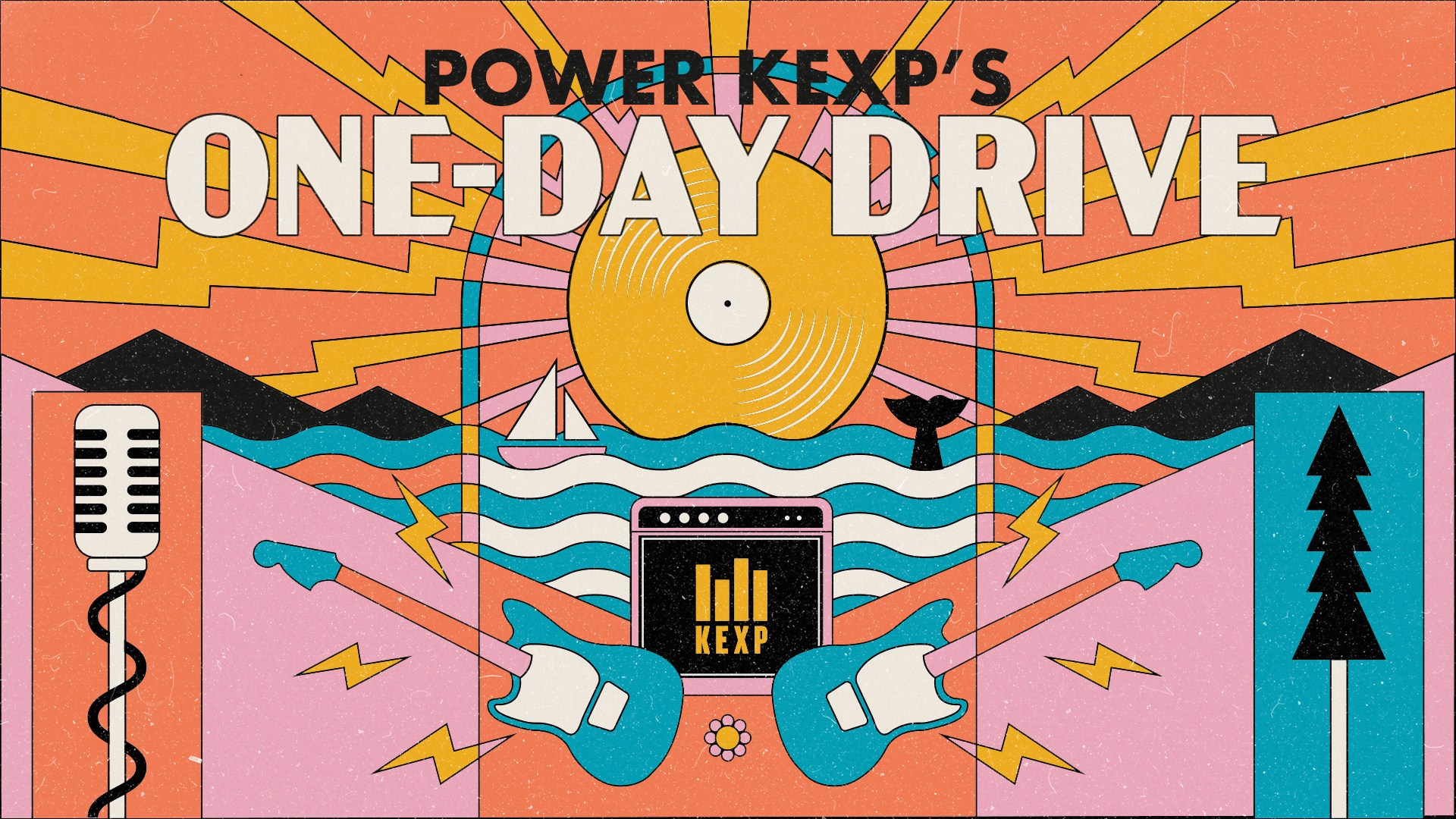
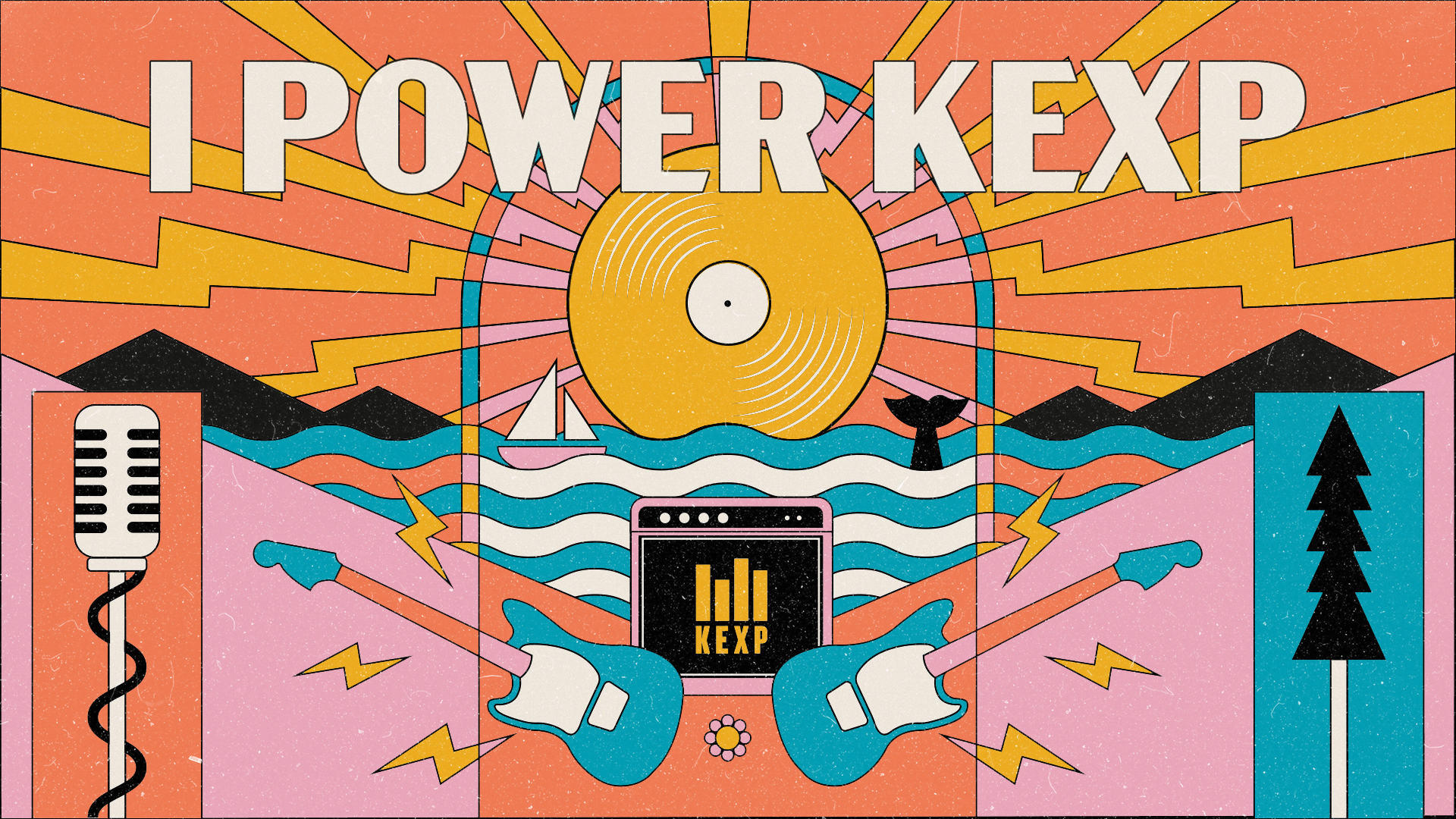
Postcard front for drive announcement
KEXP is almost entirely funded by listener donations, and has four(ish) drives a year. The 2021 Summer drive was based off of a postcard design I made as a reminder card for existing donors to continue their monthly donations/membership.
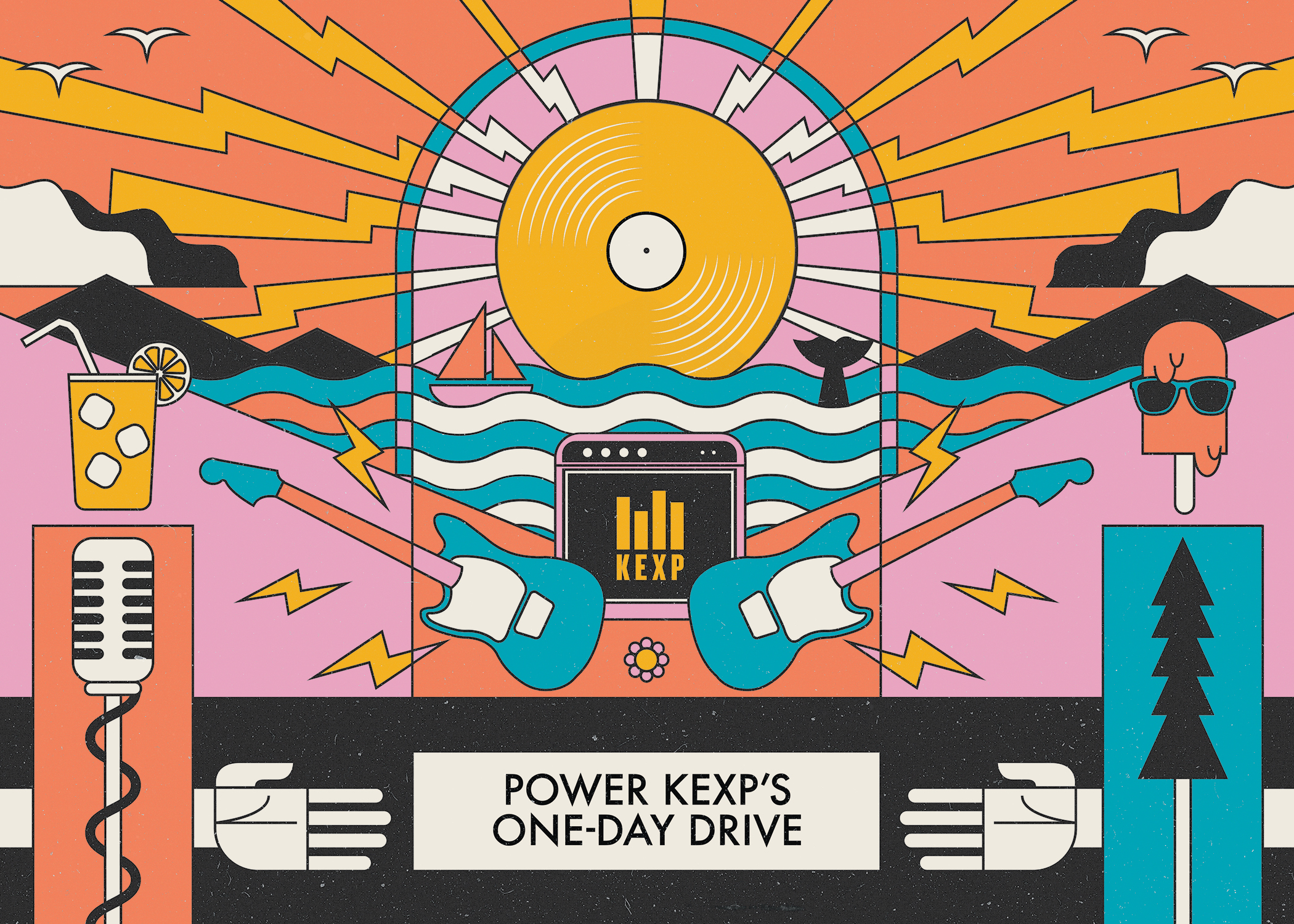
The reminder card was from a request for something geometric, vintage looking, and maybe a little agit-prop inspired—with all the elements that make up KEXP included. We went through some old posters and found some styles we liked and found a palette we could add the KEXP gold into. The “golden record” as a sun (it’s also a space reference btw—they love space) along with coffee, nature, and music equipment.
The reminder card was from a request for something geometric, vintage looking, and maybe a little agit-prop inspired—with all the elements that make up KEXP included. We went through some old posters and found some styles we liked and found a palette we could add the KEXP gold into. The “golden record” as a sun (it’s also a space reference btw—they love space) along with coffee, nature, and music equipment.
Two variations for social media
Initial postcard made for a spring-time reminder message

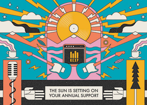
Large social media header (for end of drive Thank You)
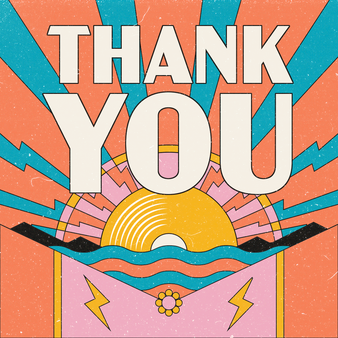
To make it into the summer drive, we did a rotation of the same color palette, and changed some of the elements into a more summery/warm theme. For the record, just between you and me—I don’t know why a popsicle with sunglasses made the cut, but a hotdog with sunglasses didn’t. Anyways, for the end of drive thank you messaging, I felt that having the sun/record setting behind the water and mountains would be a nice way to show a bit of sentimentality in the end. This also required another color rotation to make it look more like a sunset.
The only swag item for this drive was their request for a tote bag that was supposed to look as “publicly funded media as possible” (boring) and emphasized to pick a font that’s probably default on MS Word. It was a huge hit and all were snatched up within hours.
This ended up being KEXP’s most successful fundraising to date.
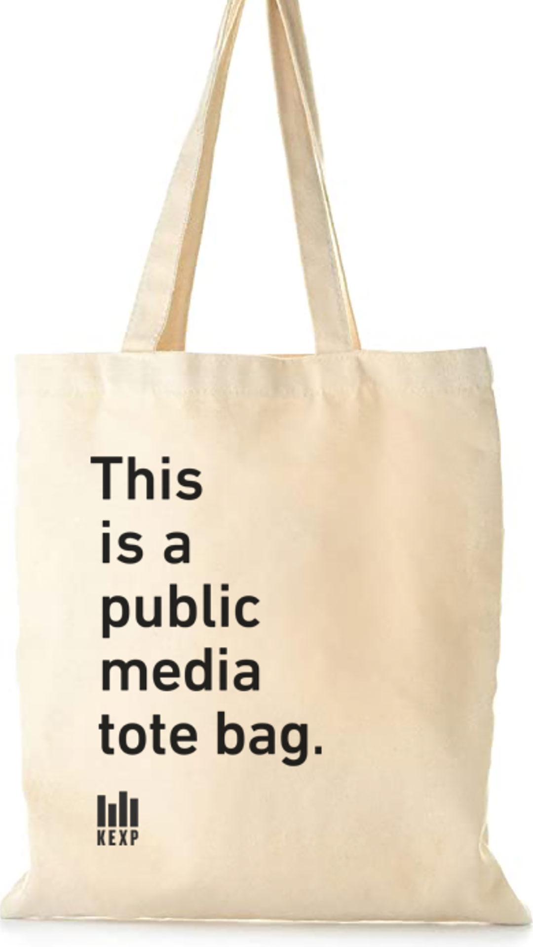
The ever-popular KEXP tote

Mobile Splash-page


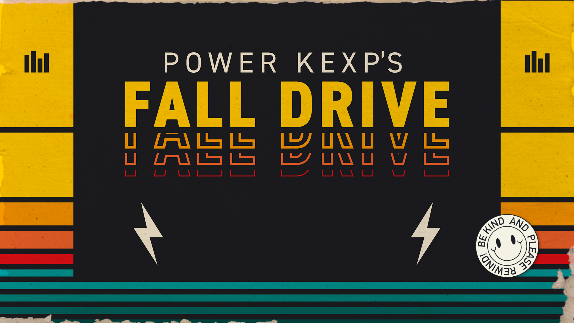
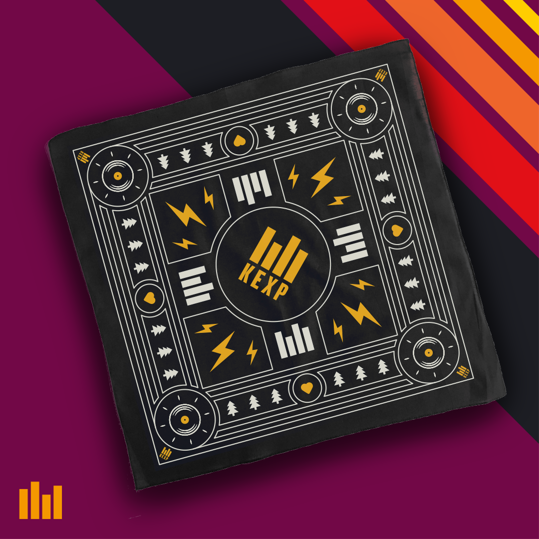
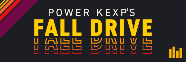
KEXP Fall Drive
Annual Fall Week-long Fundraiser
Timeframe: August-October 2021
Collaborated with: Michelle Billings (Design Director)
Roles:
- Graphic Designer
- Illustration
- Production

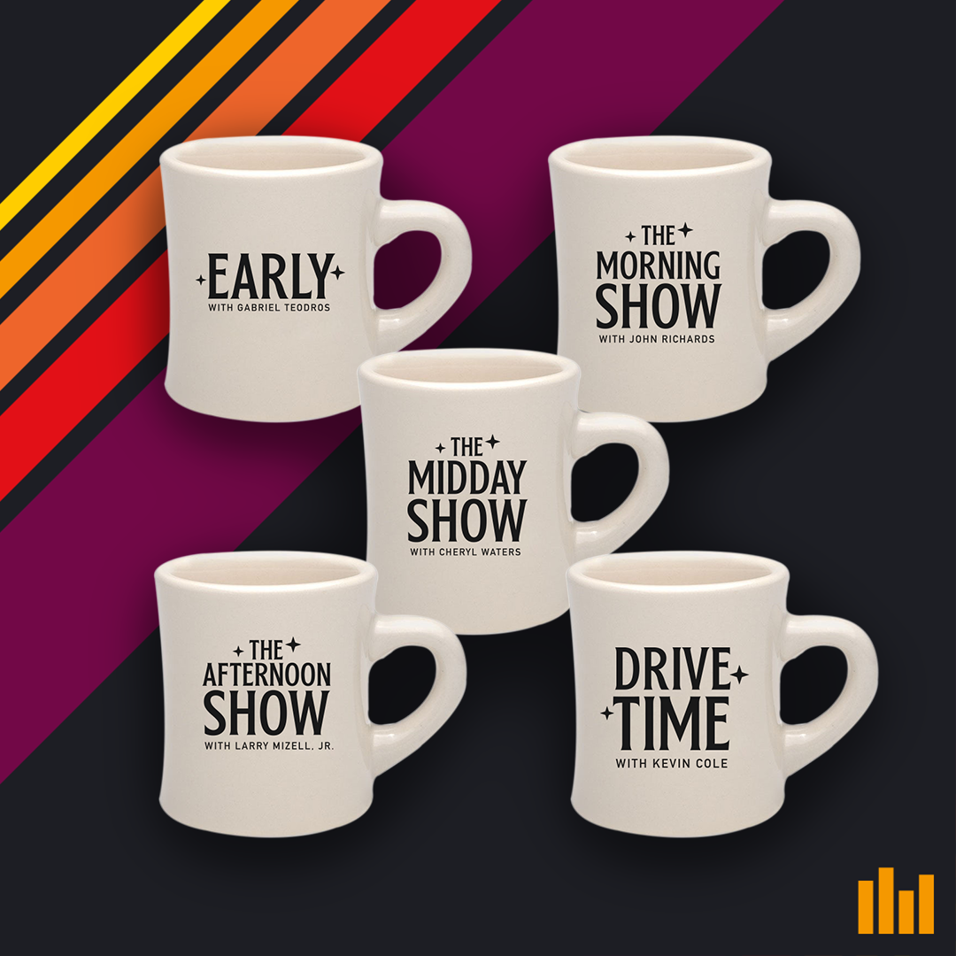 A mug for every daytime show
With their show’s tagline on back
 So much swag/giveaways!
We started the Fall Drive in August working on the t-shirt that was a piece of the supporting swag. This was a very swag heavy drive, by the way! They wanted a type focused design that could be evergreen as well. The goal was for the shirt design to lead the rest of the drive’s direction, but mid process we were given new direction to make it “inspired by 80’s cassette and vhs tapes.” We eventually found a balance between the Amplifier Love Day type style (see below), and tape covers, and brought that to fruition.
There was a bit of simpliciation involved as my concept with the distressed cardboard cover was too much for the time frame involved, and eventually replaced the teal with a purple to warm up the palette.
There was a bit of simpliciation involved as my concept with the distressed cardboard cover was too much for the time frame involved, and eventually replaced the teal with a purple to warm up the palette.
 Concept art that was reduced to a simpler style for final execution
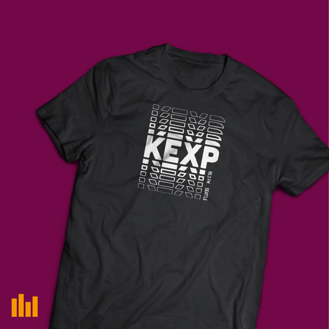 Final t-shirt design
As this was a swag heavy drive, in addition to the t-shirt, there were also five mugs (one for each daytime show) with the show title and slogan, a bandana, a beanie (much requested), a sling bag. The latter two were just logo slaps, but I needed to make them look real for the donors, as the product was yet to have been ordered.
Amplifier Love Day
One-Day Drive/Appreciation day for monthly donors
Timeframe: July 2021
Collaborated with: Michelle Billings (Design Director)
Roles:
- Graphic Designer
- Illustration
- Production
- Animation
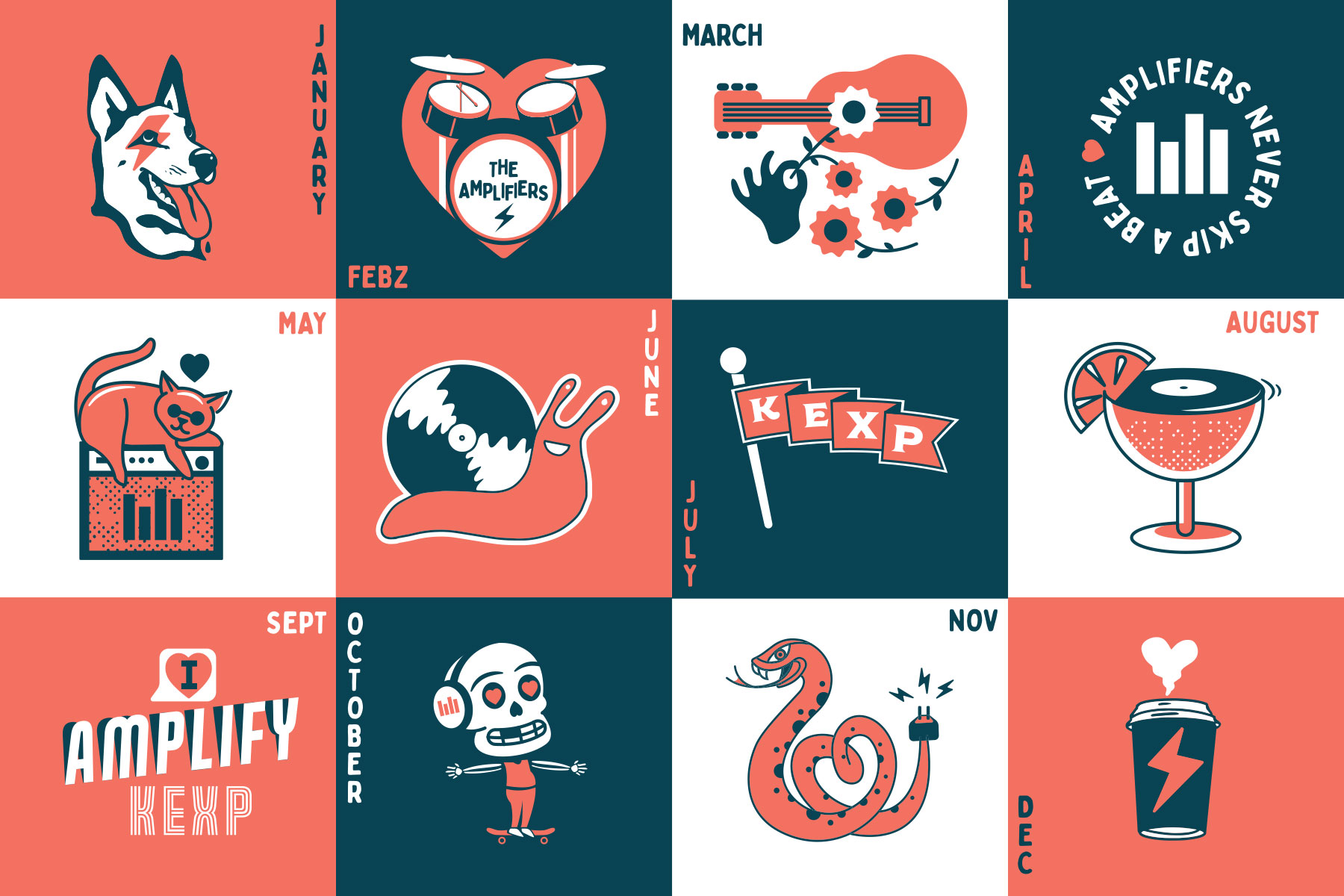
This was a two part project, the initial part was creating a sticker-postcard. The ask was for something like a calendar, and they wanted 12 stickers on a 5”7” card. Michelle and I basically just went to town making a ton of illustrations with the concept of “Amplifiers help us keep a beat.” We tried a couple iterations of things that suggest or rhymed with beat, along with some seasonal images. The end product was kind of a grab bag of the client’s favorite drawings we made, that I layed out and scaled to look as much like a calendar as possible.
Part 2 was making a logo and style lockup to suggest beating. I added in some motion to the logo and lockup, feeling that the “Amplifiers” should actually amplify, and the heart should have some sort of beating to it. They hadn’t had anything animated for social usage for a while so were delighted to have a little bit of motion to post on their Instagram.
Part 2 was making a logo and style lockup to suggest beating. I added in some motion to the logo and lockup, feeling that the “Amplifiers” should actually amplify, and the heart should have some sort of beating to it. They hadn’t had anything animated for social usage for a while so were delighted to have a little bit of motion to post on their Instagram.
 Social media announcement
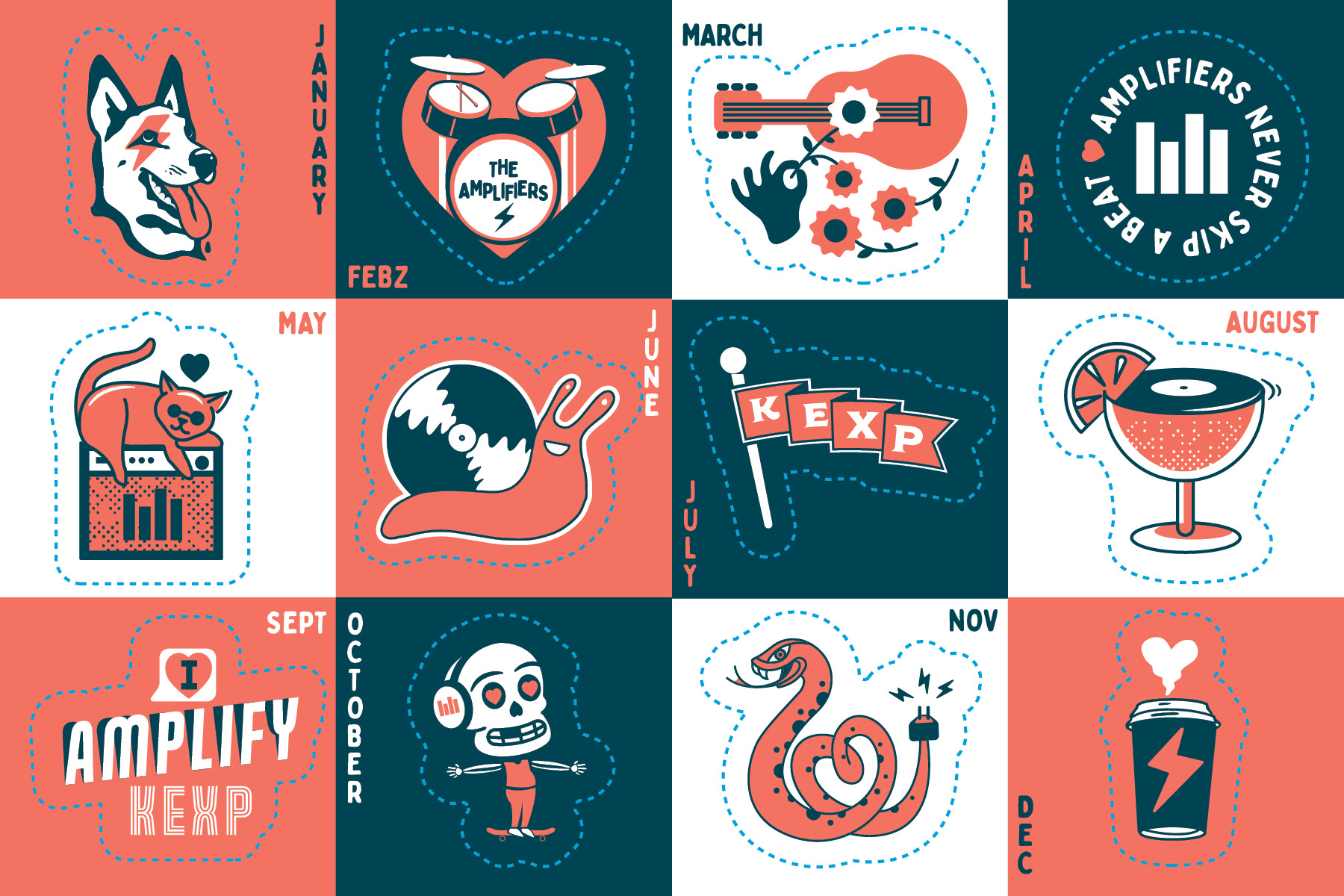
Dielines!