Packaging/Branding
Timeframe: April - May 2019
Solo Project
Roles:
Skills:
Swerve
Premium Spray PaintTimeframe: April - May 2019
Solo Project
Roles:
- Designer
Skills:
- Procreate
- Adobe Photoshop
- Adobe Illustrator
- Adobe Indesign
- Branding
- Art Direction
- Typography
- Layout
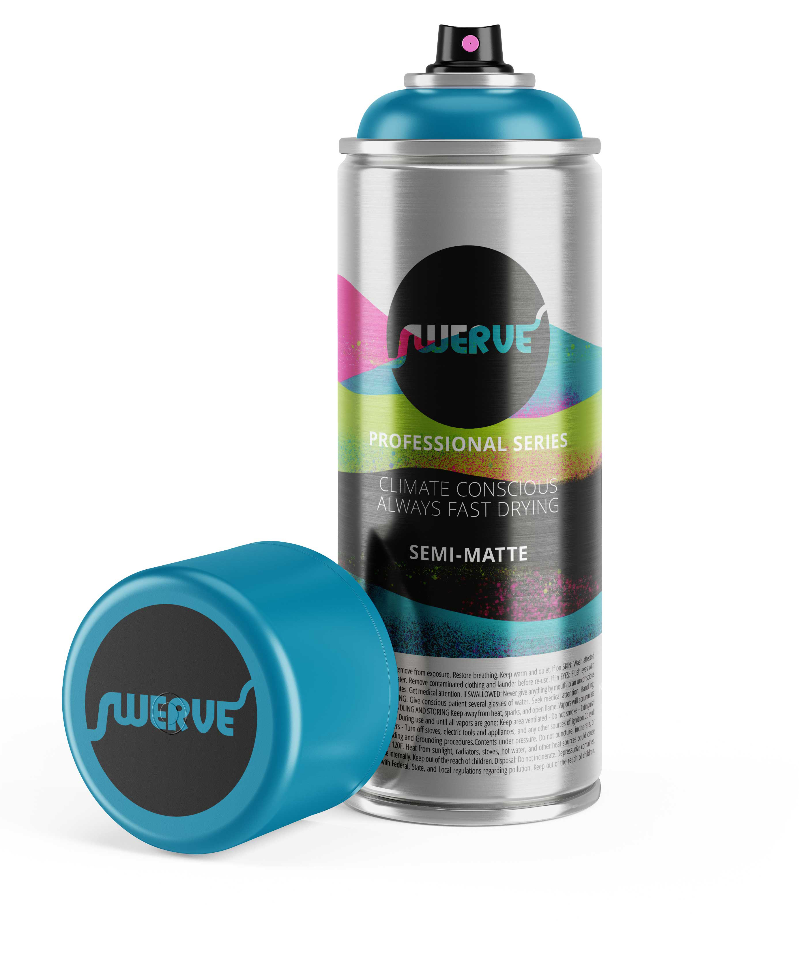
This is the finished product (btw!)
Challenge
Swerve is a (fictional) premium spray paint brand that needs a logo and new package design that says it’s a high-quality artist spray paint. It needs a cohesive label system that is exciting but also meets all the legal requirements for safety labeling. Accompanying paint-pen (I love these!)
Some premium painters tape, so you can have some nice crisp edges!I
Background
For about 5 weeks we had a time-table to create a logo and package design based on a mood board. A large obstacle in this is the HUGE block of text that the safety warning occupies. Does anyone actually read it? Well, just in case, it had to be legible, but still not take up enough space to overwhelm the design.Objective
Create an interesting and beautiful layout while managing a gigantic block of really boring text that could possibly save someone’s life if they bothered to read it. But no one does.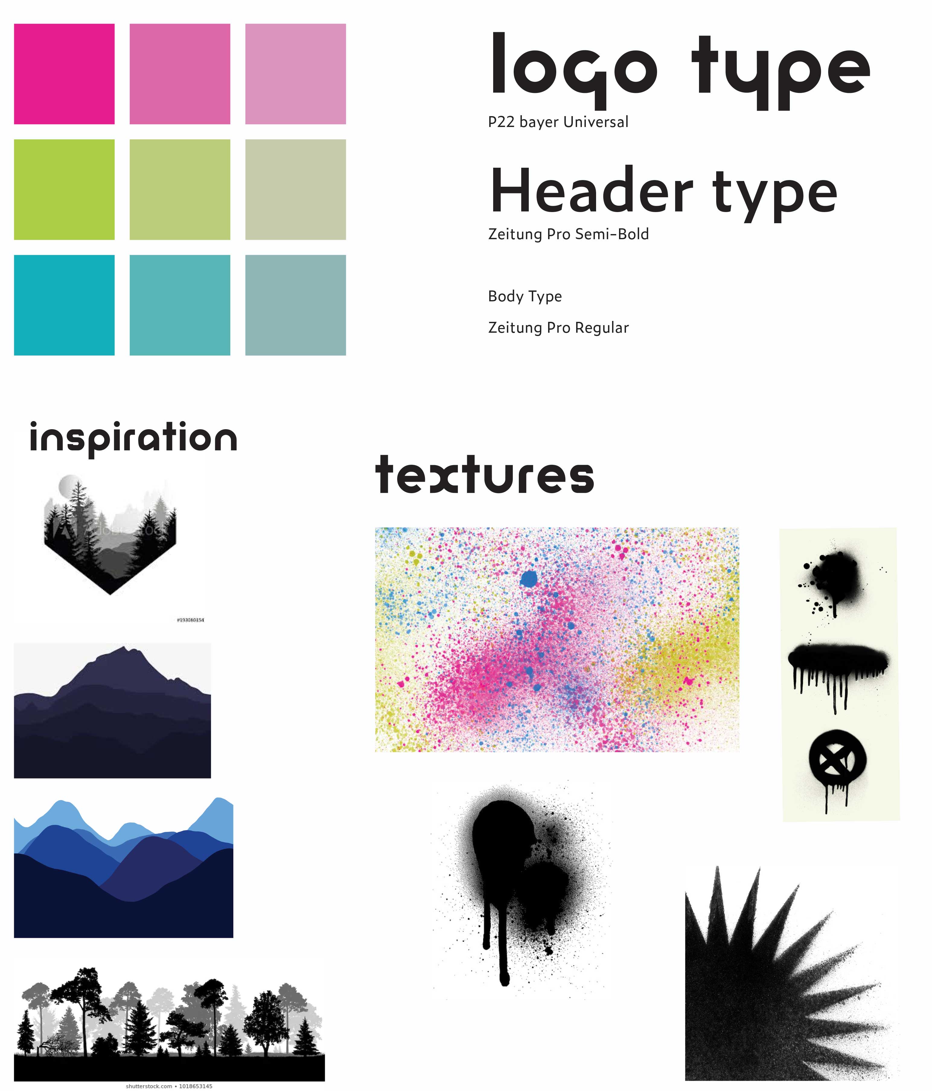
Process
I researched what what existing spray paint cans and packaging looked like, especially the premium cans. This was pretty fun, I went on a couple field trips down to Art Primo to talk to the owners, and also chatted with some of the folks who paint the walls on the courts I play bike polo at. From there I made a moodboard and looked at a cool way to express what a “premium” can would be.I really wanted to have a mix of splattered texture, overlap, and some aspect of minimalism (cuz that says premium, right?). That’s a lot to bargain for. I made a couple backgrounds in Procreate and once I found one that worked I went into layout and type. I found a compromise to the minimal look was to have raw can visible. No other can was doing that. And for the HUGE block of text, I held a can and thought about how it looks in the hand and not on the shelf (the cans are displaced cap out–so the label isn’t even visible until you can actually pick it up). My idea was to wrap it around the bottom of the can, so the can would look nice on every side.
Well, that was a struggle. And it kind of worked, and I wound up with something I was ok with, especially after mocking it up in the real world.
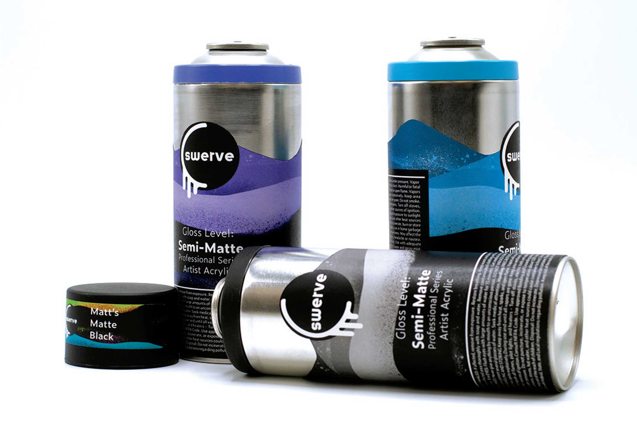
Three cans mocked up together. I was not sold on having the backgrounds match the color of the paint, and turns out neither was anyone else.
 This might be in the top 5 worst mockups available. Ugh. Barf.
Solution
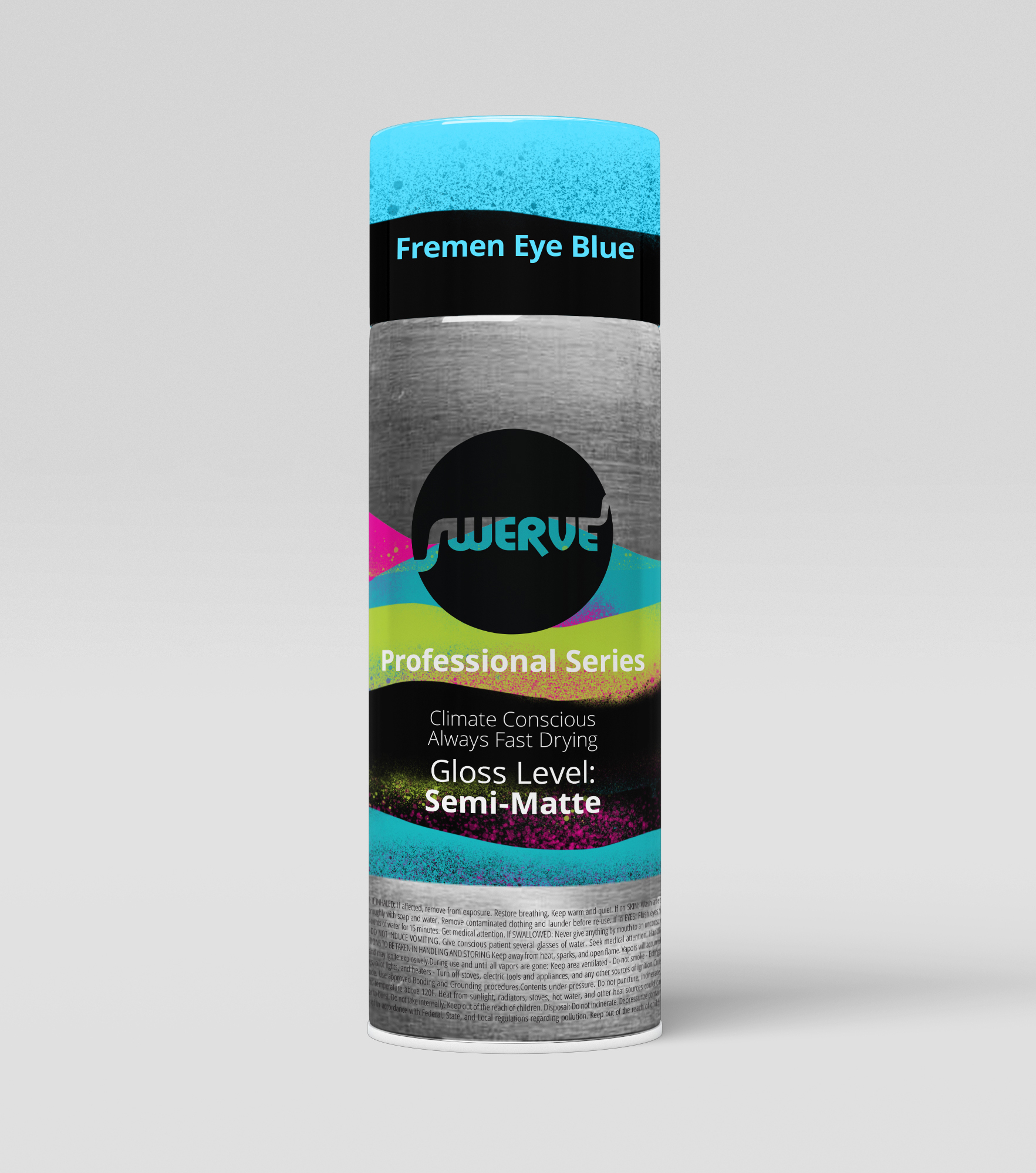
After a year or so, I came back to this. I wanted it to be right. After feedback from professors, classmates, and alumni, the biggest fixes needed to be the logo, type hierarchy, and resolving the colors of the cans.I went to an original background I made that felt better and a lot more exciting. I remembered that they would be shopping by the cap color, so the color should be on the cap, not the label.
Refining the logo came down to emphasizing the “swerve” aspect of it. My peers got me to ditch the drips, and my fix for still having a paint like element was creating a cut-out, as if it was a stencil, and then use it as a window to show background and raw metal below.
SPEAKING OF RAW METAL. After chatting with some alumni on how to handle a mockup when I have no access to a printer, or my existing cans while under lockdown. I realized that I need to double down on that rawness. Print the warning over the raw metal. While I don’t have the technology available to do this, a label company can probably do it in real life.
Reflections
My solution to embracing the raw can might be a little risky in a real life situation. As well as wrapping the text around the bottom. A lot of companies would still like to imagine their item being displayed on a shelf face forward, and this would really detract from that. However, from going into a dedicated street-art shop and talking to real artists, they agreed that it is the cap they see first, if it is displayed. Largely the color is chosen from a color book or pamphlet and they never see the can until it is placed in their hands.I also added a couple supporting elements (required in the original brief). Most artists paint brands also have paint-pens and custom spray tips available for purchase. Most artist paints it turns out do not come with a nozzle, and this is a very specific part. While the nozzle is going to be purely functional, designing the packaging for them would be a fun next step.